As the directors of private art dealership Clark Ark Projects, Amanda and Ben Clark know good composition. So too do Jo Foong and Jamie Sormann of Foomann, who updated and extended Amanda and Ben’s mid-century home to create more space for their two young children and diverse art collection.
“Their home is a 1957 modernist gem designed by C.C. Sainsbury and is more exuberant than the typical war-services home,” says Jamie. “They wanted us to respect the original elements of the house and to showcase their art, books and furniture, and encouraged us to be gutsy in our approach.” Maintaining the footprint of the house, Foomann did an internal refurbishment with a new kitchen, laundry and storage, and added a second storey with two children’s bedrooms. “Our intention was to preserve as much as we could while creating something bold, with a cohesive feel using contemporary execution,” says Jamie.
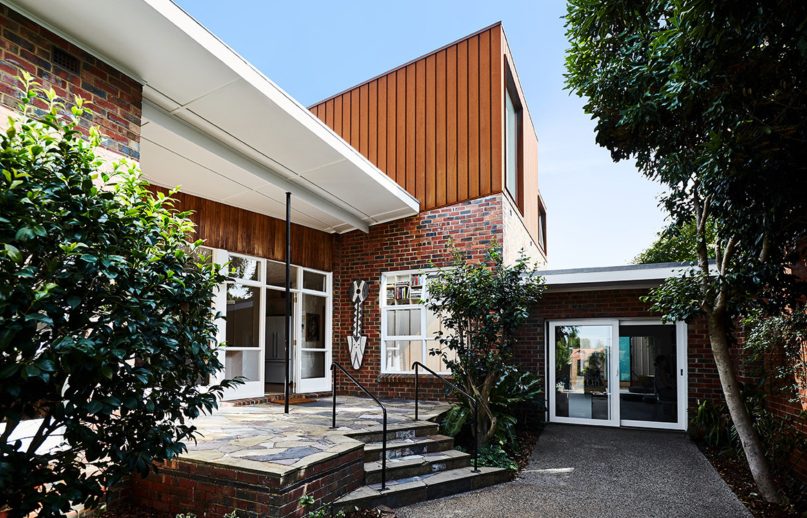
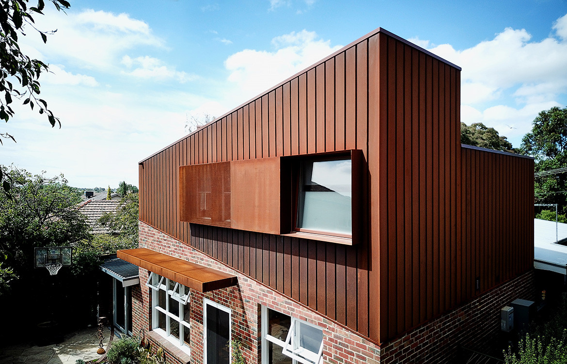
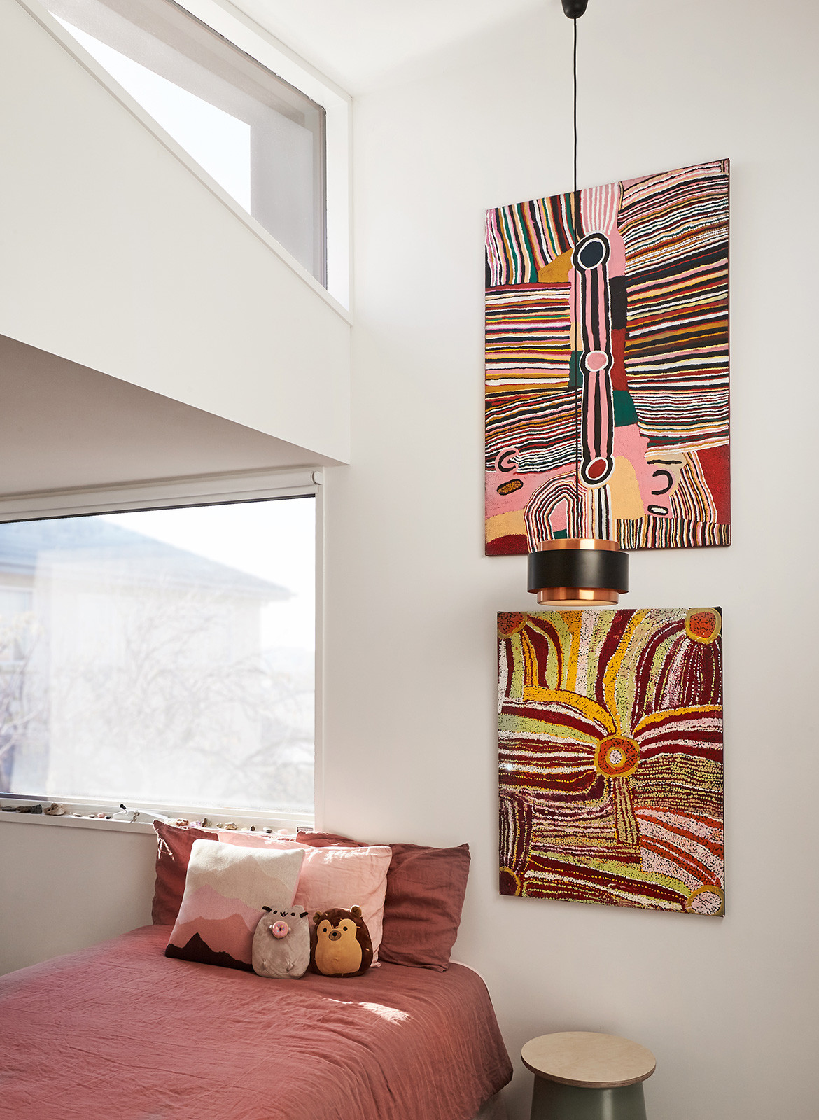
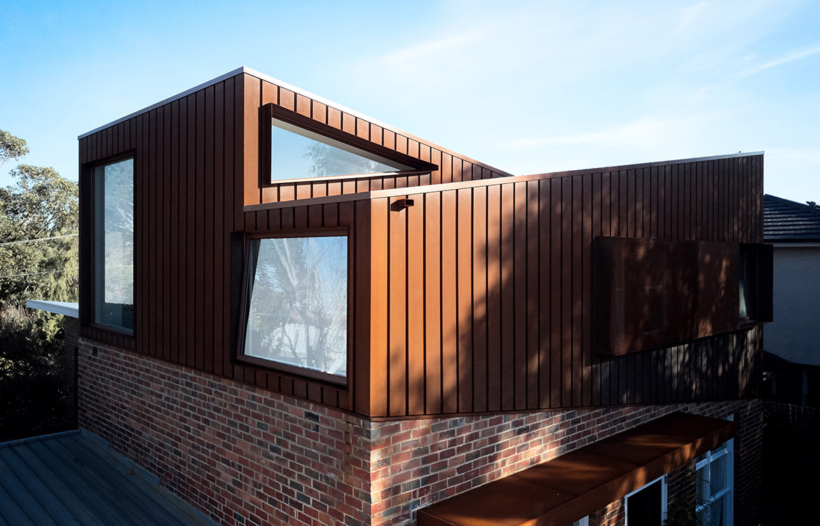
The new addition sits above the downstairs bedrooms at the rear of the house. To respect the skillion roofs and deep eaves of the original house, Foomann created two intersecting volumes with opposing raked roofs that echo the pitch of the existing house. “This created dynamic internal spaces, particularly at the intersection, where triangular windows draw in light and sky views,” says Jamie. Grooved Corten clads the upper level, tonally complementing the brick and timber and mimicking the angle of the skillion roof to define it as a distinct new element.
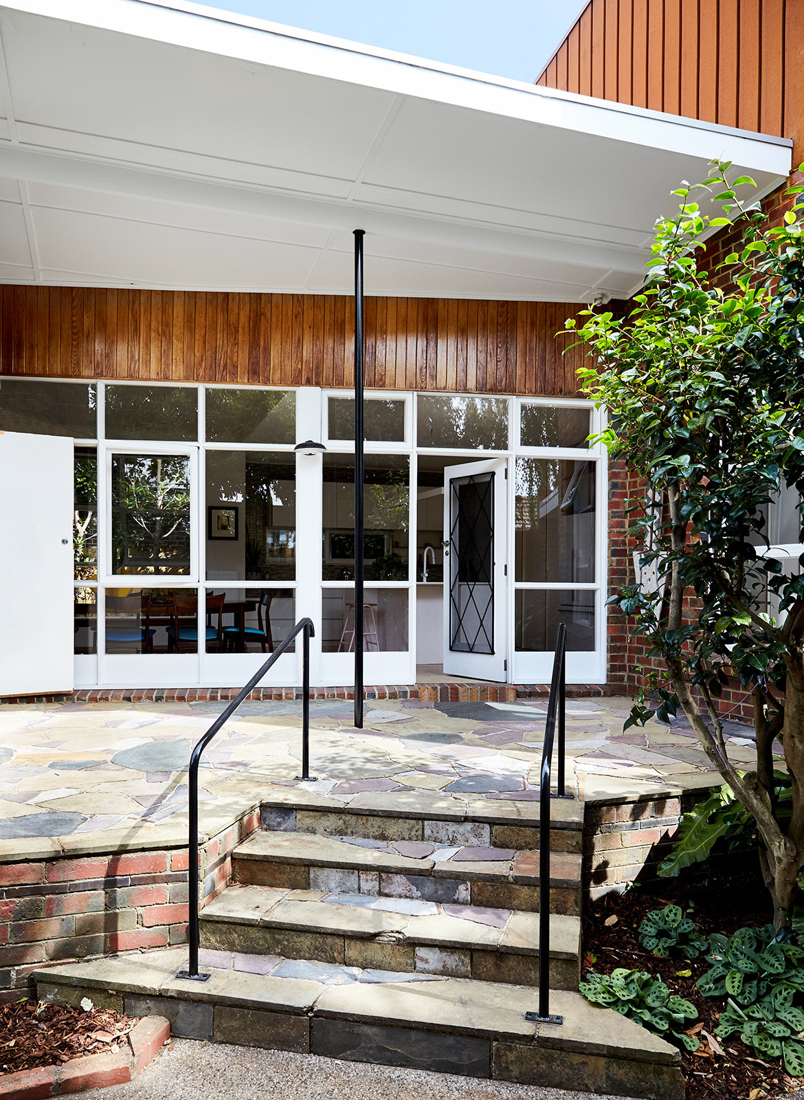
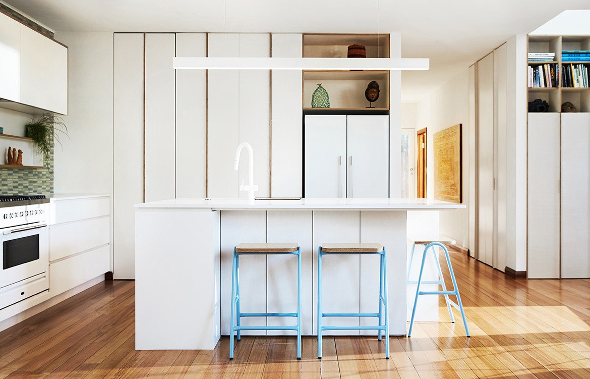
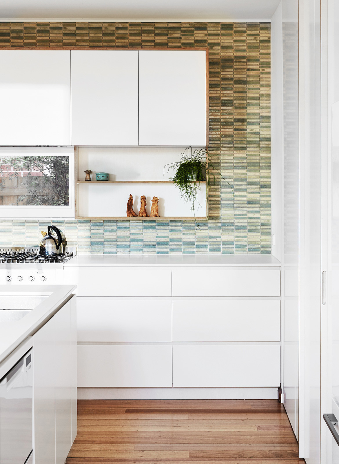
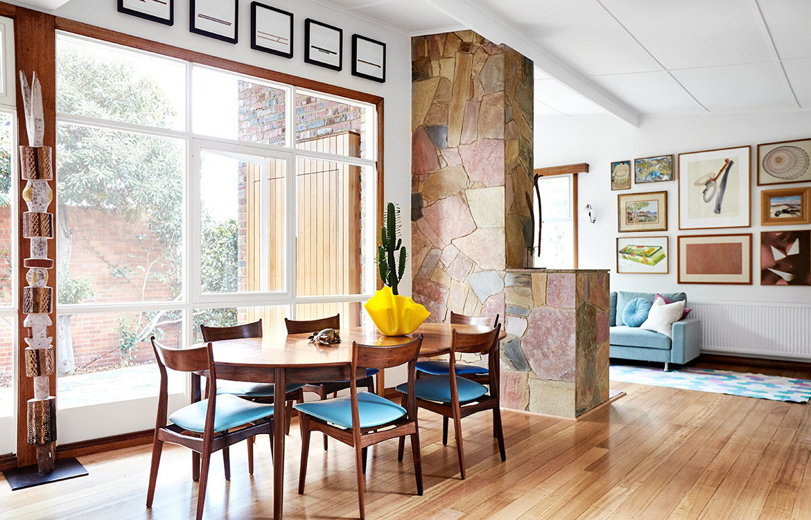
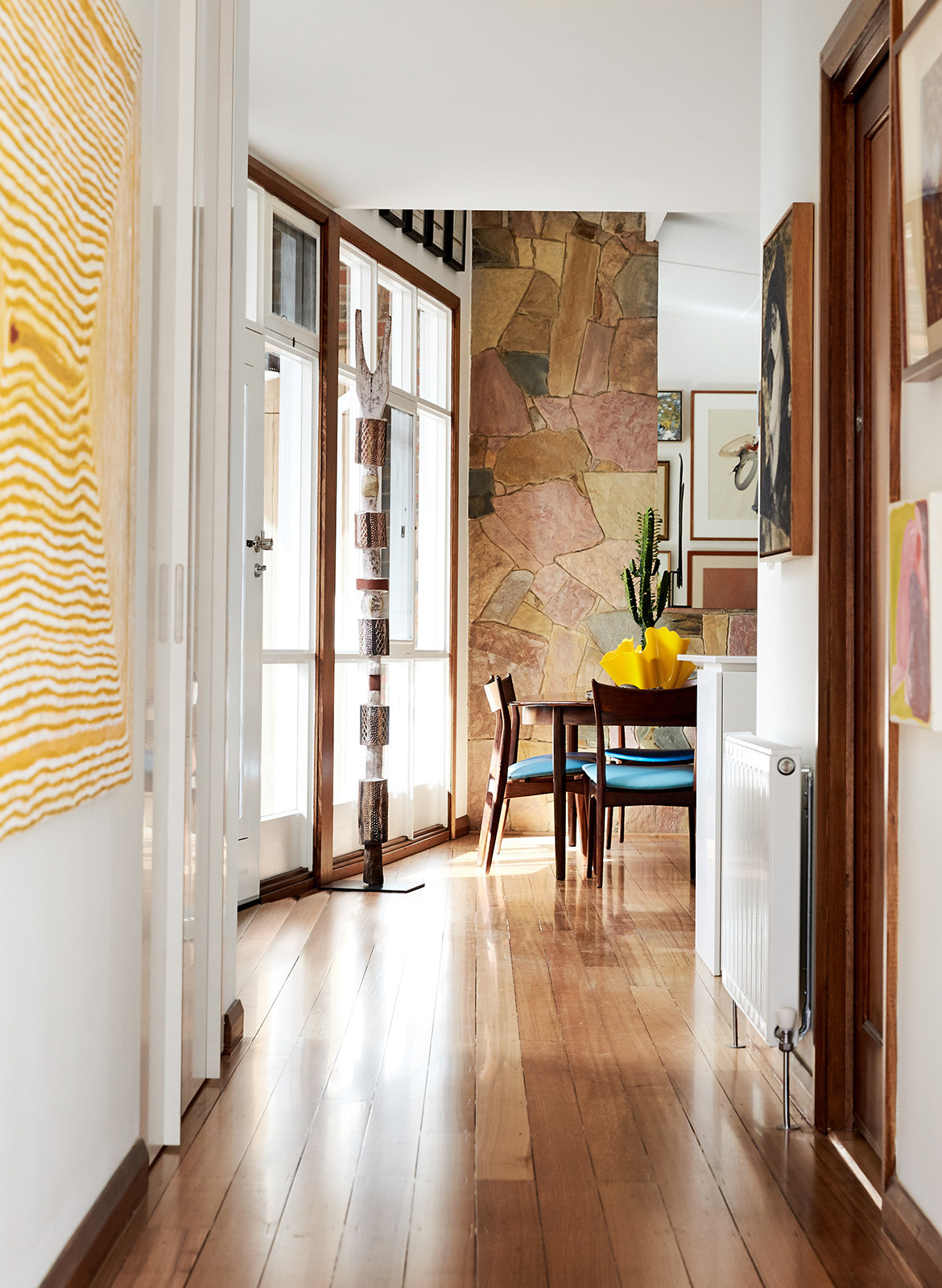
The crazy paved entrance at the front of the house leads into the dining area and new kitchen, which has a clean white palette with timber detailing and green splashback. A colourful stone wall provides a backdrop in the dining area and living room and expansive white walls provide for Amanda and Ben’s collection of artworks.
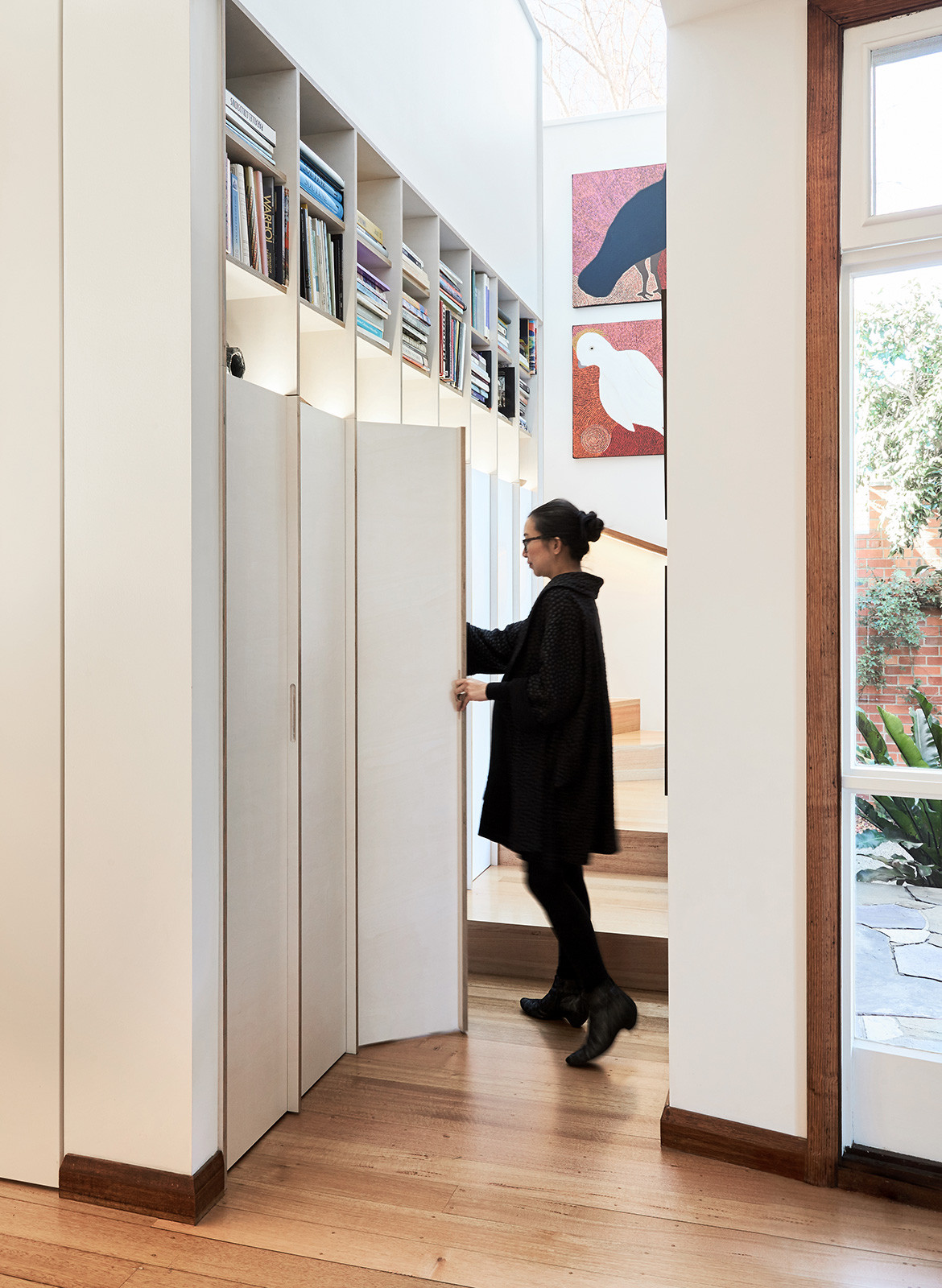
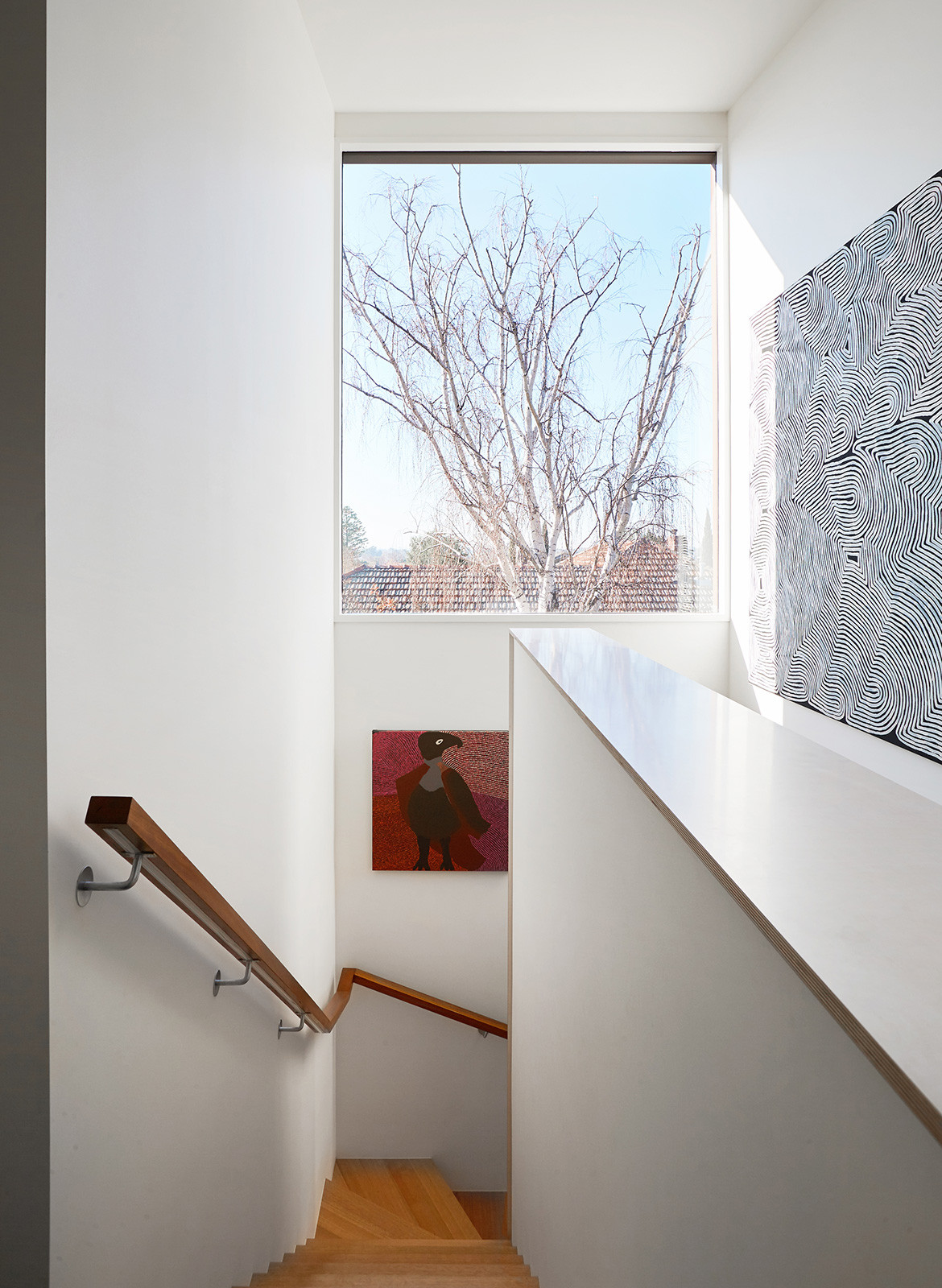
The new staircase is designed to wrap around a joinery wall with display space for small sculptures and books. The joinery also conceals a new laundry and storage space. The children’s bedrooms upstairs receive natural light through the triangular windows where the forms of the new volume overlap. Windows and perforated screens are strategically placed to block views of the neighbours, and an east-facing window at the top of the stair frames views a mature Silver Birch.
“It’s nice to work with a building that was designed in a modernist spirit,” says Jamie. “The existing forms made it challenging to resolve, but we are particularly proud of the overall composition and the internal spaces they provide.”
Foomann
foomann.com.au
Fido Projects
fidoprojects.com.au
Photography by Willem-Dirk du Toit
Styling by Esme Parker, Art Curation by Clark Art
Dissection Information
Plywood supplied by KoskiDecor Eco
Carpet in Coal Ash from Hycraft Carramar
Hurdle Stool from Dowel Jones
Freestanding Cooker in Bright White from ILVE
Pinboard supplied by EchoPanel
We think you might also like The Mill House by Carter Williamson
