It has become a quintessential Australian housing typology: the long, narrow terrace house in inner city Sydney and Melbourne, redesigned to make clever use of what might usually be taken as a set of severe restraints. Often, the redesign comes hand in hand with gentrification but, in this case, one of the endearing features of the project is the multi-generational story of family occupation over many years.
The client previously engaged an architect, Caroline Pidcock, to renovate the house some years ago; Sam Crawford Architects’ intervention is just the latest, and most ambitious, of numerous chapters in the life of this home.
“The client’s parents bought the house shortly after arriving as immigrants and she grew up in it. We found that rich history fascinating – she could remember all the changes that have been made to the building over time,” explains Sam Crawford.
“Part of it was about restoring the building to its glory, as well as creating much more comfortable spaces for the family.”

The footprint of the building stayed almost exactly the same. An addition of approximately four square metres was enough to unlock some living space while maintaining the openness of the courtyard. Extending the structure just a small distance in the direction of the backyard was enough to allow for light to be brought into the central living space.
“We took the spaces provided to us and enhanced them. They are almost the same but small, subtle touches such as raising ceilings to allow the eye to travel further,” says Crawford.

Meanwhile, the lightwell created in the main living room is a further example of how to work with this type of site: “With terraces, most of the time it’s about finding a way to maximise light. We wanted to keep a sense of space, light and generosity.”
The overall approach is anything but heavy-handed and, in this way, it honours the particular story of this house as a home. Instead of destroying things and starting over, the design seeks to work with what has been built up there over decades in order to refine and enhance it.

The stairway addition is a particularly striking intervention, immediately notable in the way that the porous, industrial white section connects in such strong juxtaposition and intriguing detailing to the lower timber area. The full design here is a microcosm: the same space but new material touches and the invitation for light from the above to enter the lower, narrow parts of the house.
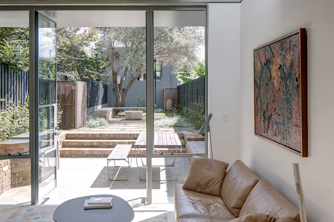
In these lower spaces, the material palette is restrained and even austere. A concrete frame hosting a television gives way to the earthier colours of outdoor bricks, making the threshold between inside and outside somewhat pronounced.
Above all, the constraints of the long, thin terrace have been turned into points of opportunity. Deserving of particular recognition is the choice to maintain such a rich outdoor courtyard space in this type of site, rather than expand into it for more rooms – long may it continue.
Project details
Architecture – Sam Crawford Architects
Photography – Brett Boardman


We think you might like this story on How Architects Are Modernising Heritage Houses.

