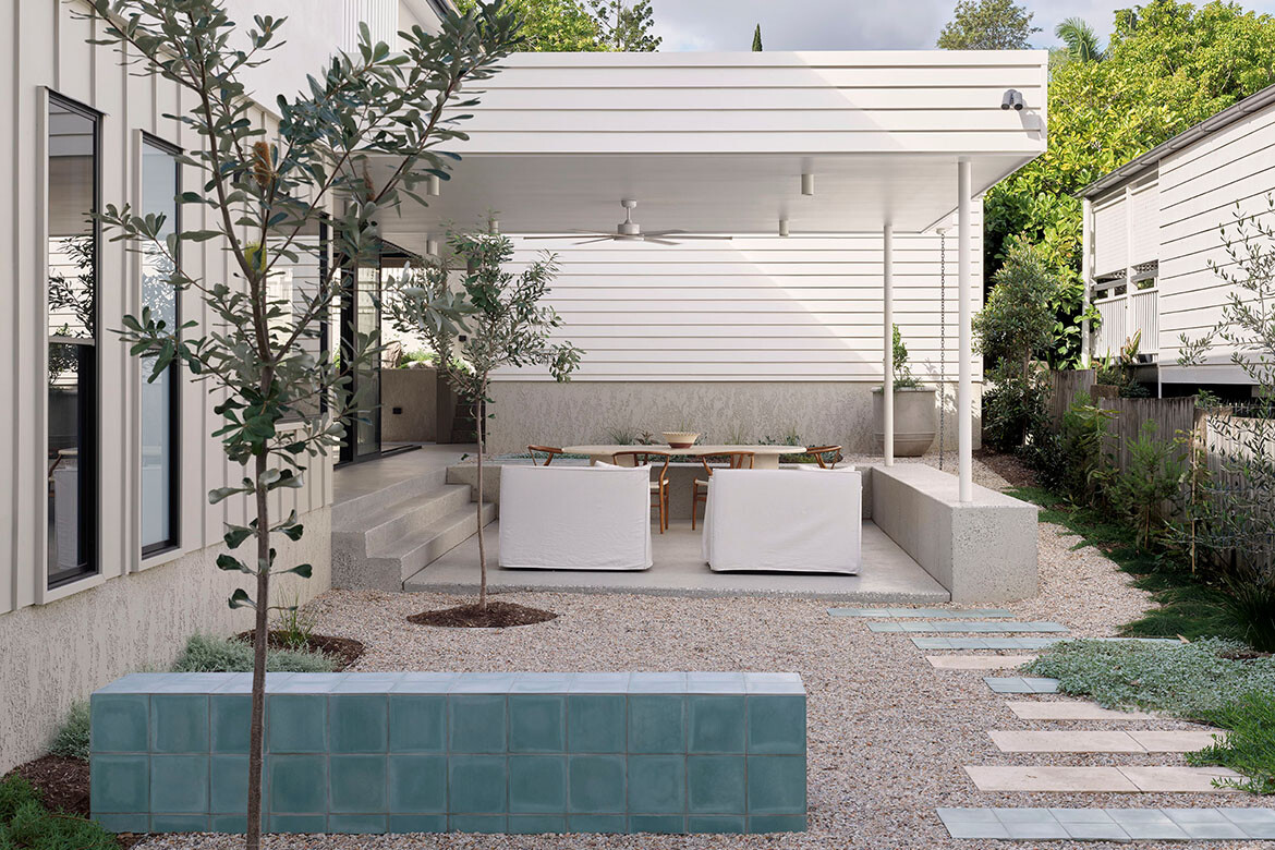
There is plenty in the design of Same Same But Different House that sets this residence apart, but there is also a journey of friendship, collaboration and character that unfolded along the way.
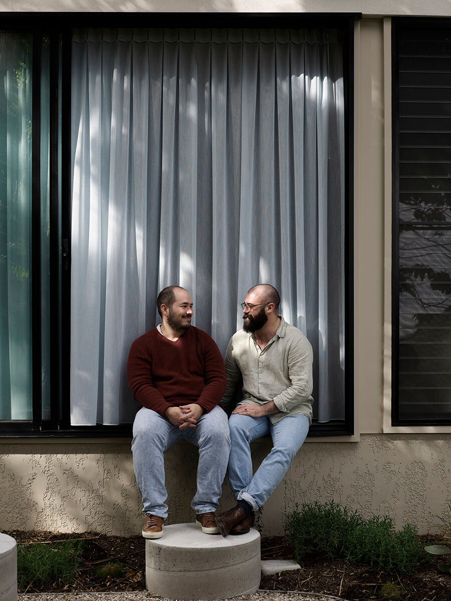
“They were the dream clients,” as Maytree Studio’s director Rebecca Caldwell and interior designer Alisha Bouris recall. With previous experience building and renovating houses – once with an architect and also a volume builder – the owners deeply understood the processes that go into designing and building a house.
“By the time they came to us, they knew what didn’t work. They also understood more than most where the costs could overrun and were willing to roll their sleeves up and hunt for things that matched exactly what they wanted,” says Caldwell on what set the project off to a great start.
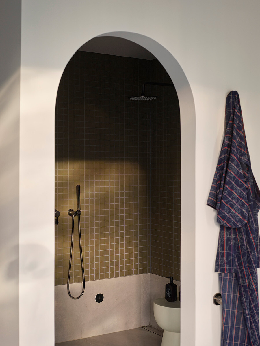
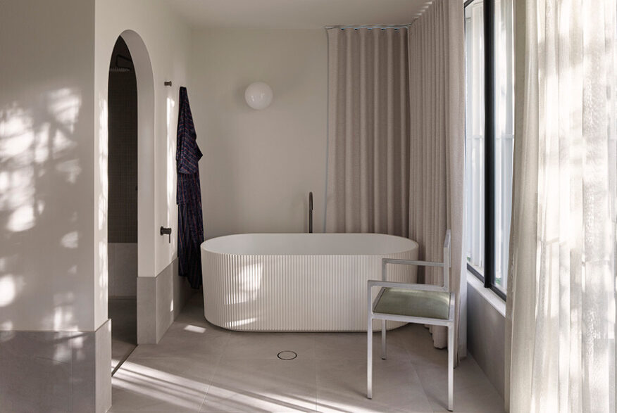
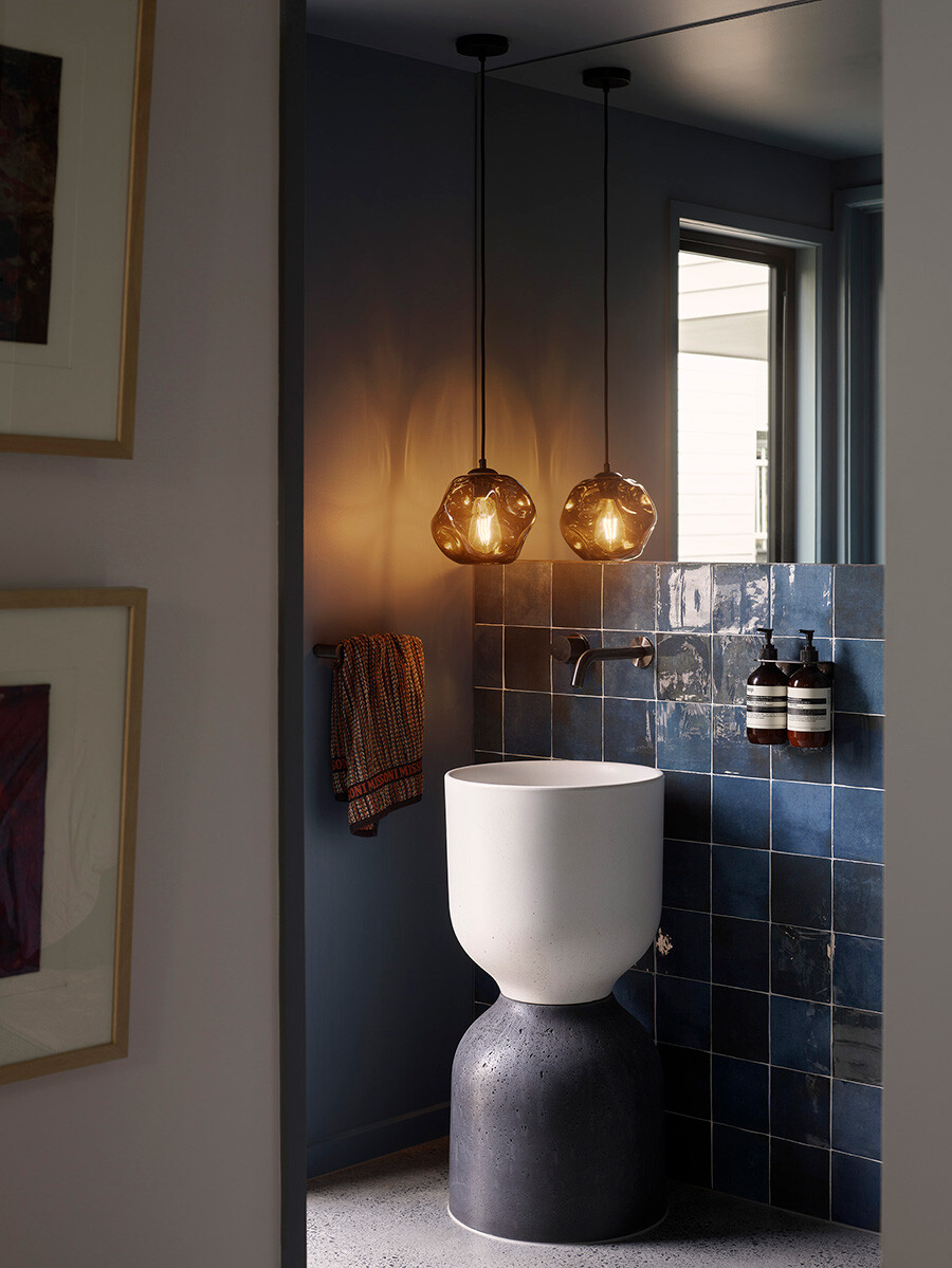
Deeply involved in the process from the get-go, this holistic understanding from the client’s side saw them making decisions that they knew would impact the outcome; for instance, sourcing the perfect, blue-toned tiles on sale, and recreating light fixtures similar to what they originally envisioned.
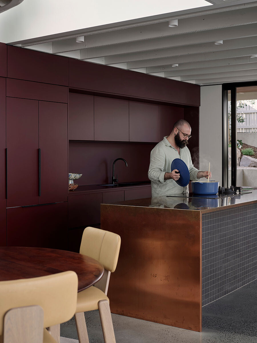
The project was a new build and Maytree Studios worked across the architecture, interiors and project management. One of the challenges was in balancing the natural slope of the block. There is an initial steep incline from the street down, which then tapers off at the other end to be comparatively flat. This required careful planning to make the house appear modest and in keeping with the rest of the street.
Another layer of complexity came in the architectural character of the suburb, which demanded that the house respond to the Queenslander vernacular. Maytree Studios was acutely aware of finding a solution that would blend seamlessly with the timber and tin weatherboard buildings of the neighbourhood.
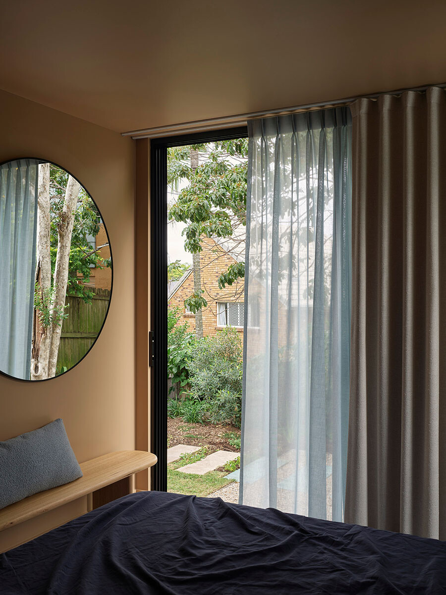
Key to achieving this – which was also encouraged by the clients – was the desire to infuse a sense of age and moodiness both inside and out. From the street, the residence feels decidedly at ease in its surroundings.
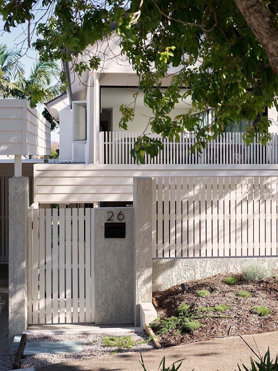
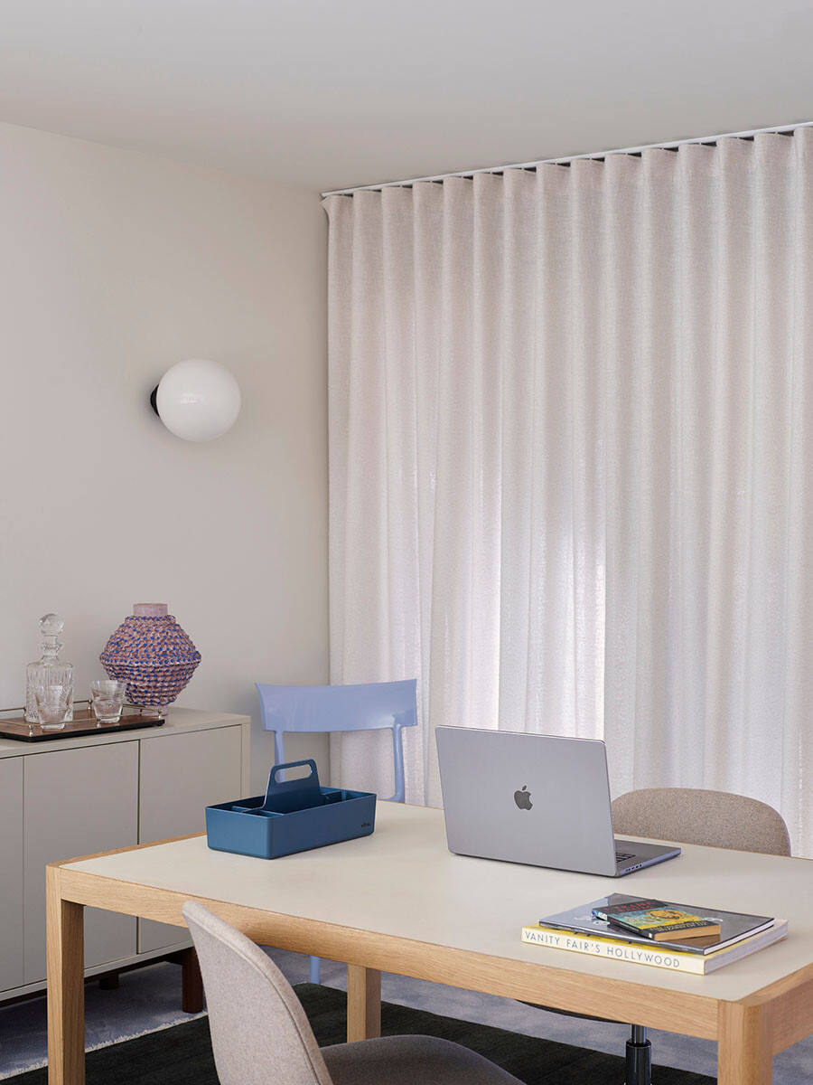
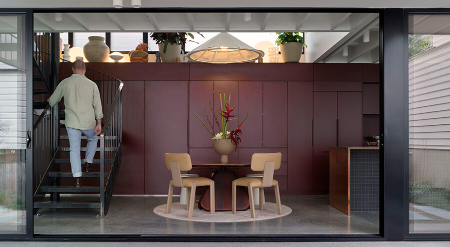
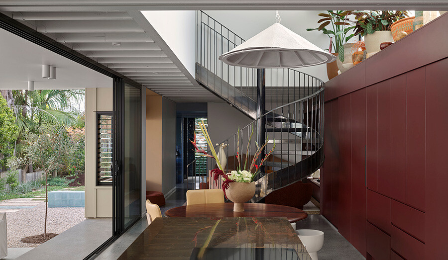
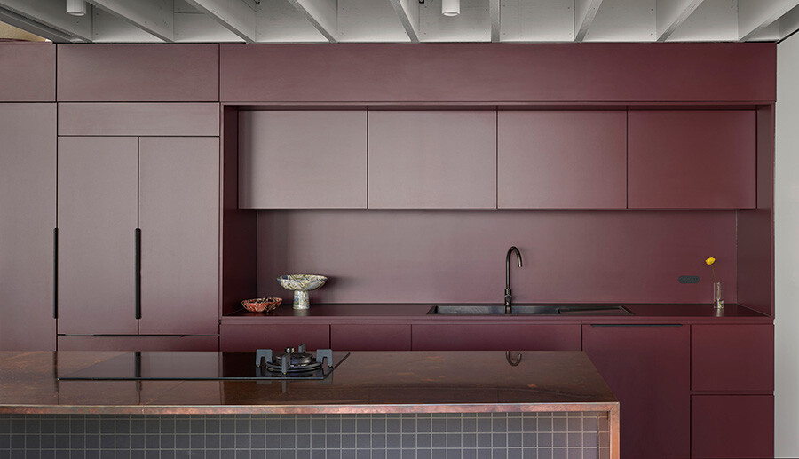
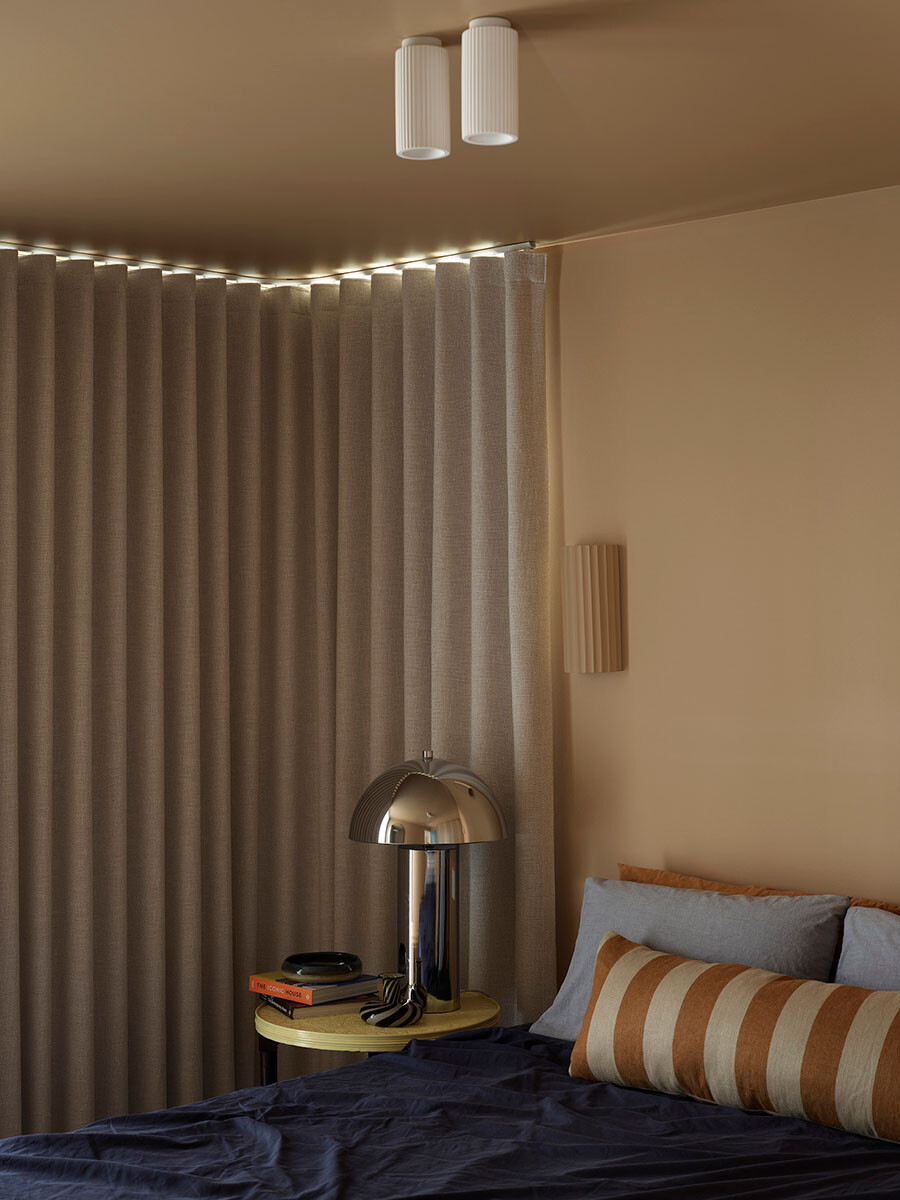
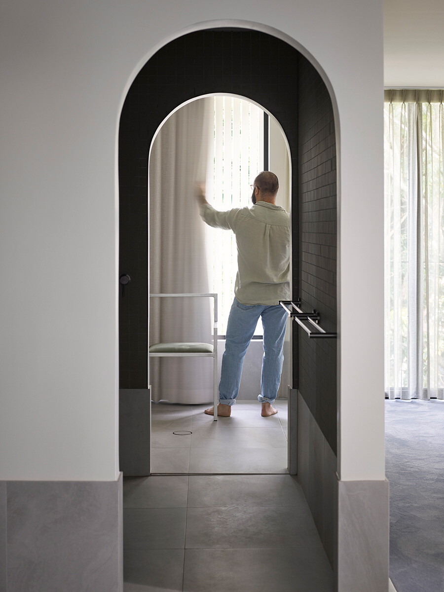
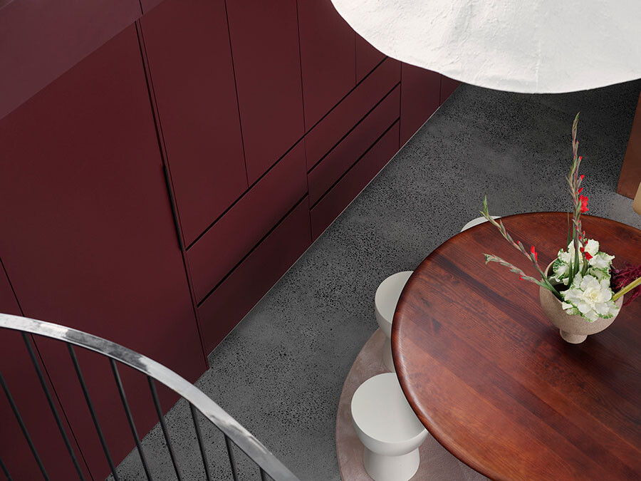
Moving inside, the inspirations came from French bistros and moody spaces, expressed through dark joinery that contrasts against the lightness of the openings. A daring, deep maroon colour of Laminex creates a wall of joinery and sits alongside a copper bench – as chosen by the client, adding an unexpected twist.
“We’re often proposing things that end up being muted or softened by the client. But all of the bolder choices came from the client or were very much embraced by them,” says Bouris.
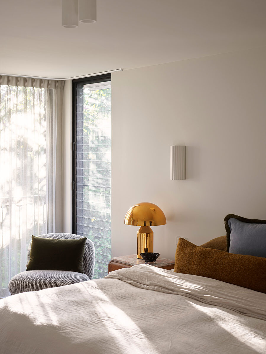
Creative colour combinations repeat throughout, upstairs another adventurous choice of carpet gives way to mustard tones in the bedroom. The notion of ‘surprise and delight’ comes up again and again, opening up the kitchen cupboards reveals another pop of colour.
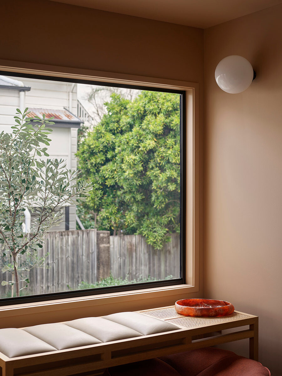
A key part of the brief was to “live in the garden”. As a south-facing block, the home needed a clever design solution to maximise as much natural light as possible, it also meant keeping the floor area to a modest volume. A big lightwell void was introduced, to bring in strong daytime light and warmth during winter, while an east-facing morning coffee spot offers cool respite during the summer afternoons.
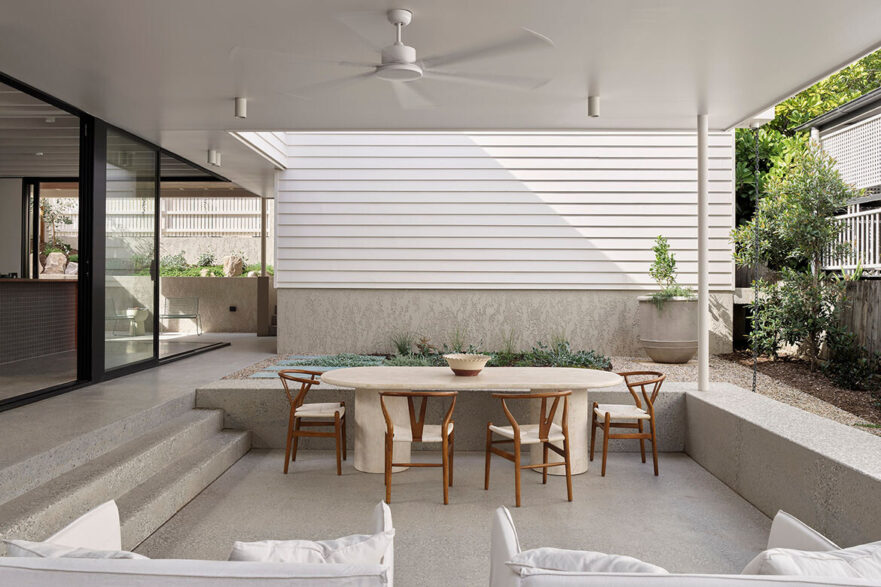
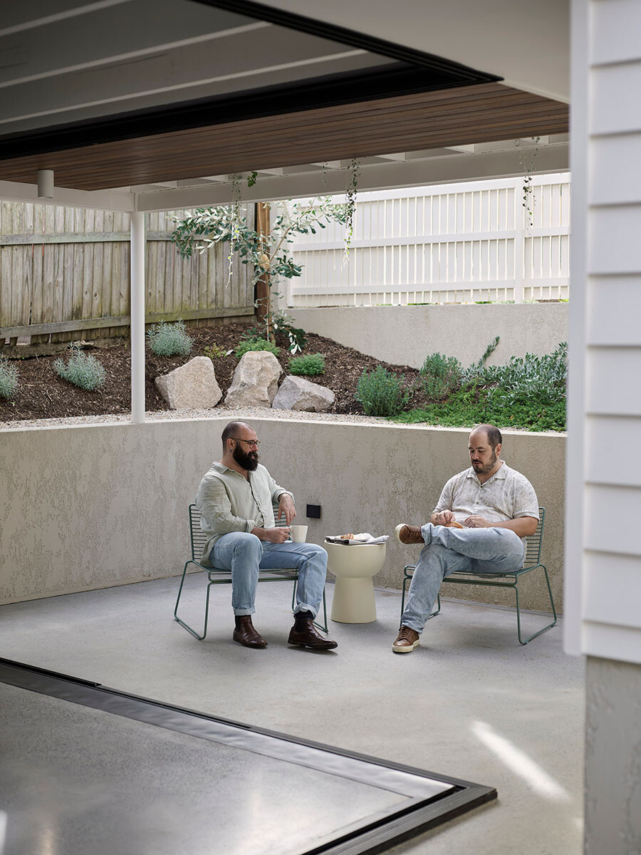
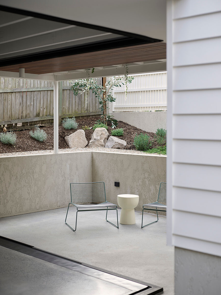
Another way that space has been carefully thought out is in the carport. It offers privacy and uses architecture to frame the space with slices of garden in between. It also doubles as a space that can be used to entertain, where people can spill from the indoors-out.
Maytree Studios worked with Ecru Design Studio on the landscape. Rather than building retaining walls, which would have added significantly to the costs, the existing vegetation on the site was preserved, forming a lush backdrop canvas.
Same Same But Different House is a perfect example of how a dream home can be created with a creative approach. Like so many projects to come to fruition in the past few years, this one faced material cost increases and supply chain disruptions. But working alongside the builders Allen Brothers Construction, the process was carefully managed.
“In this market, it’s important how we spend people’s money. As a studio, we like to challenge what people are asking for and why they need it. The outcome doesn’t have to be bland, it’s about being smart to get the best result,” shares Caldwell.
Allowing the client’s eclectic charm to shine, while being strategic in their design decisions has resulted in Same Same But Different House being truly one-of-a-kind. This home is a true reflection of the ever-evolving spirit of modern living. Maytree Studios has not just designed a house; they’ve crafted a story that will be cherished for years.
Project details
Location – Brisbane, Australia
Traditional Custodians – Yuggera & Turrbal people
Architecture and interiors – Maytree Studios
Builder – Allen Brothers Construction
Landscape architect – Ecru Design Studio
Photography – Toby Scott
Styling – Brady Sherwell
