Fremantle is one of those places that has a rugged charm about it, a vibe. It has a distinct grit and grunge having recently emerged from an industrial past as the port town to Perth. Part of its appeal – especially to the owners of this residence – are the old factories and warehouses. In a surge of development throughout the 90s, many of these buildings were converted into apartments including the heritage-listed, 1930s Weeties Warehouse.
Having already been divided into 13 quite small, dark apartments, it wasn’t exactly screaming ‘family home’. So the owner purchased the apartments on either side, to consolidate three into a larger home; something that would “more closely resemble the spatial qualities of the original warehouse building itself ”, according to Dimmity Walker, principal at spaceagency.
As far as client briefs go, this was certainly one that Walker was excited by. “It isn’t a normal house, or a normal brief. It’s got such a playful energy, which is an unusual aspect for a family house,” shares Walker.
The first port of call was opening up the interiors and bringing in as much natural light as possible, all while respecting the distinct heritage of the industrial shell. The design response is nothing short of masterful, where a considered and incisive series of moves has created a home that is truly unlike anything else.
It started out as a process of elimination, stripping out and removing as much of the 90s renovation as possible and bringing it “basically back to the point where we could see the original”, says Walker. To reinstate the warehouse vernacular, the windows were reverted to their original size and proportions.
An unexpected element within the heart of the cavernous space is a pool and a glasshouse-style garden. The “breathing lungs” of the warehouse, this interior oasis elevates the home by providing the kind of necessities expected in a typical family residence. Which is exactly how it made its way into the planning. Walker shares: “One of the things they didn’t have in a warehouse was outdoor space for the kids.”
Utilising both the horizontal and vertical planes that an industrial building can afford, the lower level is where life is acted out. “The ground floor is organised around a linear core that consolidates all of the services. There’s a kitchen, pantry, laundry, powder room, and all of the vertical plumbing and electrical are centralised into this core,” explains Walker.
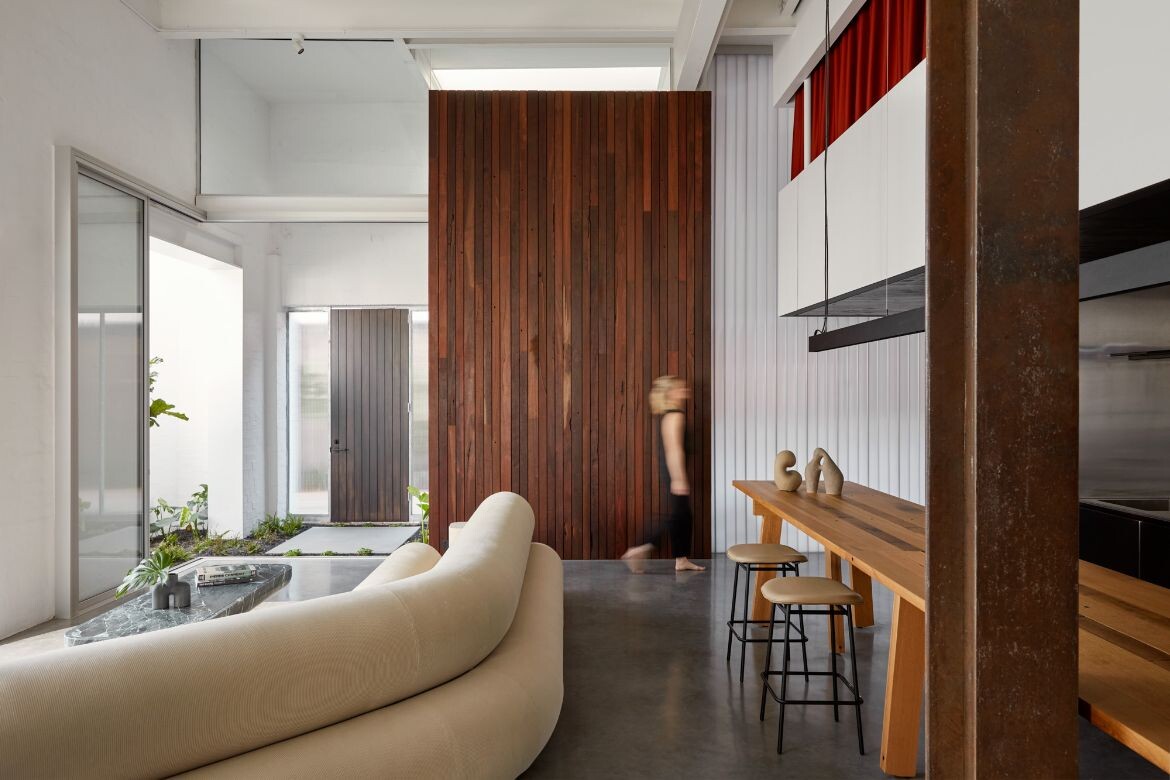
It’s an arrangement that allows for open spaces around the perimeter, where as much light can penetrate from the windows. Set as an accompaniment to this central core element is a showstopping eight-metre-long, bespoke dining table that runs adjacent. Not surprisingly, the owners adore entertaining, and this stunning table can host 22 guests. Part island bench, part dining table, it’s partnered with a kitchen that is equally equipped for hosting. “The client’s like having dinner parties at one long table. It’s quite a distinctive feature and was made specially to suit these clients,” says Walker. The opened and interconnected living and dining zones splay out to the garden and pool area, which are positioned in what was previously one of the apartments.
Allowing the building to still be read as a warehouse the architects have hung a mezzanine level set back from the windows and aligned vertically to the linear core. “The original ground floor had a five-metre ceiling height in what would have been the factory space. We’ve opened that up so that in most of the ground floor you can experience the full height of the building, but the mezzanine is positioned to cap off the kitchen and service core,” says Walker.
Fine tuning the exact positioning of the core and mezzanine was dictated by the vertical element of the stair. This is where the spatial organisation was critical. With limited options for where to locate the stair due to structural elements holding up the floor, the team had to map the best spot. “The first floor planning was key in how we could get all the vertical services down in the most seamless way possible. Then the stair is a big, dramatic, sculptural focal point,” says Walker.
There is a logic applied to the planning that works with the constraints, such as where to arrive and descend. “The spiral gave us the best outcome in terms of functional requirements, but then it also influences other things, like the circular swimming pool and other circular elements that were spun off the spiral stair,” shares Walker.
The circle motif adds an organic flow, which sits in opposition to the rationalist approach to the mezzanine. Yet it works because the upper level recedes into the vastness of the whole and is intended to be read in this manner, which Walker confirms: “The main floor is very open and flexible, but upstairs is quite orderly.”
The insertion is conceived as a separate intervention. “We created a new, external skin inside the envelope which allowed us to get lots of natural light and air deep into the plan,” says Walker. It also meant that, programmatically, four bedrooms and a rumpus could be achieved without having to stick to the location of existing windows to get light and ventilation through.
Balancing proportion, volume and light, this family warehouse home has a deceptively pure elegance. As Walker sums up so perfectly: “It’s one of those things that looks really simple, and obvious and easy. But it’s much more complex to achieve than you would imagine.”
Project details
Location – Fremantle, WA, Australia
Traditional custodians – Whadjuk People
Architecture and interiors – spaceagency
Project team – Dimmity Walker (lead), Michael Patroni, Tobias Busch, Julia Kaptein, Samantha Mofflin
Builder – Assemble Building Company
Structural engineer – Hera Engineering
Landscape designer – Dangar Barin Smith
Photography – Jack Lovel
Dissections
FINISHES
Dawn Curtain from Kvadrat. Vixel mosaic wall tiles from Artedomus. Terrazzo tile in Fatima’s Reflection from Fibonacci Stone. Mosaic tiles in Velour and Vetricolour from Bisazza. Carpet by Tretford from Gibbon Group. Wall cladding from Easy Craft. Polycarbonate by Danpal.
FURNITURE
Rose sofa, Idea coffee table and Rick chair (cast resin) by Joris Poggioli. Custom cantilevered desk and guest bedhead by Remington Matters. Custom-made Island bench, main bedhead and base by joiner. Otto sofa, 194 table, Tantra rug and Dudet chair by Cassina from Mobilia. Molo outdoor sofa and coffee table, Half-dome overhang lamp by Kettal from Mobilia.
LIGHTING
Linear pendant light in Black outer and gold inner profile from Modular Lighting. ‘Howl’ Melted Brass floor light, wall light by Michael Anastassiades from Mobilia. Muse wall light in black/brass by Tooy from Radiant Lighting. External wall light by Piero Lissoni by Flos. Cluster uplight (in-ground) in Dark bronze by Unios from Mondoluce.
FIXED & FITTED
Haiku L ceiling fan in white by Big Ass Fans. Single bowl sinks by Abey. Sonar washbasins and baths by Laufen from Reece. Kitchen spout and mixer by VOLA. Yokato tapware and accessories by Brodware. Zip Hydro TapArc. Freestanding Duel Fuel Oven/Stove with Infrared Chargrill and Teppanyaki by Wolf, fridge by Sub-Zero, dishwasher by Siemens from Winning Appliances.

