“The client brief was very straightforward,” says Hana Hakim, co-director of Melbourne-based design firm Studio You Me, “to create a place that no-one had seen before.”
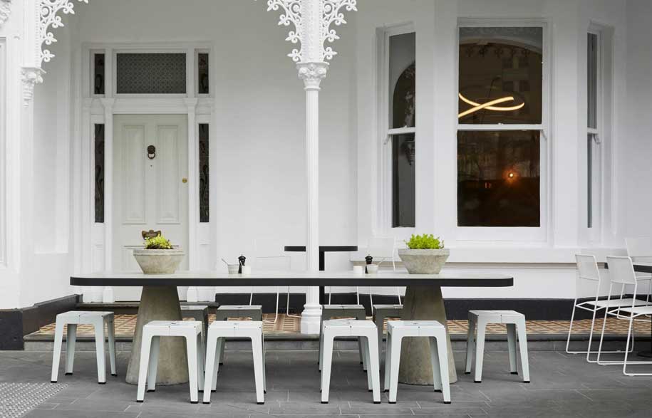

Hakim’s client, Nathan Toleman, had spotted the opportunity for a unique eatery and coffee spot in the underbelly of a newly completed apartment tower – a “precious jewel” located between commercial and residential buildings on Albert Road in South Melbourne.
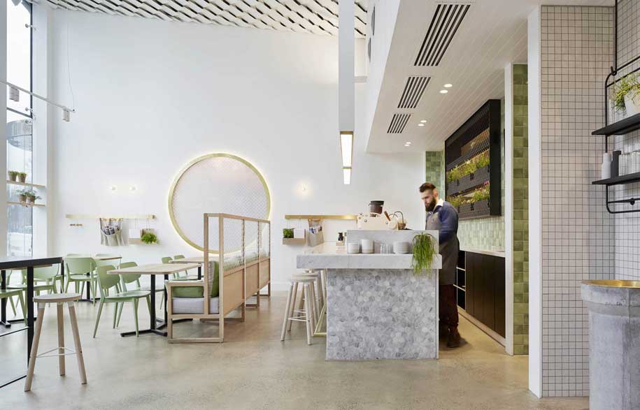
“The Kettle Black is not a standard café. It sits somewhere between a café and a restaurant, almost creating its own new genre of venue,” continues Hakim who designed the cafe with her Studio You Me co-founder Kestie Lane. “It consists of two distinct eating areas; the light filled voluminous atrium and the heritage terrace house, the more intimate of the café areas.” The two areas are seamlessly linked by the theatrical elegance of the entry foyer, which spills out to the coffee cart and the outdoor seating, uniting the two spaces.
However, the project wasn’t without its challenges. “We were faced with the challenge of how to transform the somewhat brutal commercial tenancy, with its imposing glass facade, into a delicate and friendly interior.”
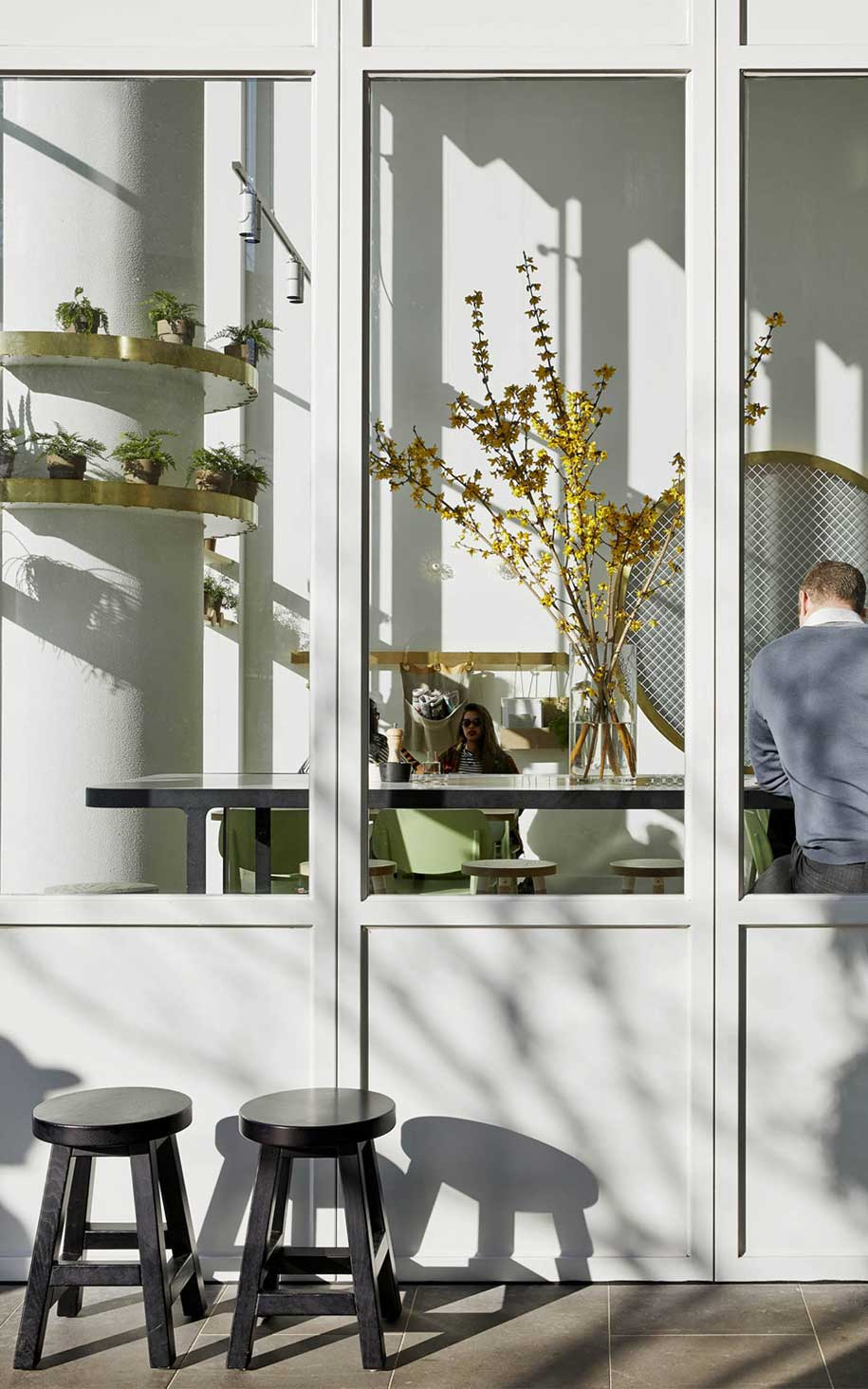
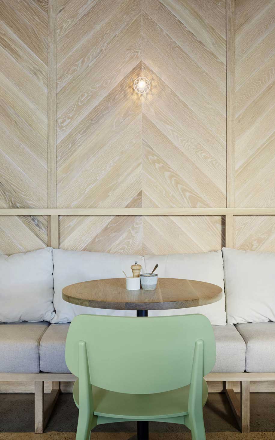
In response, the designers collaborated with many artisans, local craftsmen and designers to create a number of bespoke elements and quality details that have transformed the tenancy into a subtle, intimate and beautifully composed space.
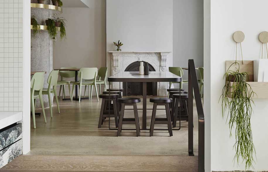
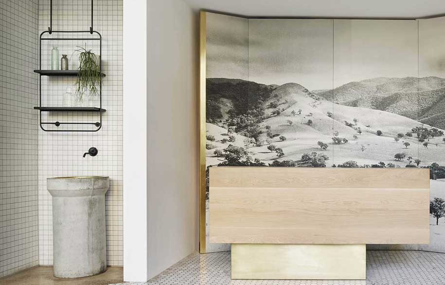
“We also selected and specify sustainable options for finishes and fixtures where possible,” Hakim continues. “We used minimal lighting, re-used existing building components, for example the concrete piping at the water station, and integrated Australian-designed and manufactured furniture.”
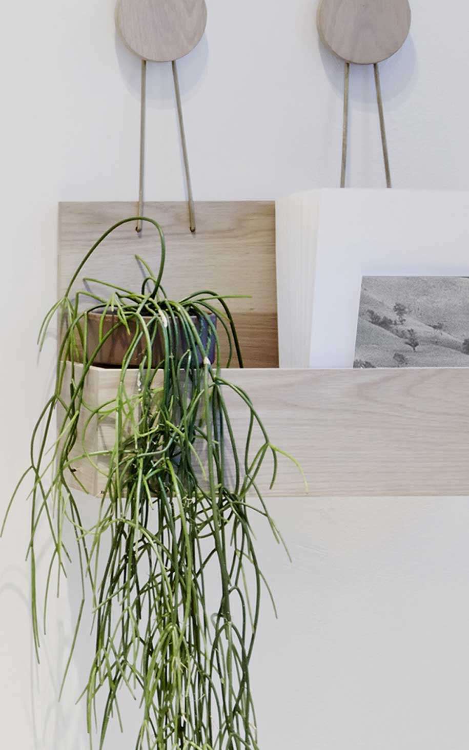
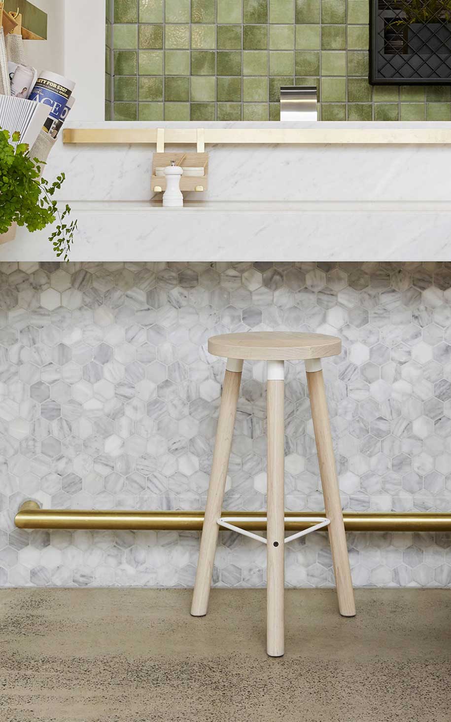
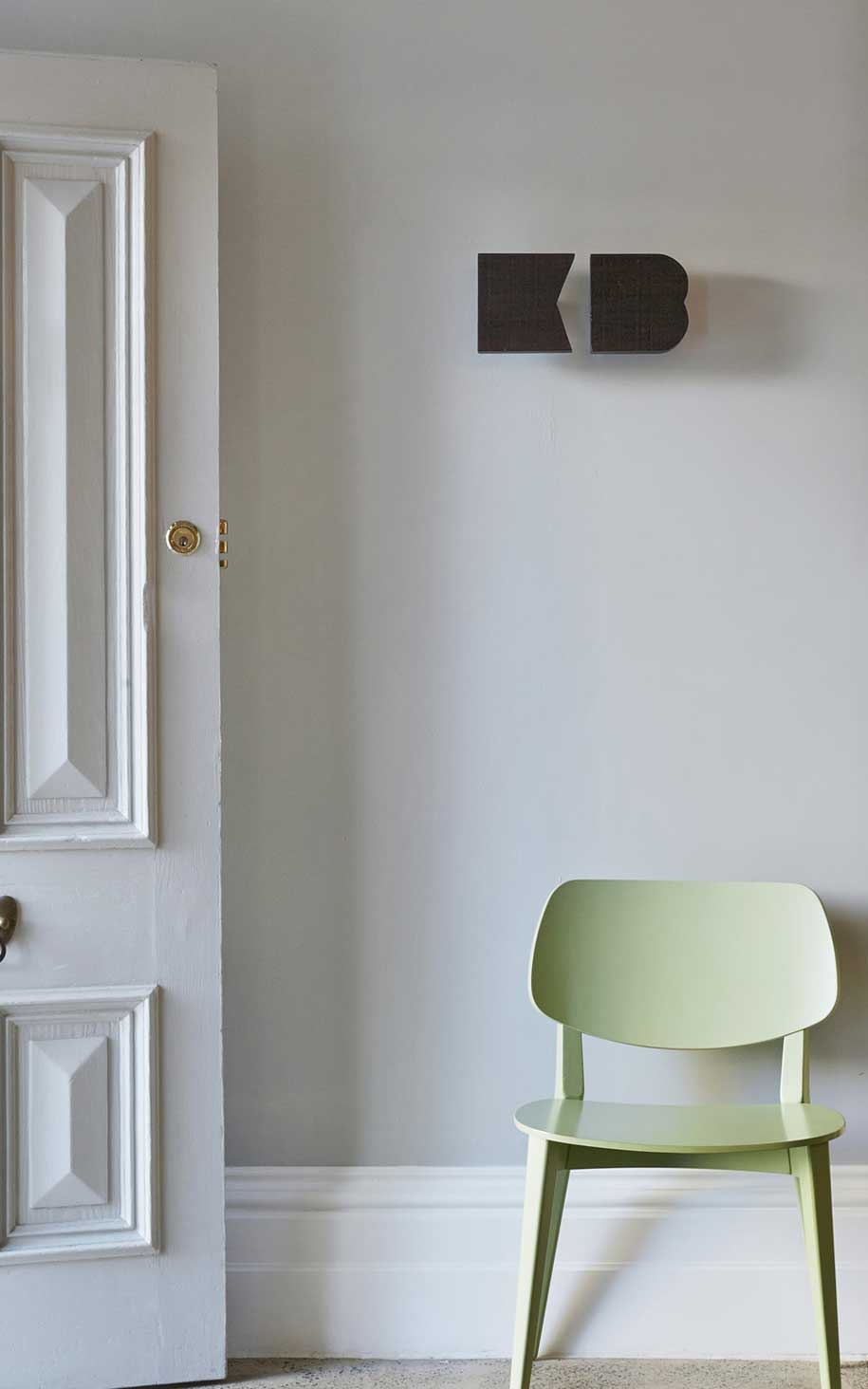
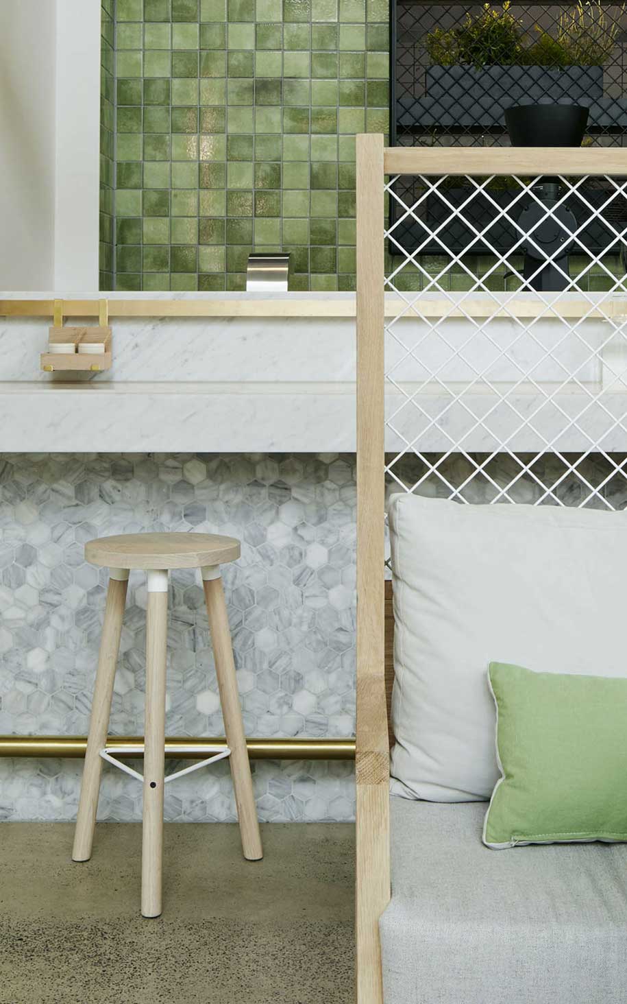
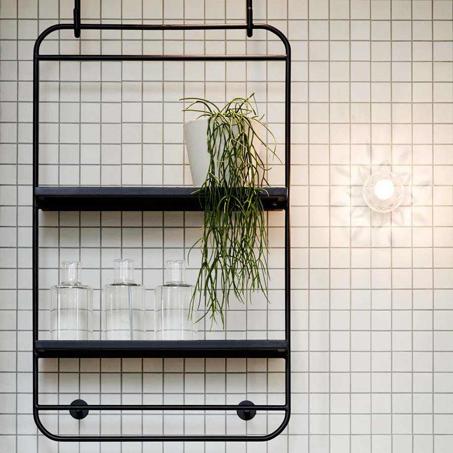
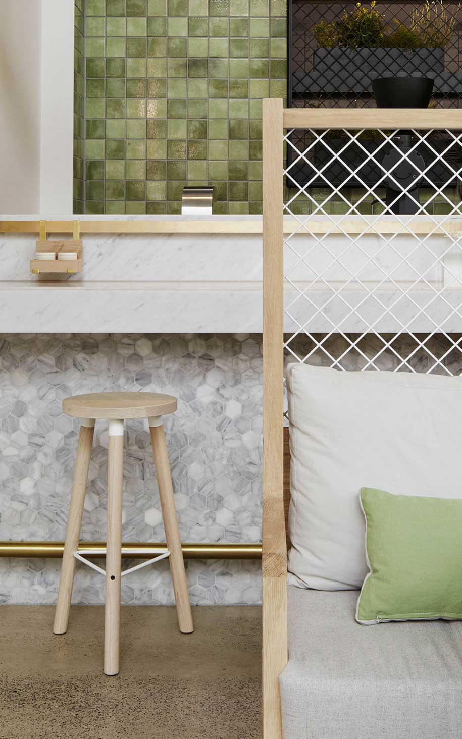
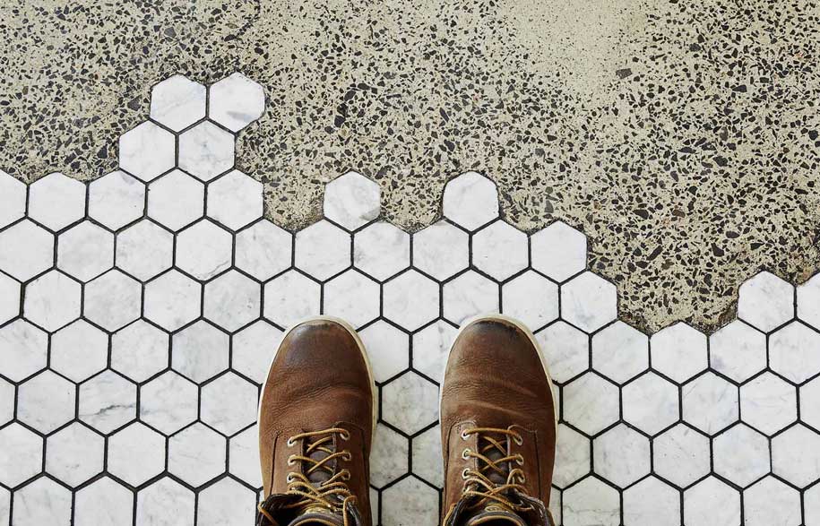
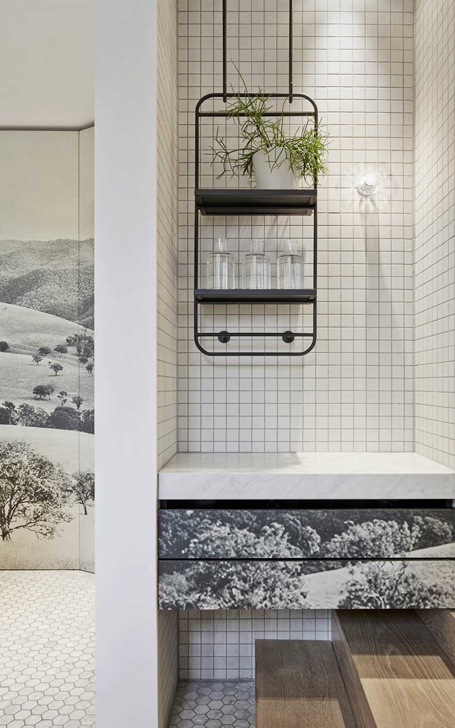
Overall, Studio You Me’s interior palette is carefully curated. Warm finishes of soft oak timbers and polished concrete are offset by the playful overlay of green furniture and tiled walls. A harder-edged aesthetic is defined by black crafted steel hanging waiters stations and mesh screens, whilst the hexagonal marble tiles and brass detailing bring a refined elegance and luxurious feel to the space.

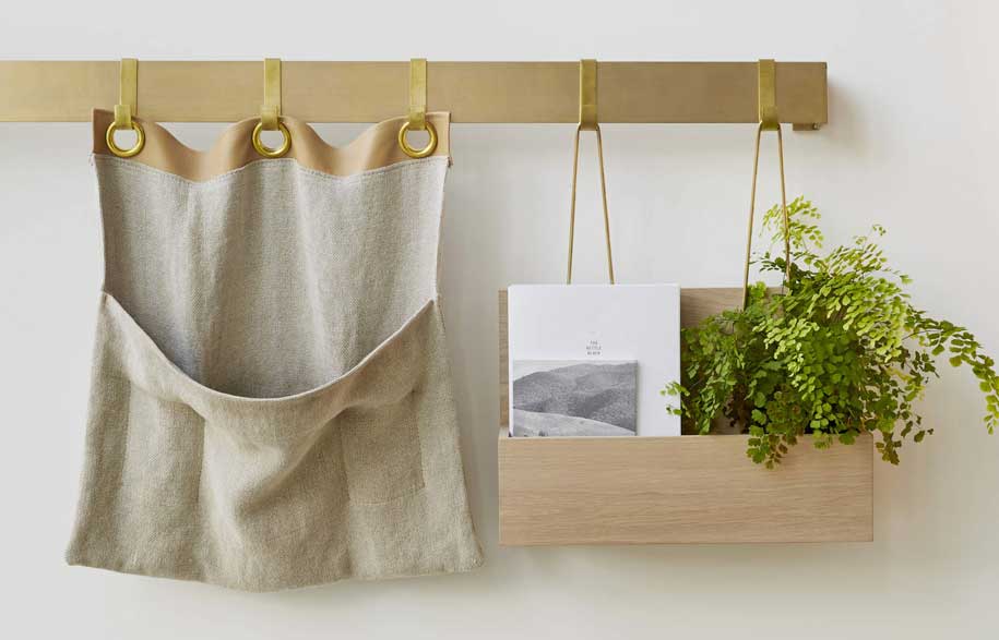
However, what really resonates and comes to the fore in this scheme are the meticulously constructed vignettes within the interior. This is where Studio You Me’s innovative and curated approach to design can be truly admired and appreciated.
Studio You Me
studioyoume.com.au
