It is not uncommon for houses within any 3-storey zone in Singapore to have owners rebuilding their house up to five levels. By adding an allowable basement and attic floor to the mix, the underlying motivation, eagerly supported by the financial industry (should additional funds be needed) is to maximise a site’s potential ‘yield’ and save on a construction’s mobilisation cost. This is especially the case when landed residential designs are not subject to a cap in maximum floor area buildable, but rather on building setbacks and envelope control. In this milieu, it takes considerable restraint and self-knowledge for any landowner to build less.

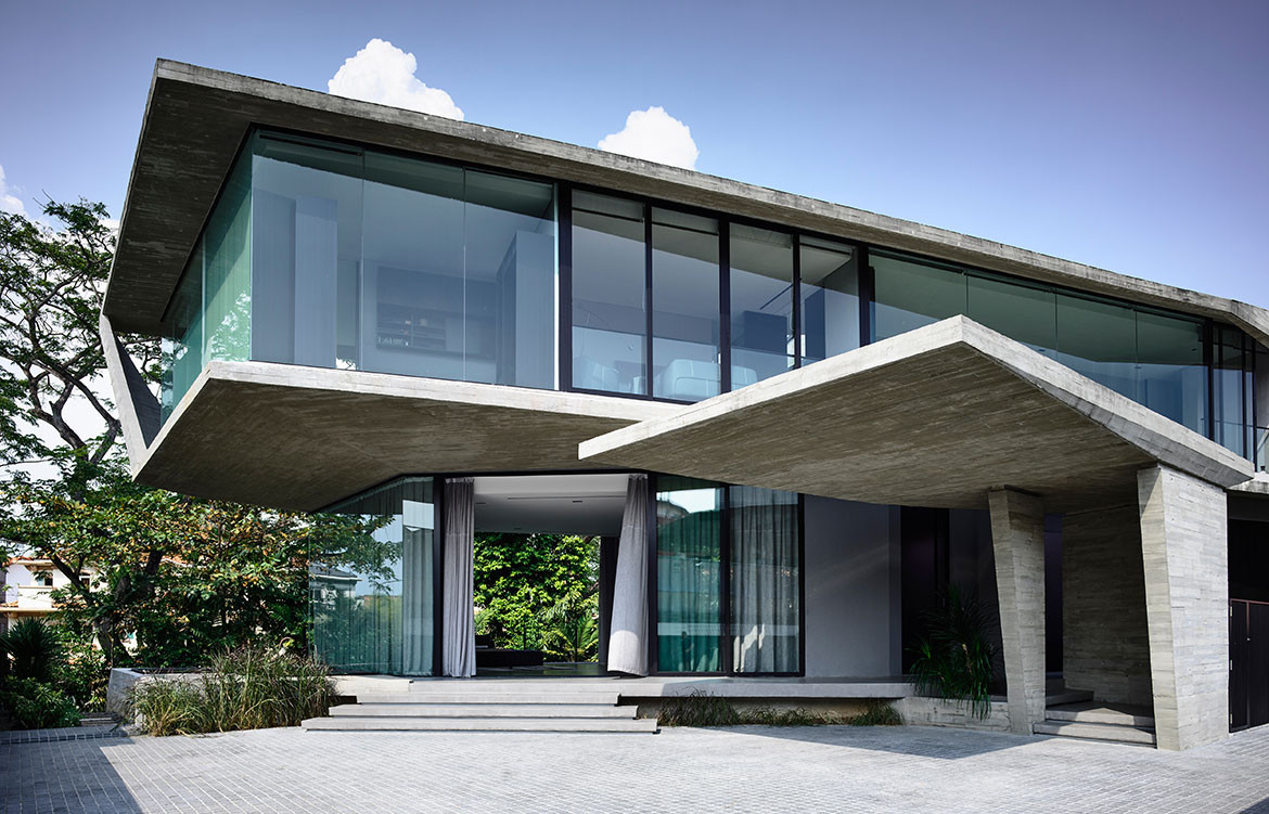
Happily, for Christina Thean, director at Park + Associates, one such owner approached her with just such a brief for their family of five. “Mr Teo’s brief to us was that they didn’t want a giant boxy house like those in the neighbourhood,” she recalls. Presenting them with an initial ground-hugging design, the owners were glad to see their ideas on scale aligned. “How did you guess we had also wanted a 2-storey house?” they asked. Composed in a horizontal sweep, the run of the residence’s upper body is perched over the entry hall with a dramatic cantilever, as if the house is poised for takeoff like the planes at Changi Airport, which is less than 1.5 kilometres from its location. A semi-basement level is tucked away from the approaching view by taking advantage of a floor-high drop in the terrain, but it is otherwise entirely open towards the greenery at the back. Elsewhere, the language is faceted and angular, making the massing more terrestrial than aerial, as if hewed tectonic plates have been playfully folded over fragile planes of ethereal glazing. The composition is simple and complete, both externally and internally, in that nothing can be added or subtracted without jarring the whole. “We wanted the architecture to be its structure, without frills,” Christina explains.

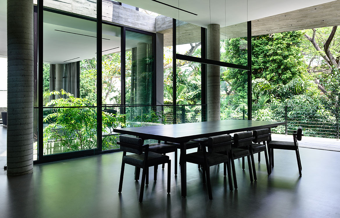
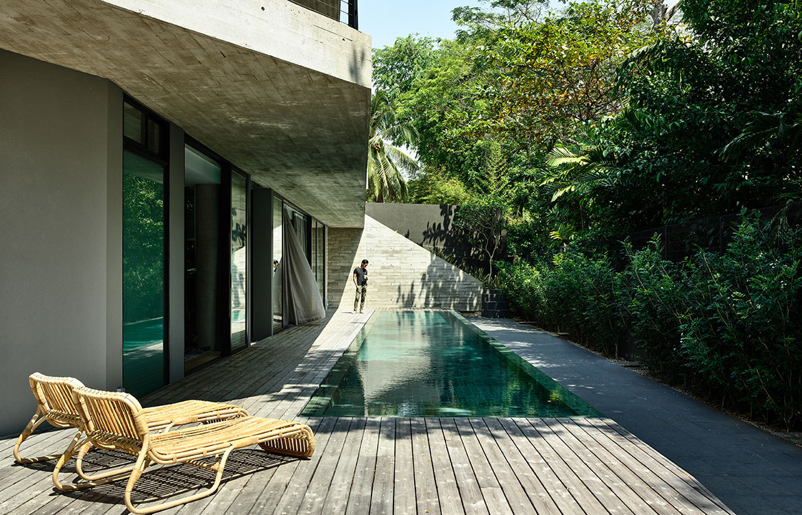
Architect and clients were also in harmony over a more austere selection of materials. The natural off-form concrete finish with timber imprints showcases the integrity of its construction – no reliance on plastering to cover up any shoddy workmanship. “We like grey and having this off-set against the Kebony timber that would also turn grey over time turned out to be a good outcome,” adds Wendy Teo, daughter of the owner. “They were also our only clients who kept asking for darker interiors,” laughs Christina, and this tonality is most apparent in the spacious family nook of the semi-basement. Here, the walls are lined with black cabinetry works, housing a good stock of books and liquor. Their neat placement in a monochromatic setting is almost an exemplary showcase for the current decluttering craze, even in this most social of spaces within the house. For it is here that entertainment can spill out to the outdoors, onto the deck of a 23-metre-long swimming pool, flanked by a luxuriant row of mature trees just beyond the porous BRC fence.
Not surprisingly, visual porosity towards the trees behind was a major driving force governing the design. Almost without exception, all the major rooms and even beds are orientated towards the trees. Views are framed by frameless glass, or else framed glass windows are slid open for direct biophilic connection. A vertical courtyard links all three floors to a dry garden at the basement, and it is positioned to be the first sight that greets the visitor upon entering the front door. There is everywhere a Zen touch that imbues the design, one that downplays the architecture so that nature can be its focus.

