Skip To Main Content
Issue 61 - Vintage Modern Issue

Issue 61

Vintage Modern Issue

The breadth and scope of Habitus has always been extraordinary. With how we live at heart of every issue, we have stepped it up with Guest Editor David Flack of Flack Studio shaking the ‘how’ and looking at new ways to make a house a home. With Vintage Modern as the issues theme, we look at the way iconic design has stayed with us, how daring pieces from the past can add the wow factor and how architecture and good design defy the pigeon hole of their era.

Order Issue

A Product of

Out of Tragedy Comes Opportunity
HomesHolly Cunneen

Out of Tragedy Comes Opportunity

Australia

When the devastating Black Saturday fires swept through Victorian bush land it was hard for anyone to imagine a positive outcome. However, nearly a decade on Steffen Welsch Architects have helped one young family find their silver lining, Holly Cunneen finds.


Look for the silver linings. It’s a lot easier said than done and yet often the harder these silver linings are to find the more important it is to do so.

Back in 2009 during the infamous Black Saturday fires that wreaked havoc through Victorian bush land, Jonathan and Jane ­– a Melbourne-based professional couple and two heads of a young family – lost their Marysville home away from home in the Yarra Ranges.

Without minimising or diminishing the loss they suffered ­– their old house completely burnt to the ground – from tragedy came an opportunity to create something spectacular.
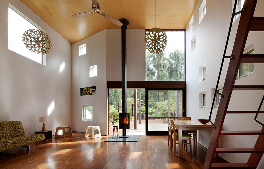
Steffan Welch House Living Room
With an existing relationship with Damien Thackray of Steffen Welsch Architects who had worked with the couple in the past, they once again enlisted the help of the studio to re-build their house from the ground up.

“Sunlight and exploring its different qualities was vital to the project, before we started designing we camped on the site and observed the path of the sun throughout the whole day,” says Steffen Welsch. “In winter the afternoon sun penetrates deep into the room and warms up the space,” he continues.

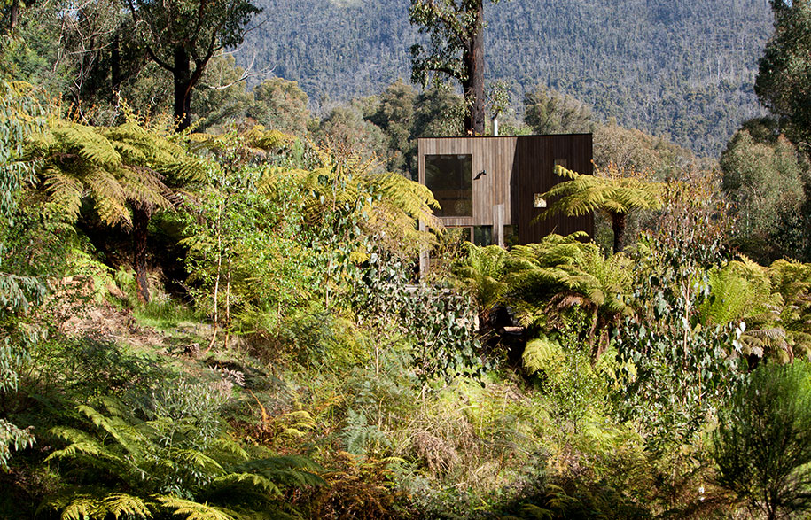
But there were also ideas and elements brought up in the initial planning stages that were later thought better of. For example the idea for a two-storey house, “nestled into the sloping site,” that would maximize views and space soon seemed rather elaborate and led the residents and architecture team to re-consider what they wanted to build, and how they wanted it to function.
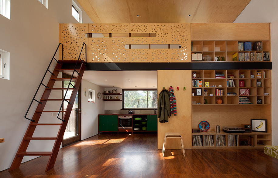
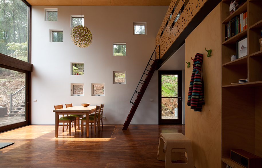
Steffan Welch House | Habitus Living

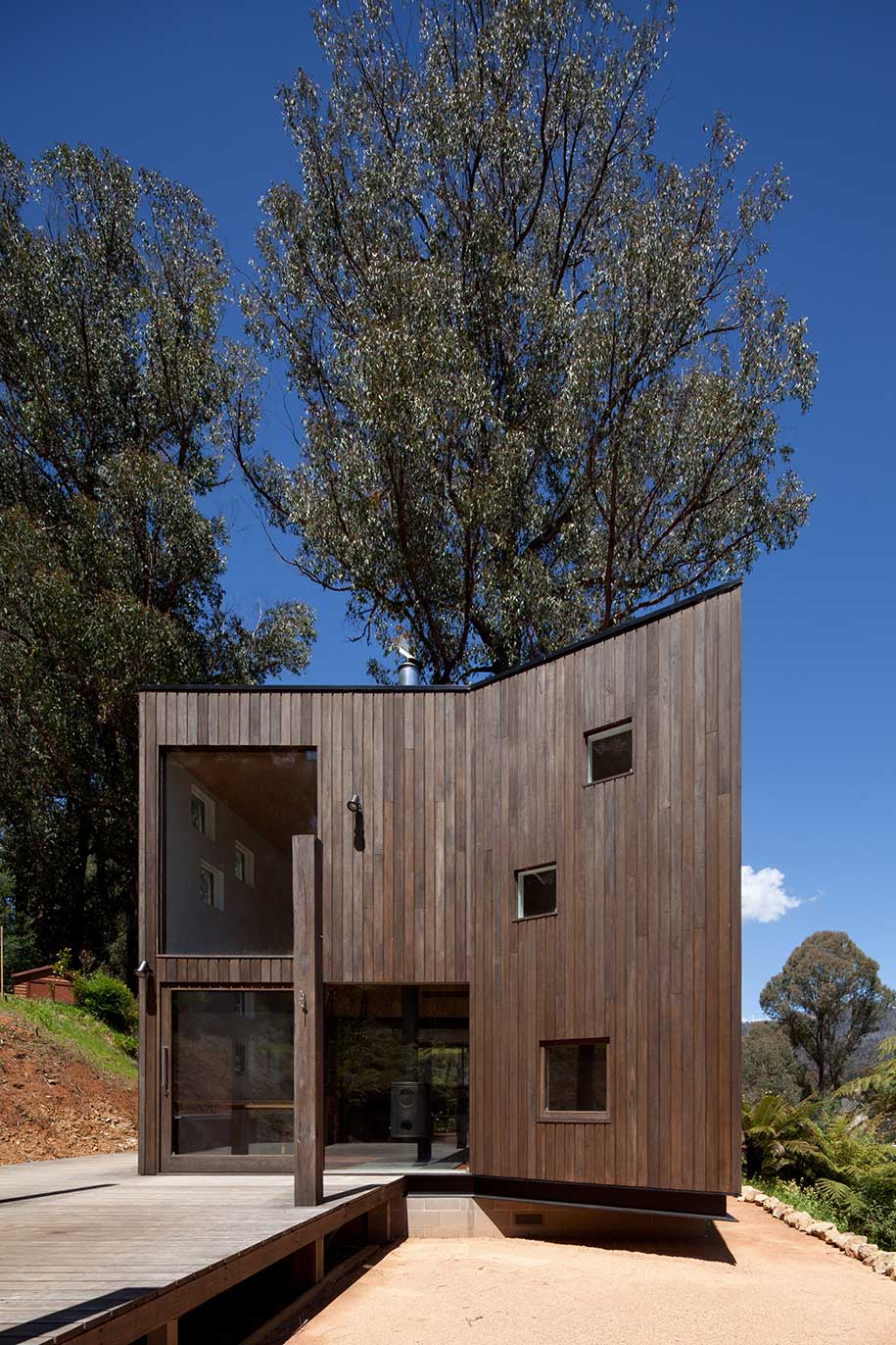
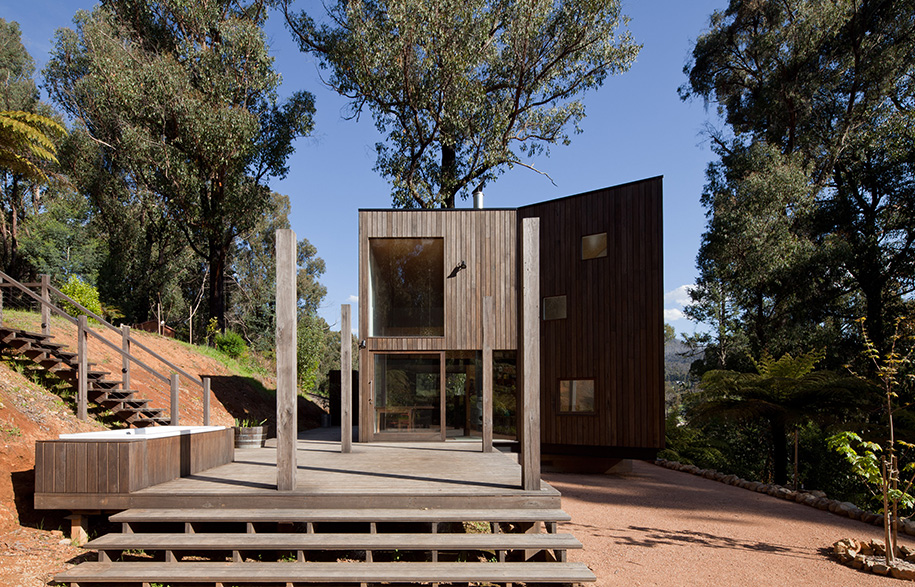
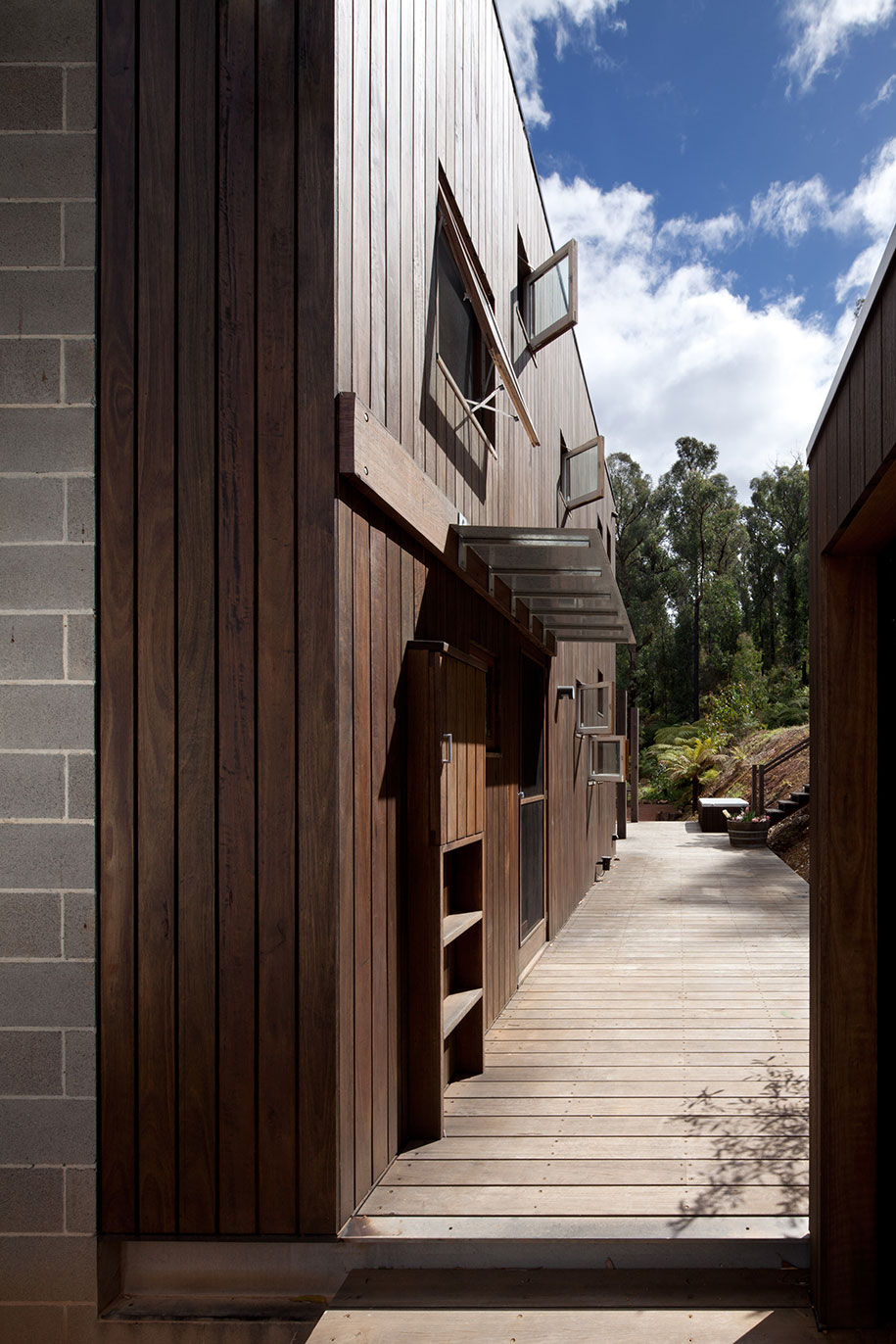
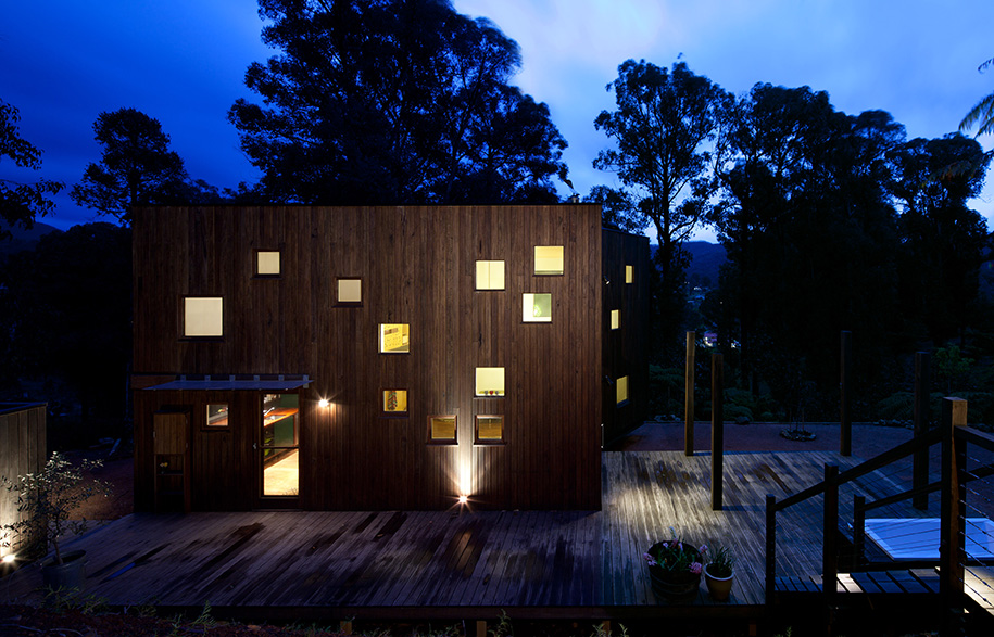
“We opted [instead] for a simple box with a collective dining/living area, a small kitchen, hidden bathroom and a mezzanine with a sleeping platform overlooking the living space. [The] laundry and additional storage were located externally.

“This simple timber box gave us the opportunity to place doors and windows to frame views, allow easy access to outside and play with sunlight as it hits the building during the day,” says Steffen.

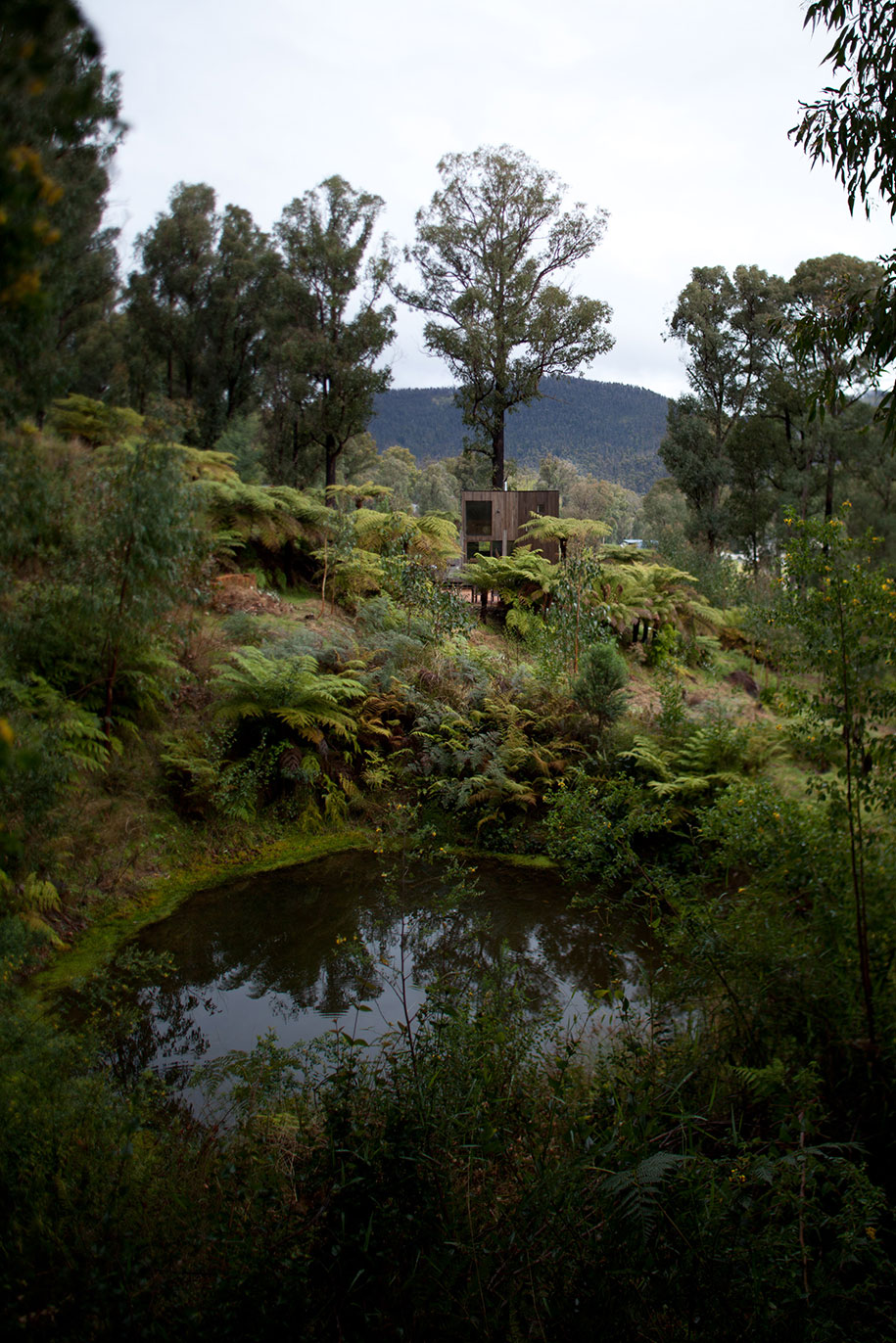
And to encourage time spent outdoors, the timber deck outside is actually bigger is space than the living area inside. That was one of the most important directions given within the brief, the new home was to embrace nature and respect its setting in the bush. Gracefully, it does so.

Steffen Welsch Architects
steffenwelsch.com.au

Photography by Brendan Finn
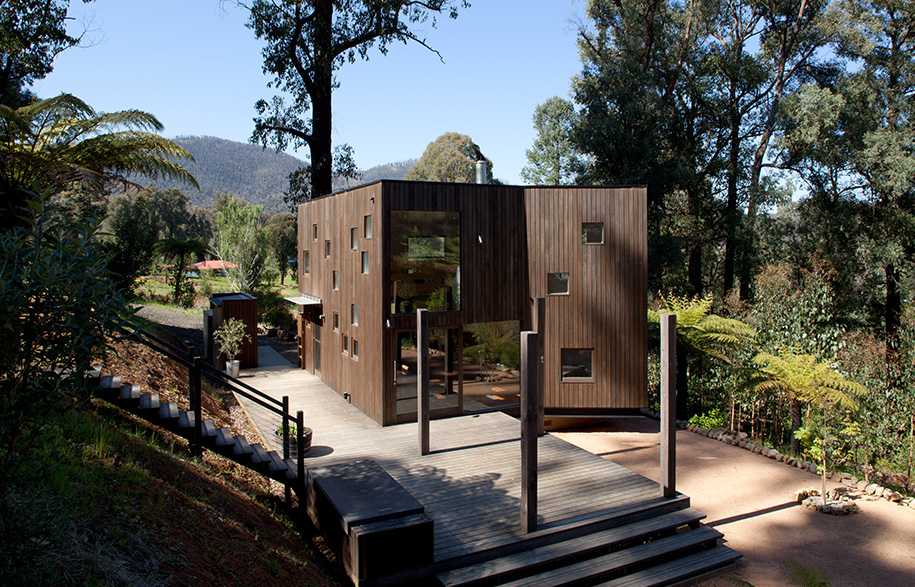
Steffan Welch House | Habitus Living

About the Author

Holly Cunneen

Tags

Home ArchitectureHouse ArchitectureResidential Architecture


Related Projects
Issue 61 - Vintage Modern Issue

Issue 61

Vintage Modern Issue

The breadth and scope of Habitus has always been extraordinary. With how we live at heart of every issue, we have stepped it up with Guest Editor David Flack of Flack Studio shaking the ‘how’ and looking at new ways to make a house a home. With Vintage Modern as the issues theme, we look at the way iconic design has stayed with us, how daring pieces from the past can add the wow factor and how architecture and good design defy the pigeon hole of their era.

Order Issue