Riffing on Californian modernists Craig Ellwood and Pierre Koenig, House Gezellig embodies a contemporary design language harnessed by modernist principles. Tasked with elevating the amenity of the charming brick home, Studio Prineas set out to answer the client’s desire for a home of conviviality.
“Having lived in the Netherlands for many years, the clients were enamoured by the concept of Gezellig and Gezelligheid – a Dutch word translating to a general and abstract sensation of individual wellbeing that one typically shares with others. This sentiment inspired a human-centric approach to the design, which seems to nurture and uplift the lives of the occupants,” says Eva-Marie Prineas, director of Studio Prineas.
As such, a rigorous approach to planning was applied that would maximise the home’s usability. This included the removal of incongruous additions, reworking and extending the floor plate to improve spatial clarity, and seizing opportunities to connect with the clients’ much-loved modernist garden.
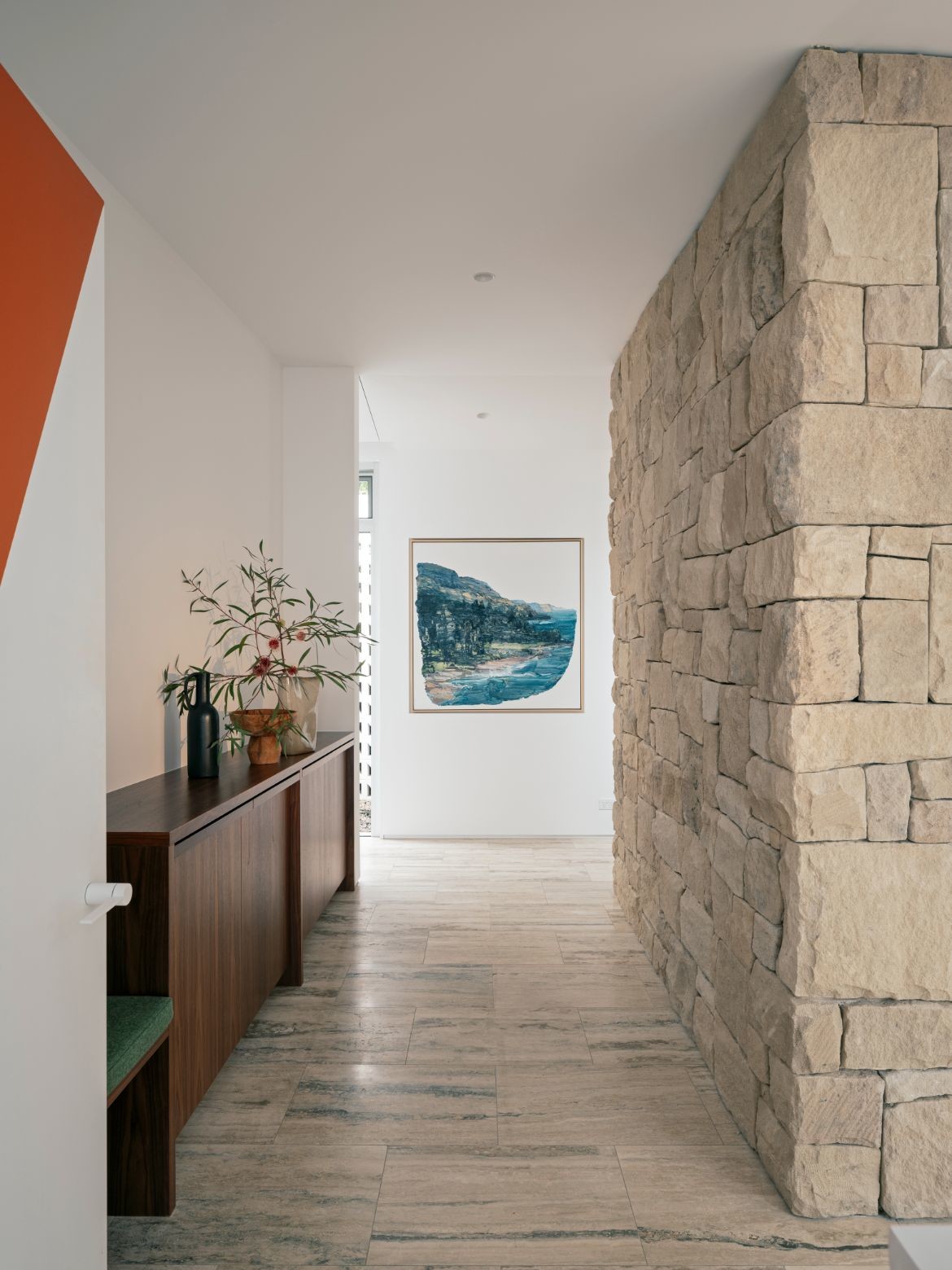
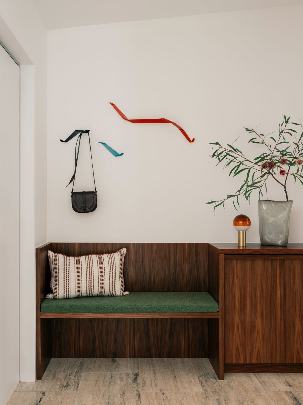
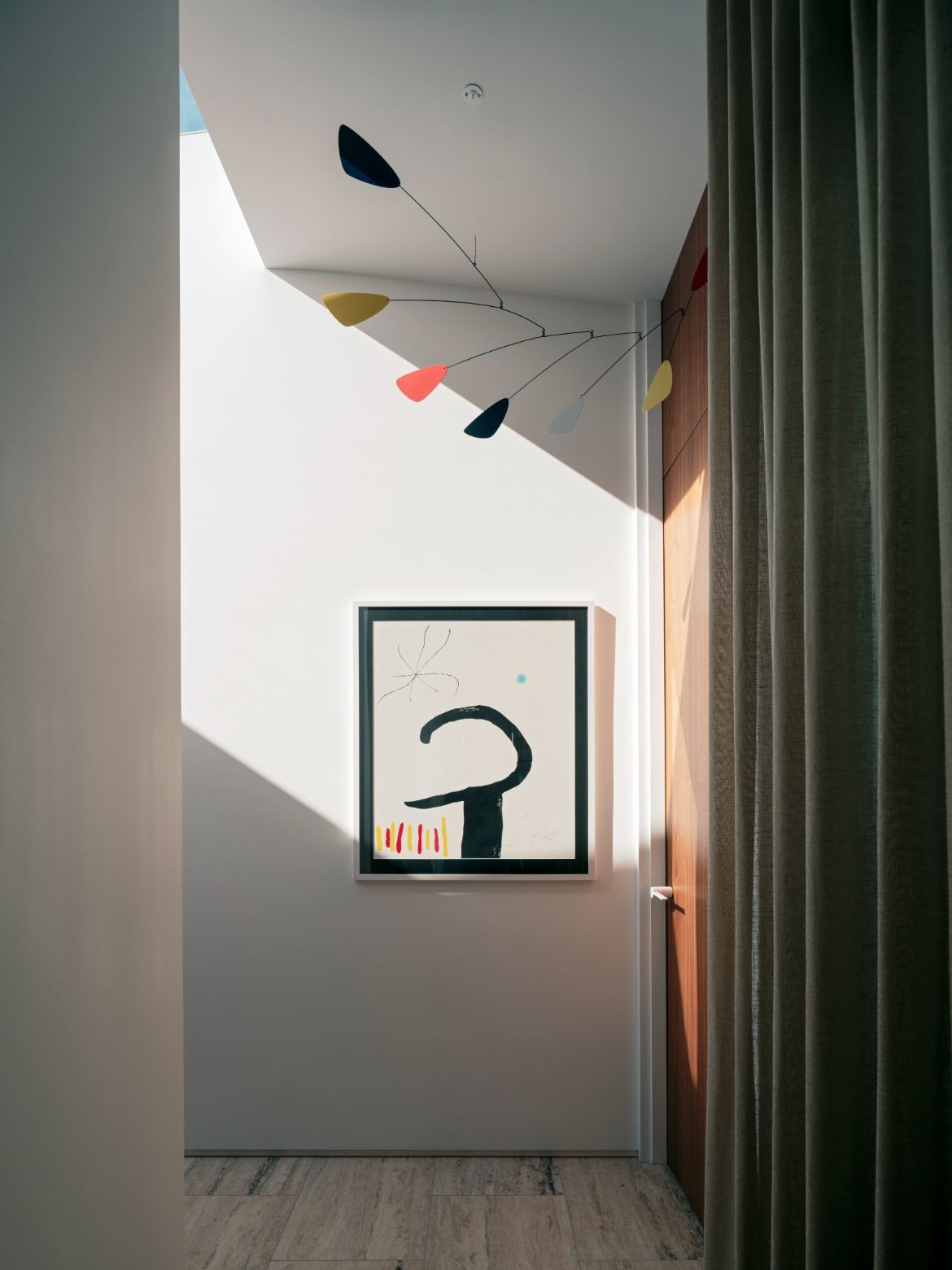
A key transformation to the home is the creation of a new entry via a paved pathway that opens directly into the warmth and vibrancy of a foyer. Here the owner’s eclectic art collection provides a welcoming statement, that continues throughout the home.
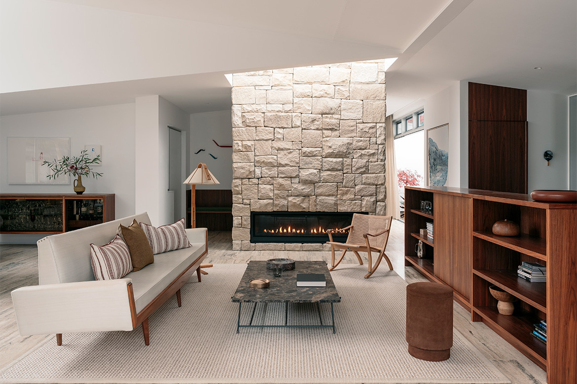
Central to the home is a floor-to-ceiling stone fireplace, this mid-century gesture effectively anchors the space while affording glimpses from the entry into the light-filled open plan living space. Following the home’s original asymmetric roofline, an over-scaled dormer window and skylights create a beautiful quality of light, while generous glazed openings extend the interior to the deck, rear studio and garden.
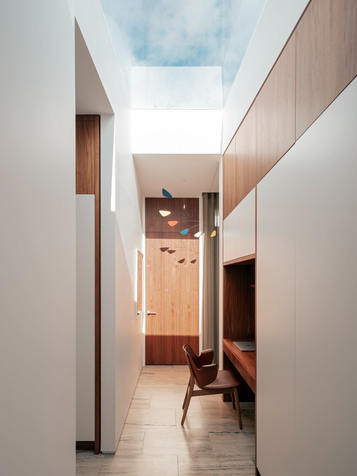
An integrated linear skylight and south-facing pocket courtyard draw light and landscape into a transitional passage at the centre of the home; a distinction between the communal and private areas. Playfully occupying this space is an Alexander Calder-style mobile that reiterates the mid-century mood beautifully.
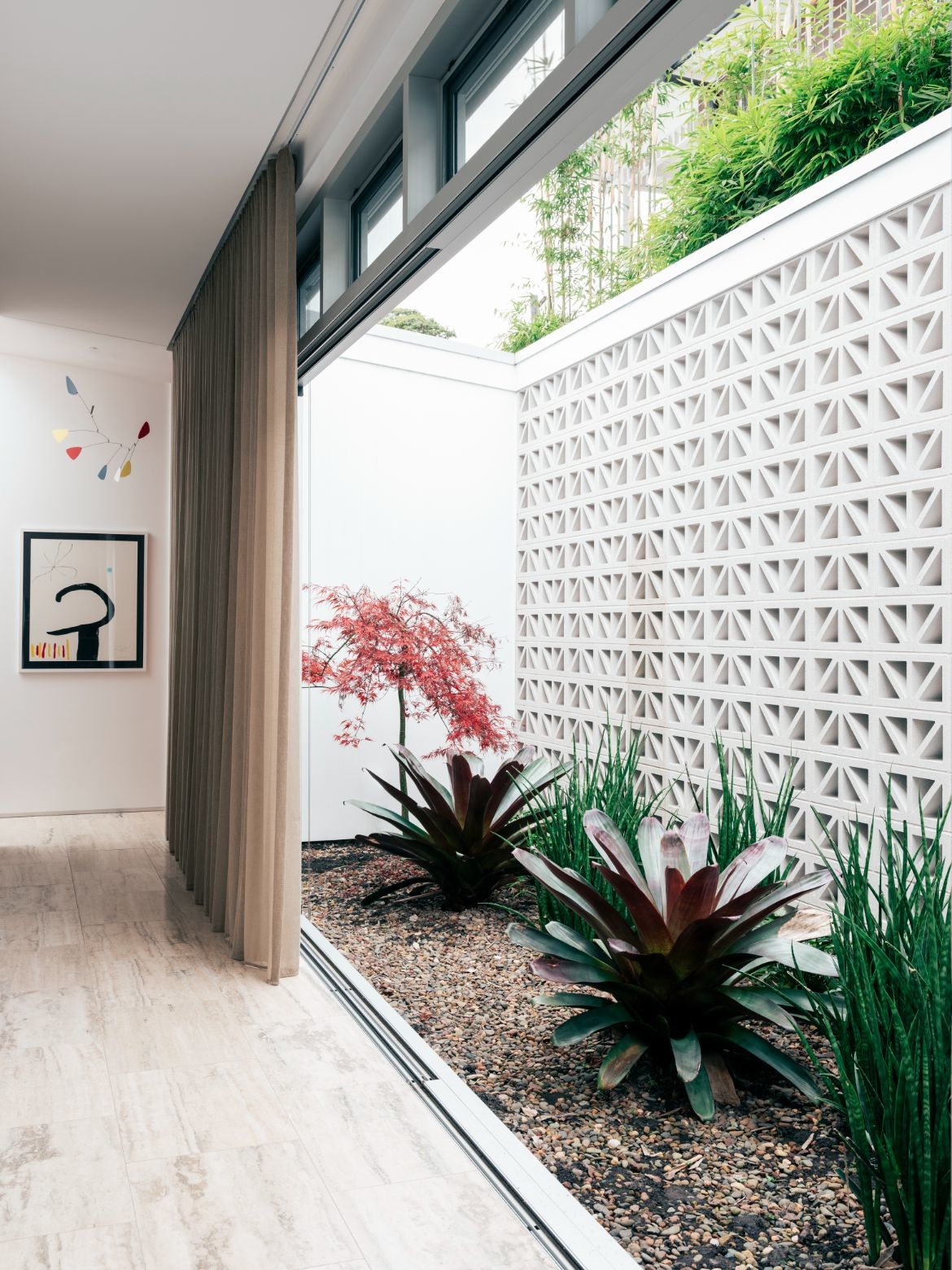
The home’s three bedrooms have been rethought to provide a generously scaled main bedroom suite and an intimate north-facing courtyard framed by breeze block walls. The walls are in fact delightful with modest height and exemplar ratio scale, while also providing a private sanctuary for the homeowners.
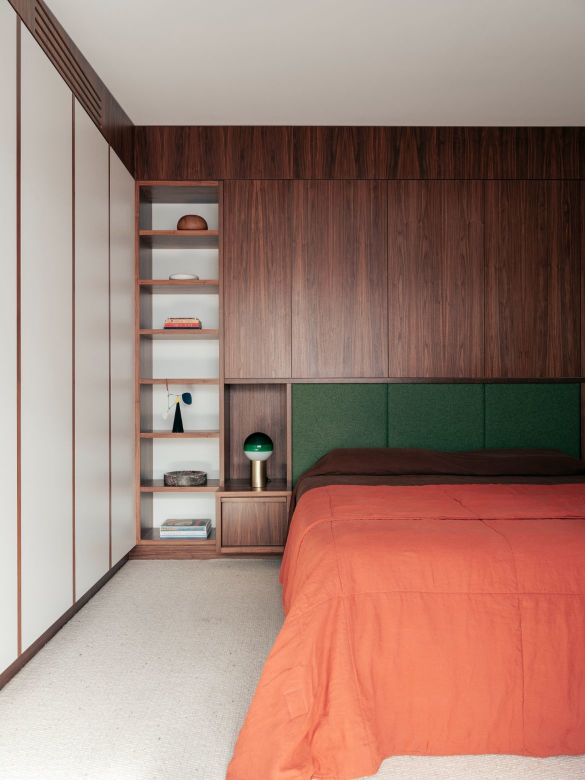
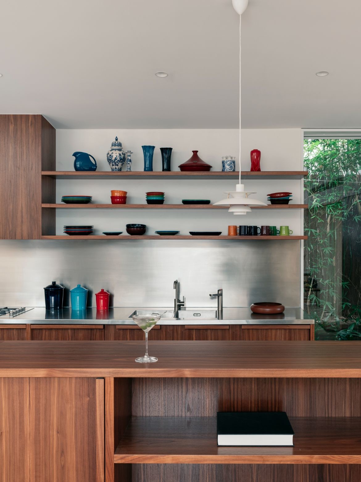
The character of the original mid-century home remains a strong feature of the new, with each element speaking to the original in some way. The wardrobes, for example, have been designed with an expressed timber frame and white infill to mimic wall panelling. Materials are similarly well considered with crown-cut walnut panelling used extensively.
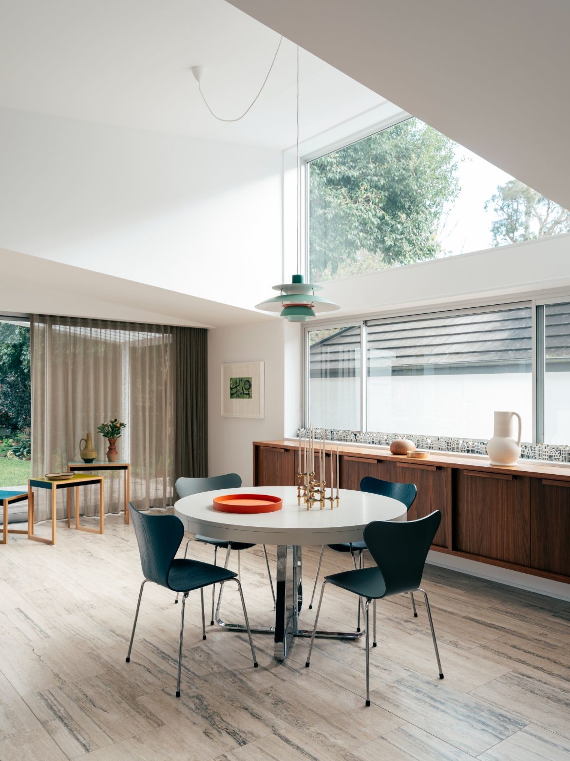
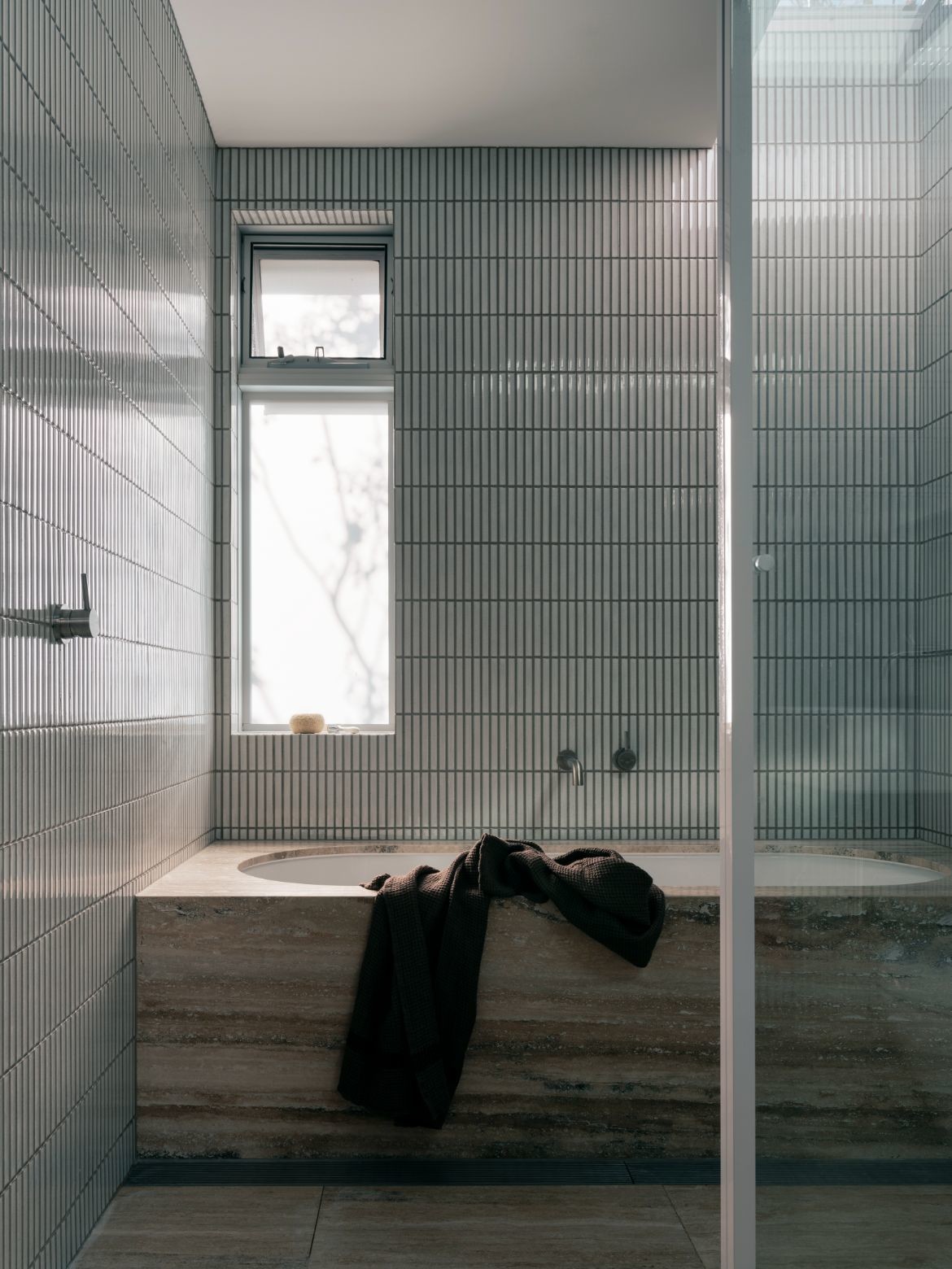
Special notice should also be made of the extraordinary floor of silver vein travertine. So abundant that it reads initially as timber, the stone floor is a smooth tonally shifting surface that greats the hewn stone of the fireplace and smooth white of walls with grace.
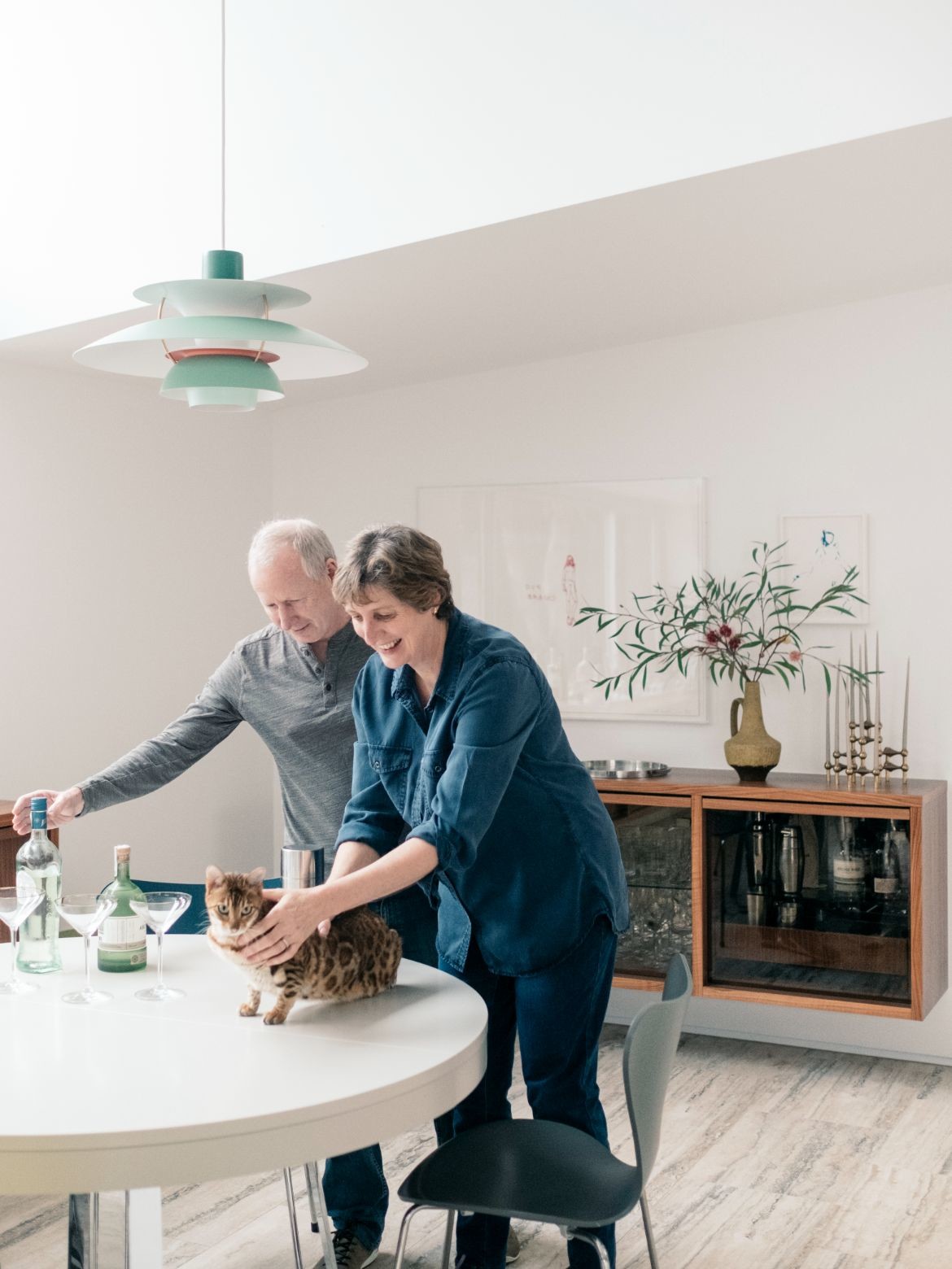
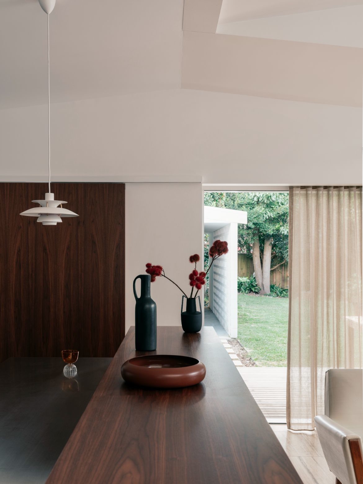
A large cream rug and sofa sit with ease on the stone flooring, while timber cabinetry and furniture details nod to the mid-century. As do the Iconic PH5 pendants by Louis Poulsen that float over the dining and kitchen spaces.
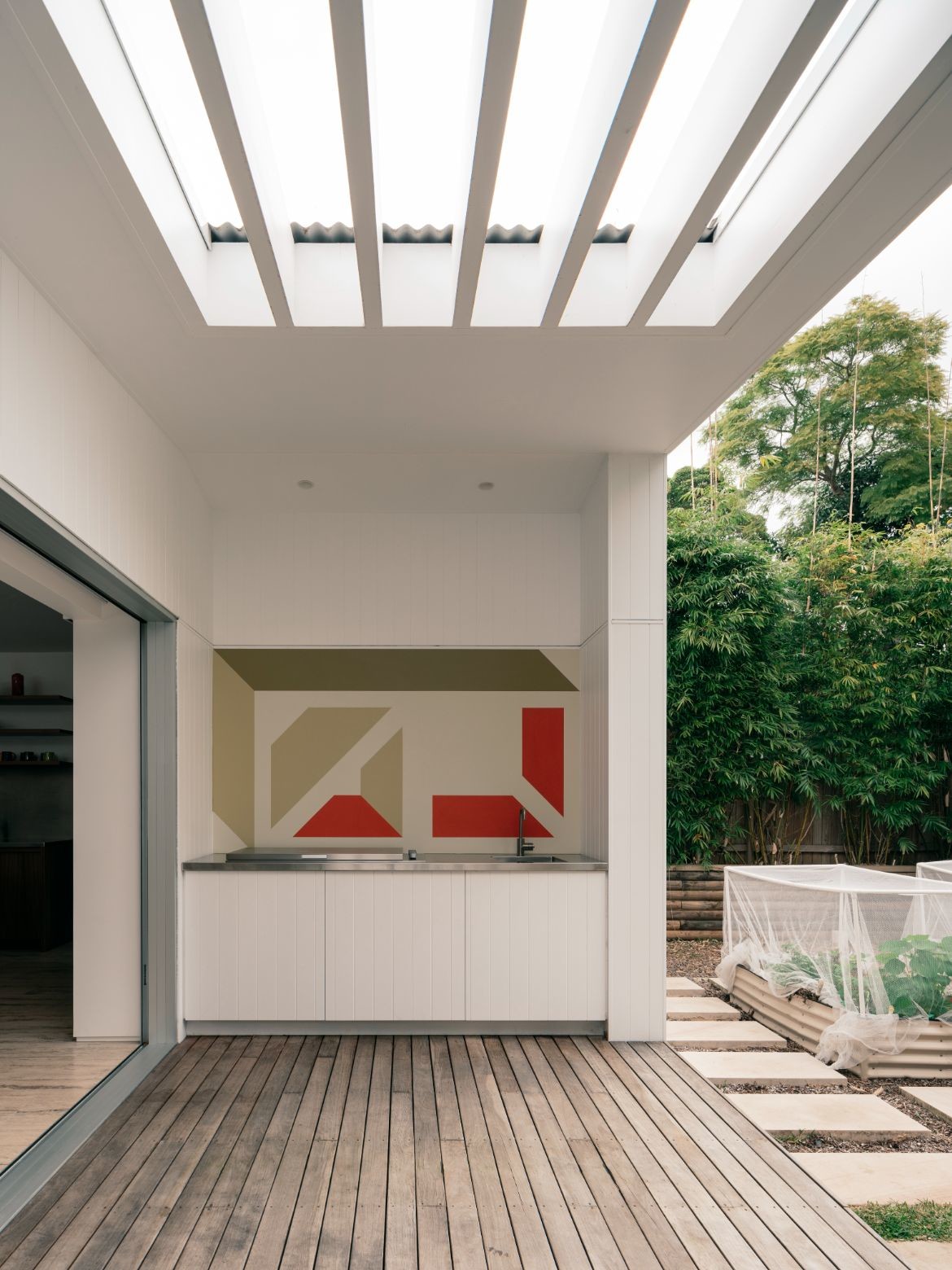
Completing the home, a wall adjacent to the garden has been painted with a mural completed by Studio Prineas and the clients at the project’s conclusion.
“The abstracted breeze-block form, hand-painted as a collective, speaks to the wonderful relationship we shared with the clients; it’s an encapsulation of the vitality and eclectic spirit of the project and our commitment to the design and delivery of truly personalised homes,” says Prineas.
Project details
Architecture & interiors – Studio Prineas
Photography – Felix Forest
We think you might like this story on 7 living spaces that vary in aesthetic.
