Randolph House is a single-fronted Victorian worker’s cottage and home to architect and studio RCA co-founder Tom Carroll, and his landscape-designer partner, Edwina Rush. “For an architect, designing one’s own home can be the ultimate satisfaction. But without a specific client, apart from his or her partner, it can also be the most challenging,” reveals Carroll.
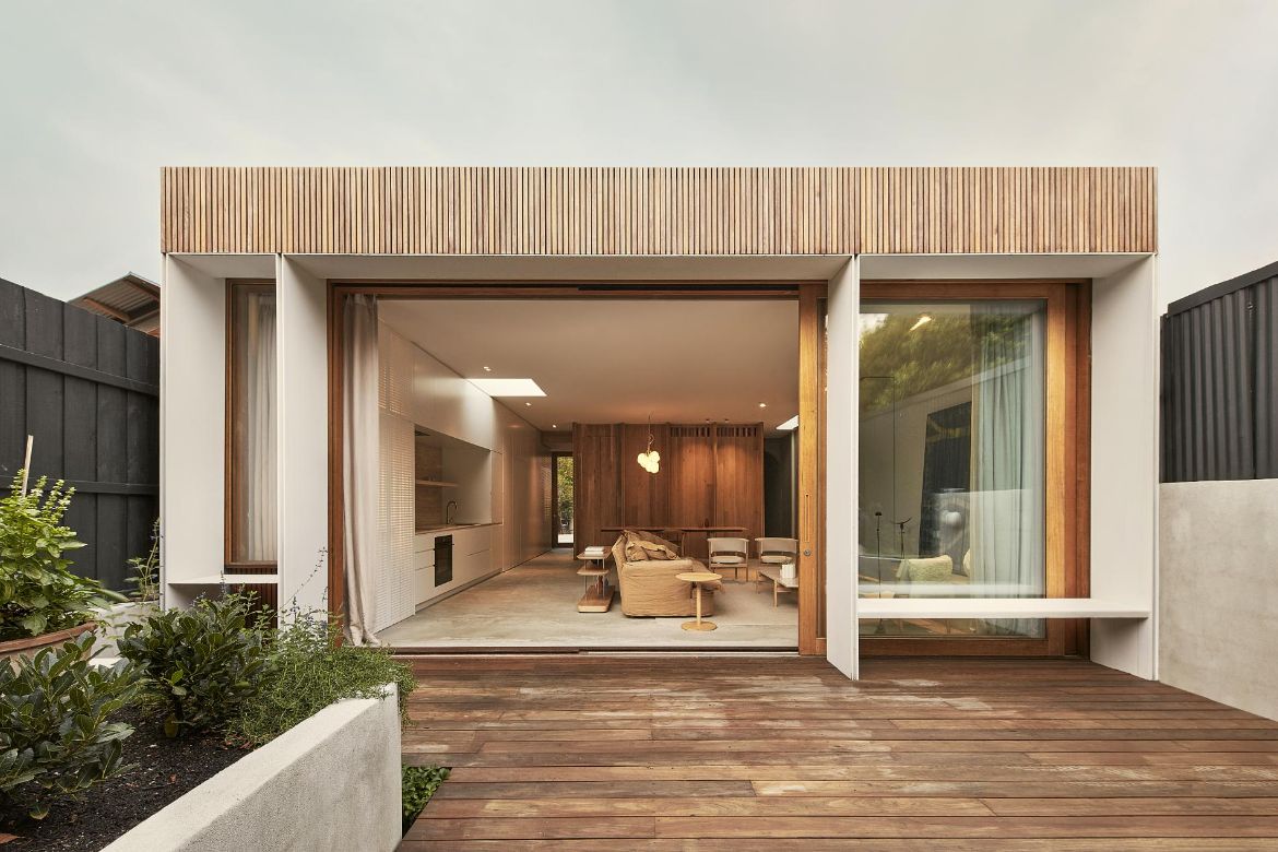
Located in a heritage streetscape lined with Victorian cottages, Randolph House pays homage to moments of its past while accommodating the needs of a growing family through a modern extension. The design approach and layout provide the small family with the amenities akin to a larger home, all in what would typically be considered a constrained site.
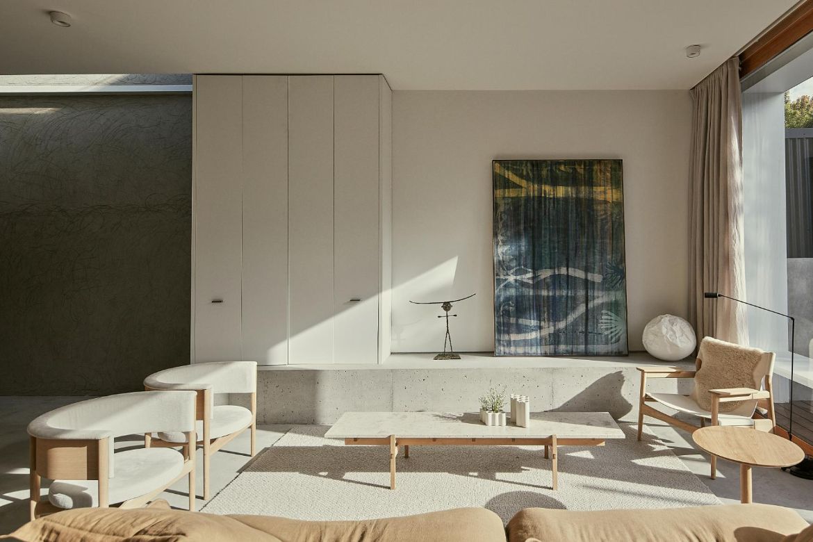
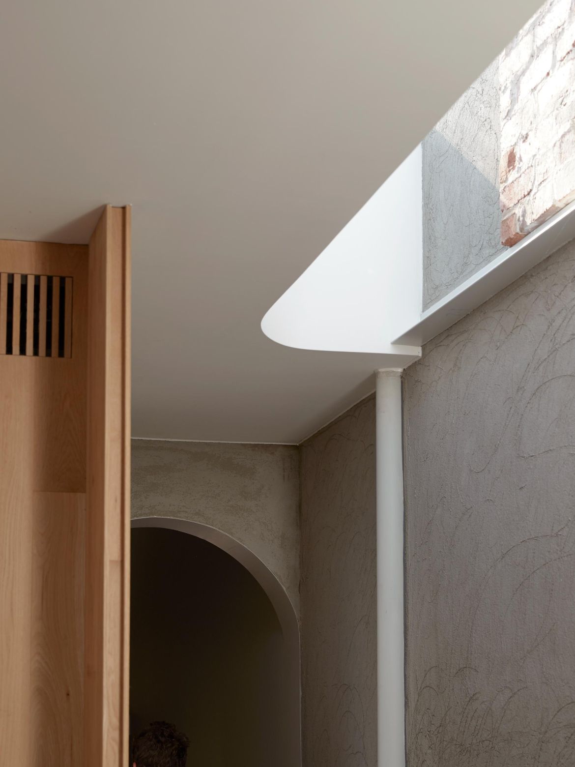
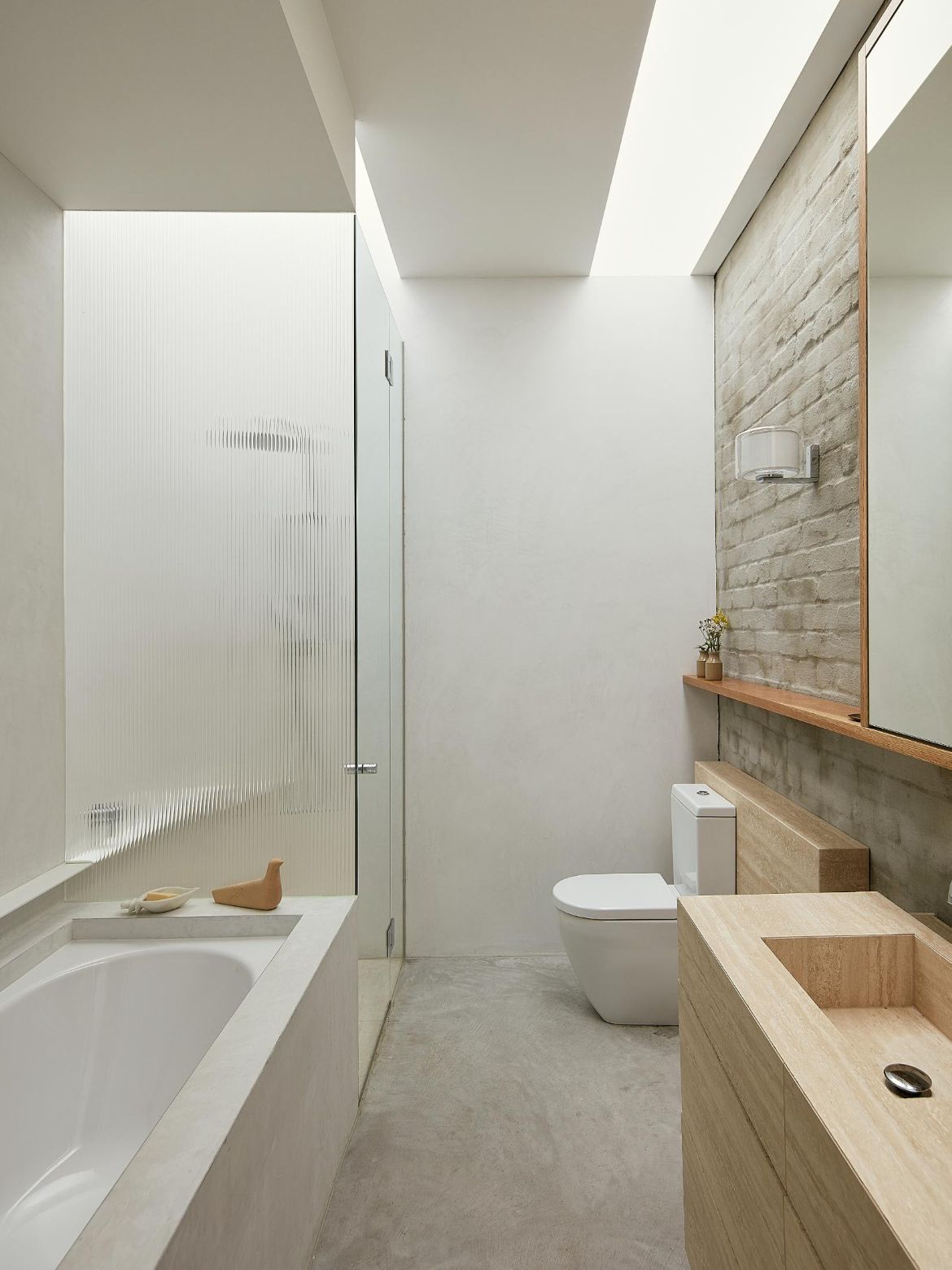
The original composition of the house comprised three bedrooms, inadequate light and a lean-to that failed to connect to the northwest garden. As such, the house has been reconfigured and designed with a highly functional interior and maximises natural light infiltration. Marked by lofty volumes in the old wing, the extension reciprocates by emphasising light and space, balanced by compact pockets that further enhance the liveability of the residence.
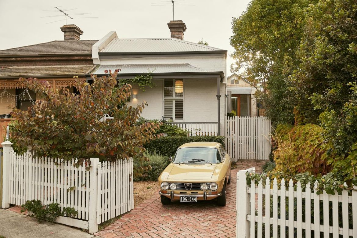
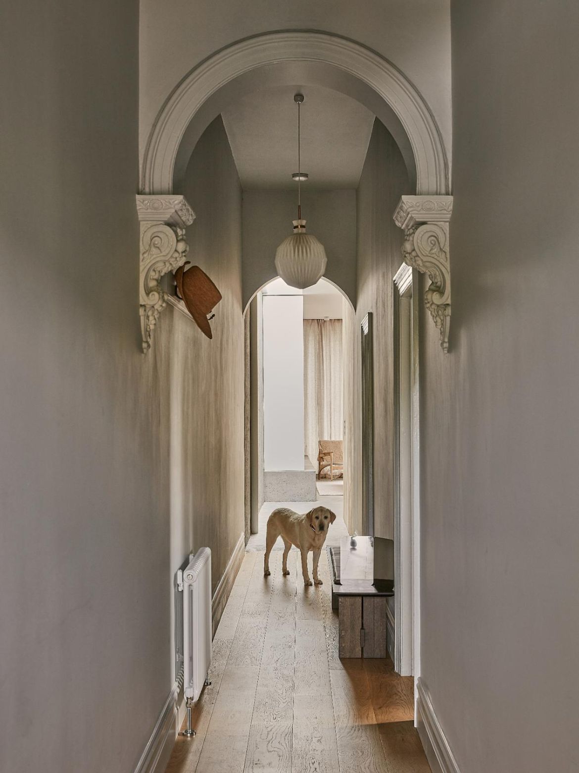
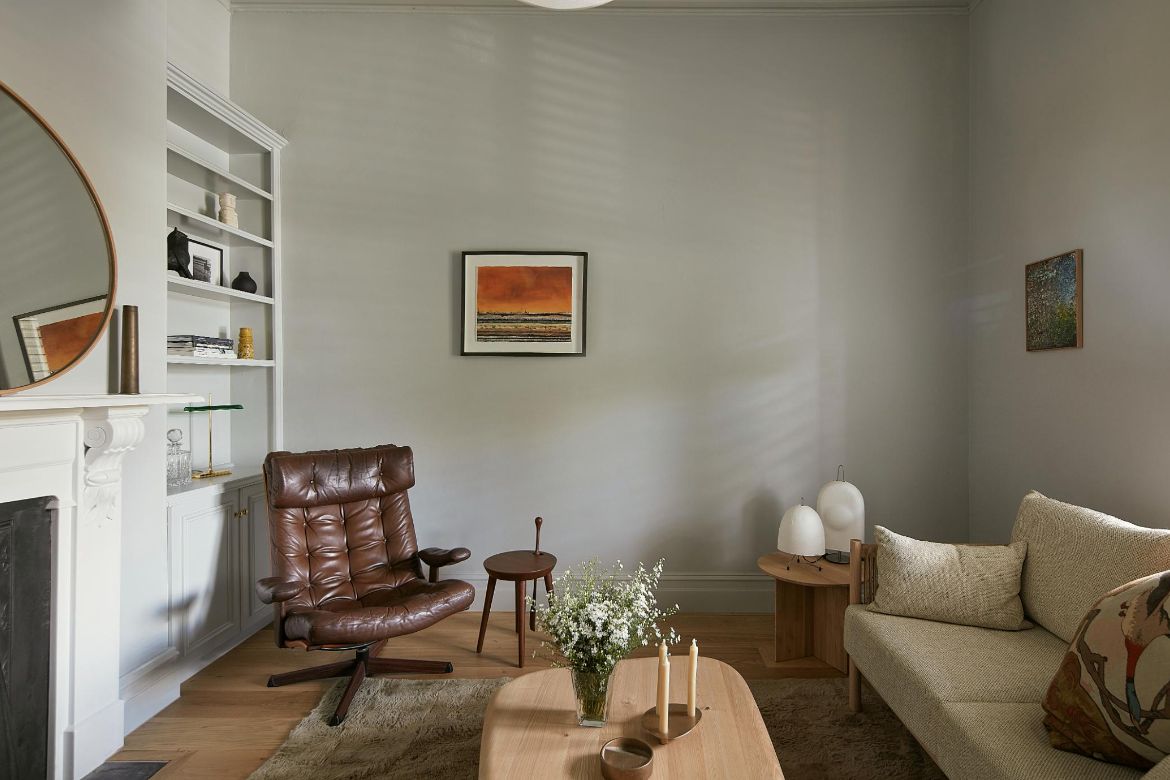
From the street, the home continues to ‘read’ as a quaint Victorian cottage; however, there’s a contemporary sense of space and light to be experienced once one passes the threshold.
Related: Garden Lane Residence by Oliver Du Puy
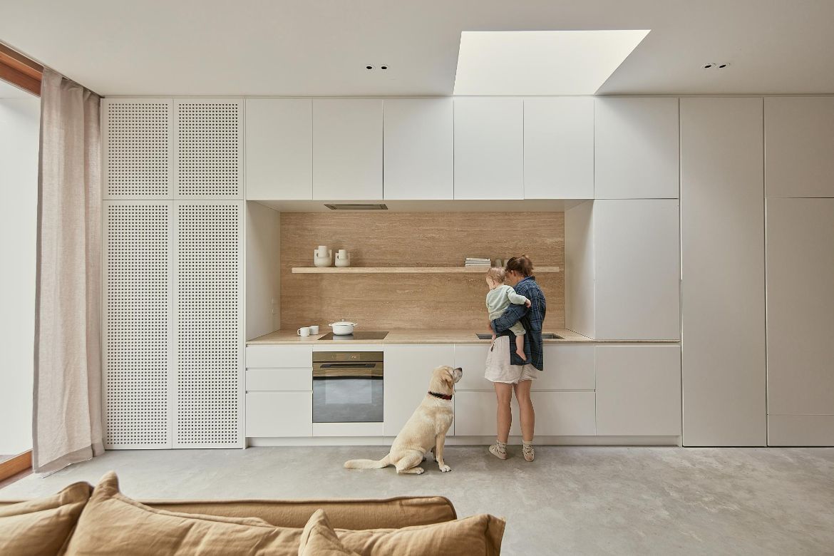
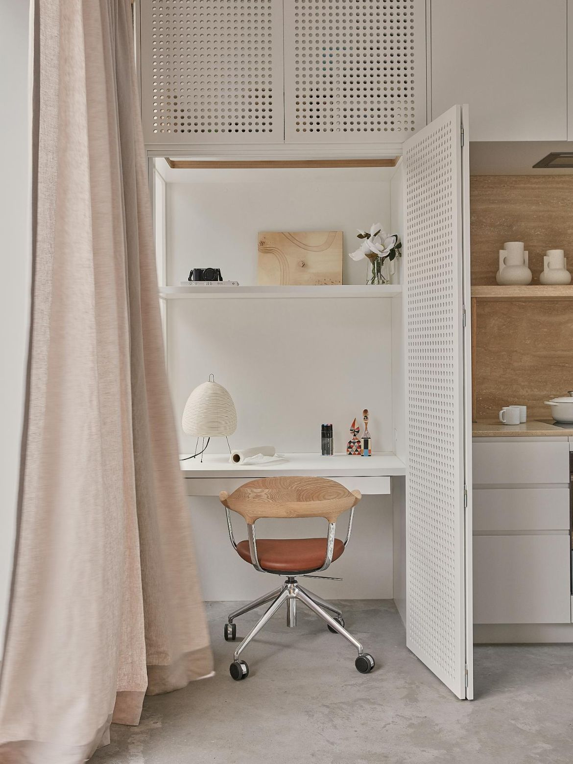
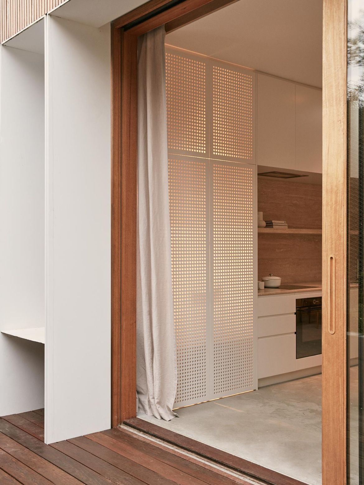
Studio RCA has designed a galley-style kitchen positioned to one side of the living quarters. Mindful of the need for storage in this housing typology, the kitchen joinery includes additional built-in functions. At one end of the joinery is a concealed laundry along with generous storage, a fridge and a pantry. At the opposing end of this continuous unit is a study, tucked behind perforated doors. Conscious of ‘future-proofing’ the house, RCA included concrete flooring in the extension, with steel embedded in the side walls – allowing for a first level to be added should additional space be required.
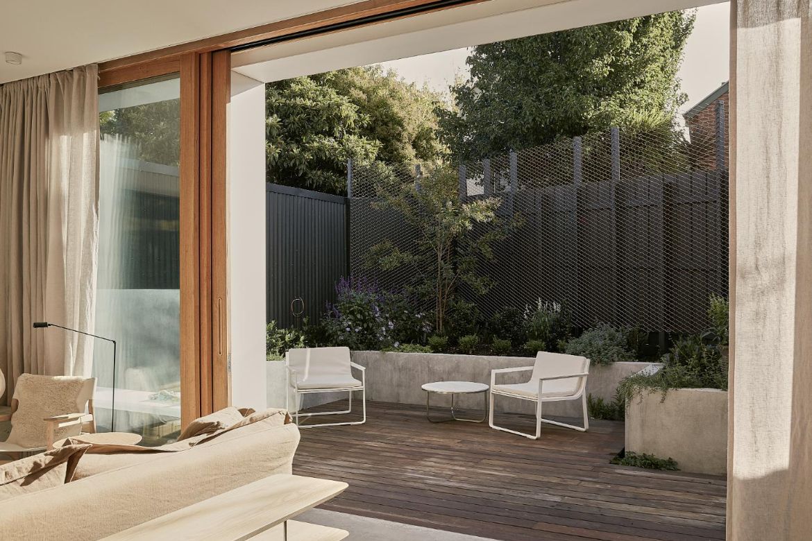
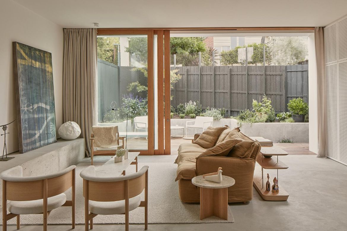
The floor plan at Randolph House is open and flexible. The bespoke joinery is functional and the kitchen, laundry and study can be easily activated and shift their utility depending on the daily time. With all built forms placed to the perimeter, replacing the smaller ad hoc nooks creates an open living space that can be easily reconfigured as the family evolves.
Given Carroll’s partner, Edwina, is a landscape designer, a connection to the landscape and natural elements was also essential. The beautiful outcome is that virtually the entire rear addition was demolished, with only a party wall retained.
Studio RCA
studiorca.com
Photography
Willem Dirk Du Toit
More kitchen standouts: A special residence in the mountains of India
