Landed houses in Singapore are a rare and extortionate commodity; the creme de la creme of the residential locale. Typically deemed to be at the opposite end of the desirability scale for property in Singapore are ground floor units, which suffer in perceived value often due to lack of view. So when L Architects was approached by a client, who’d always aspired to live in a landed house, to reimagine the interior architecture and design of her ground floor apartment, the Singapore-based design practice sought to reconcile the differences between the conventionally contrary residential typologies.
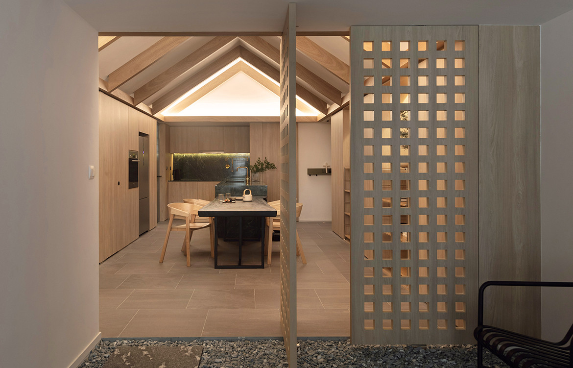
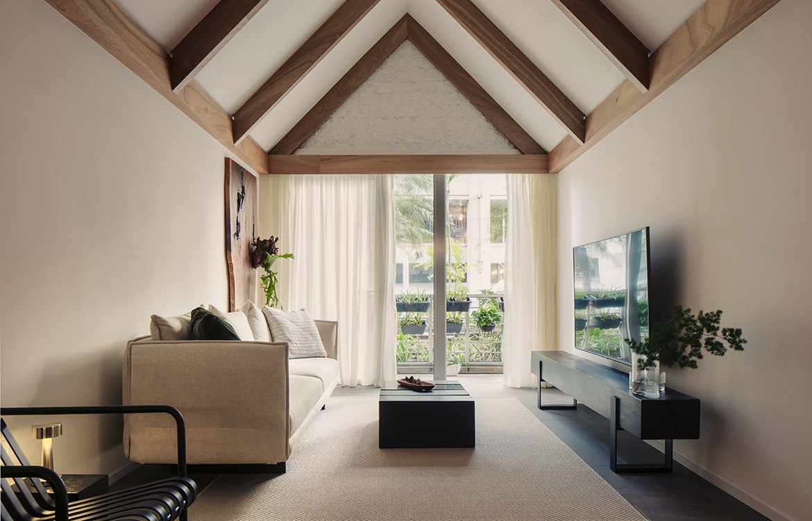
The House Apartment had its genesis in L Architects’ desire to belie the stereotypically perceived shortcomings of the ground floor apartment and harness them instead as its becoming features. While, from its unelevated perspective, there were no spectacular skylines in sight, the apartment basked with a tranquil outlook of trees, greenery and a water feature. Grounding its design in the borrowed landscape of this communal outdoor area, L Architects has tactfully transposed the residence, in look and feel, into something more akin to a single storey landed dwelling than a unit at the base of a multi-residential block.
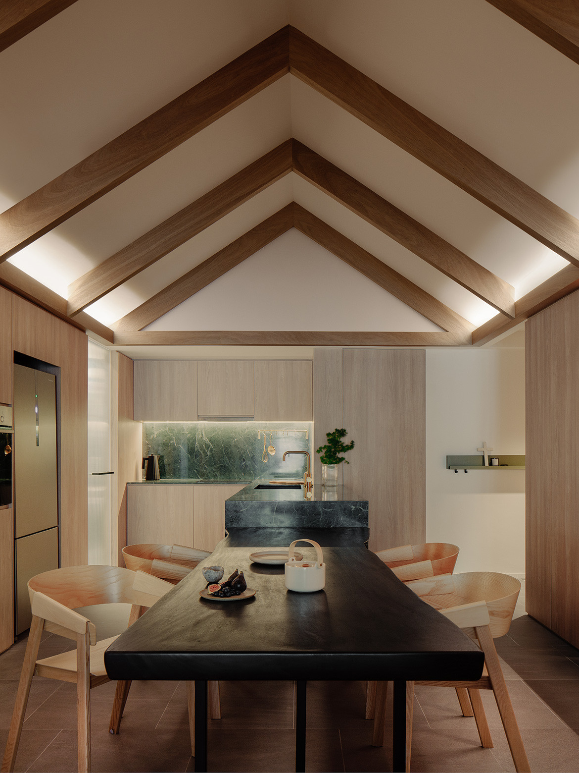
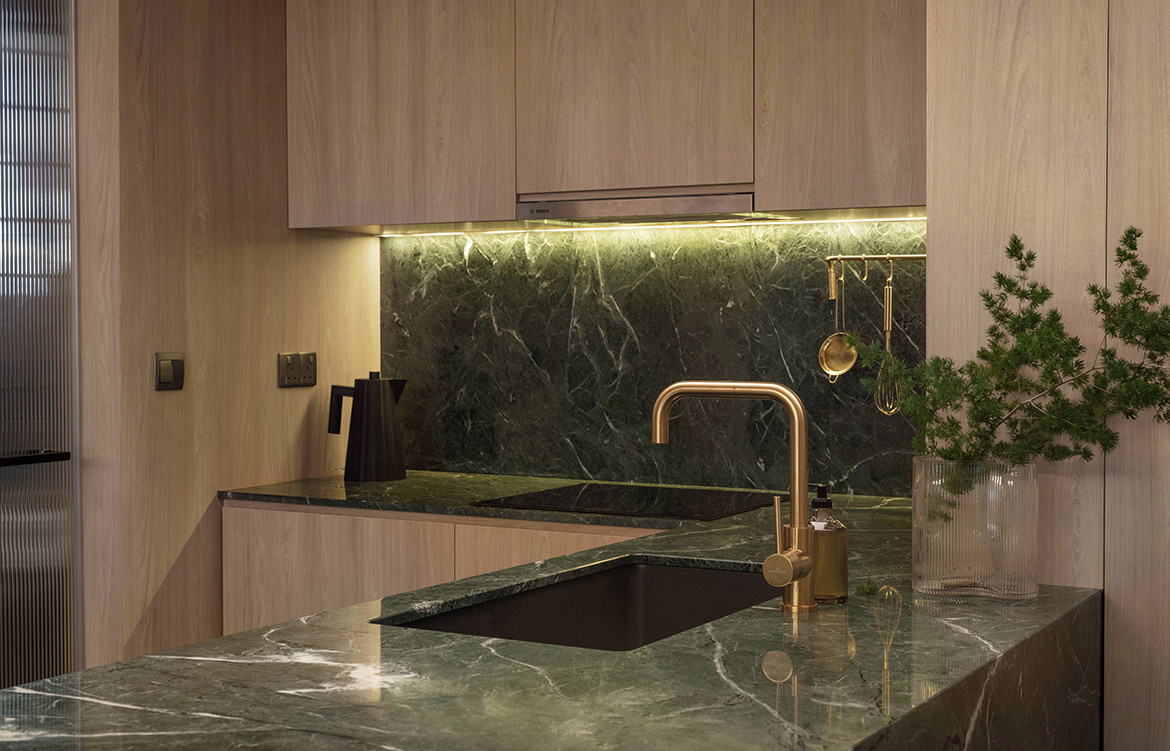
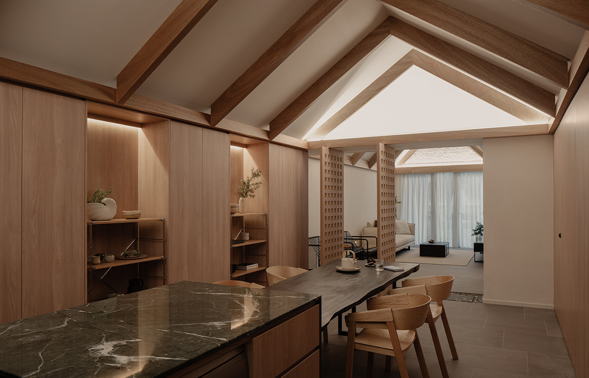
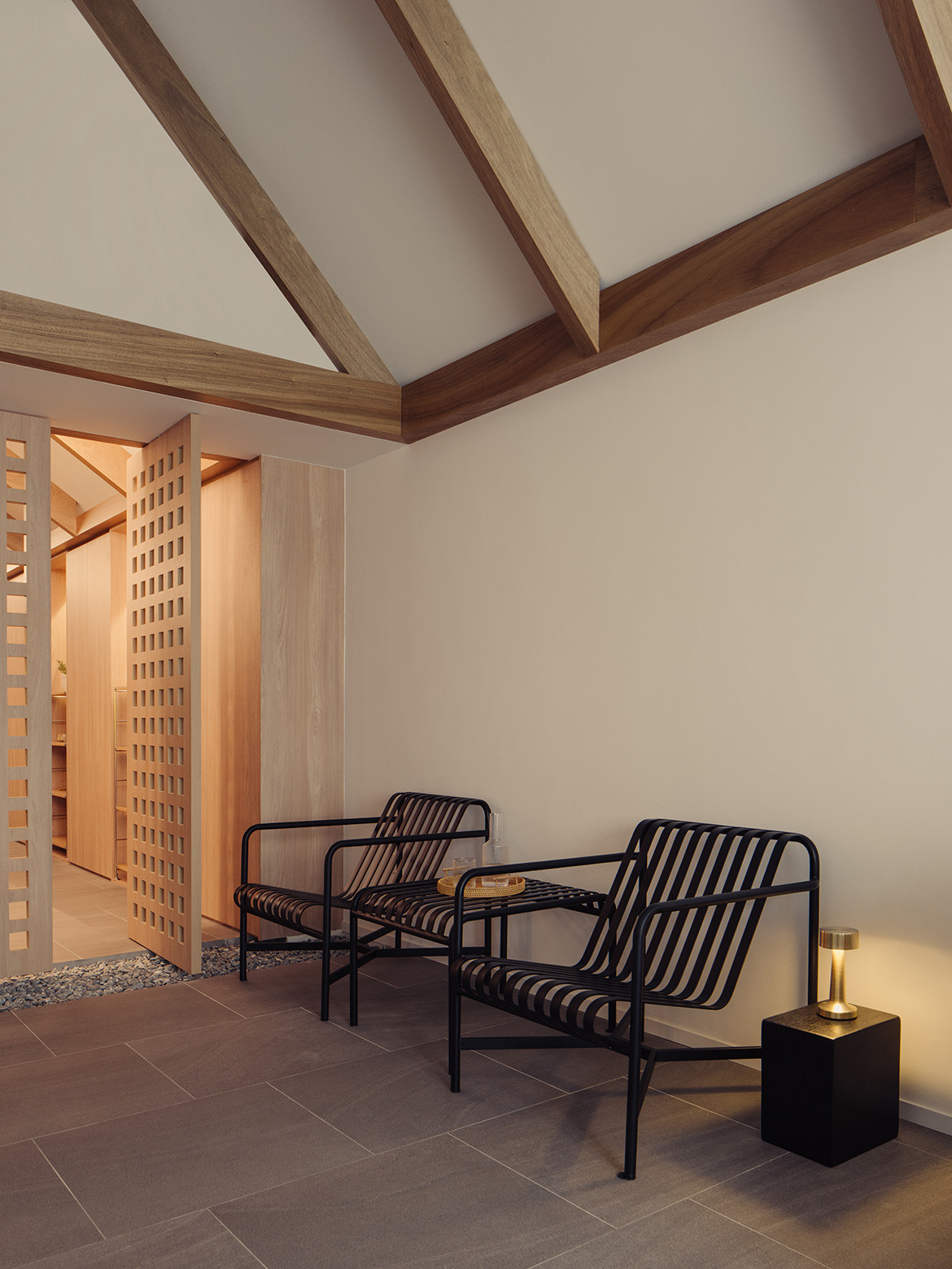
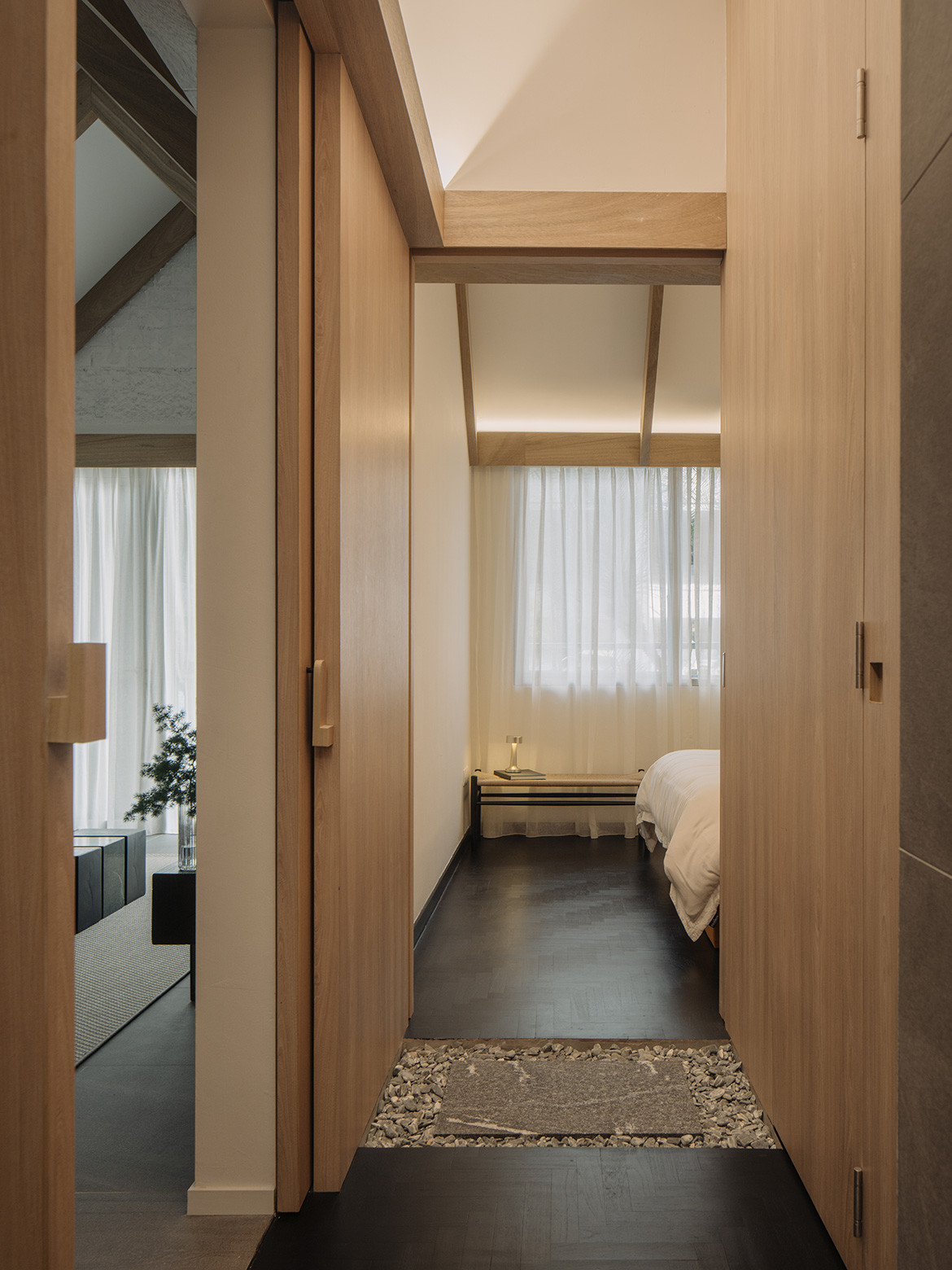
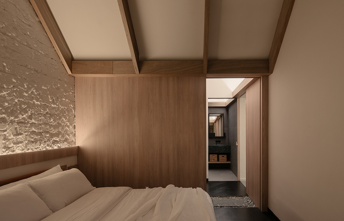
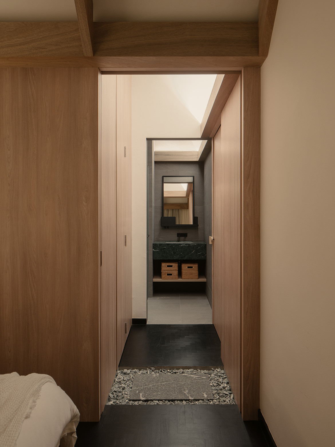
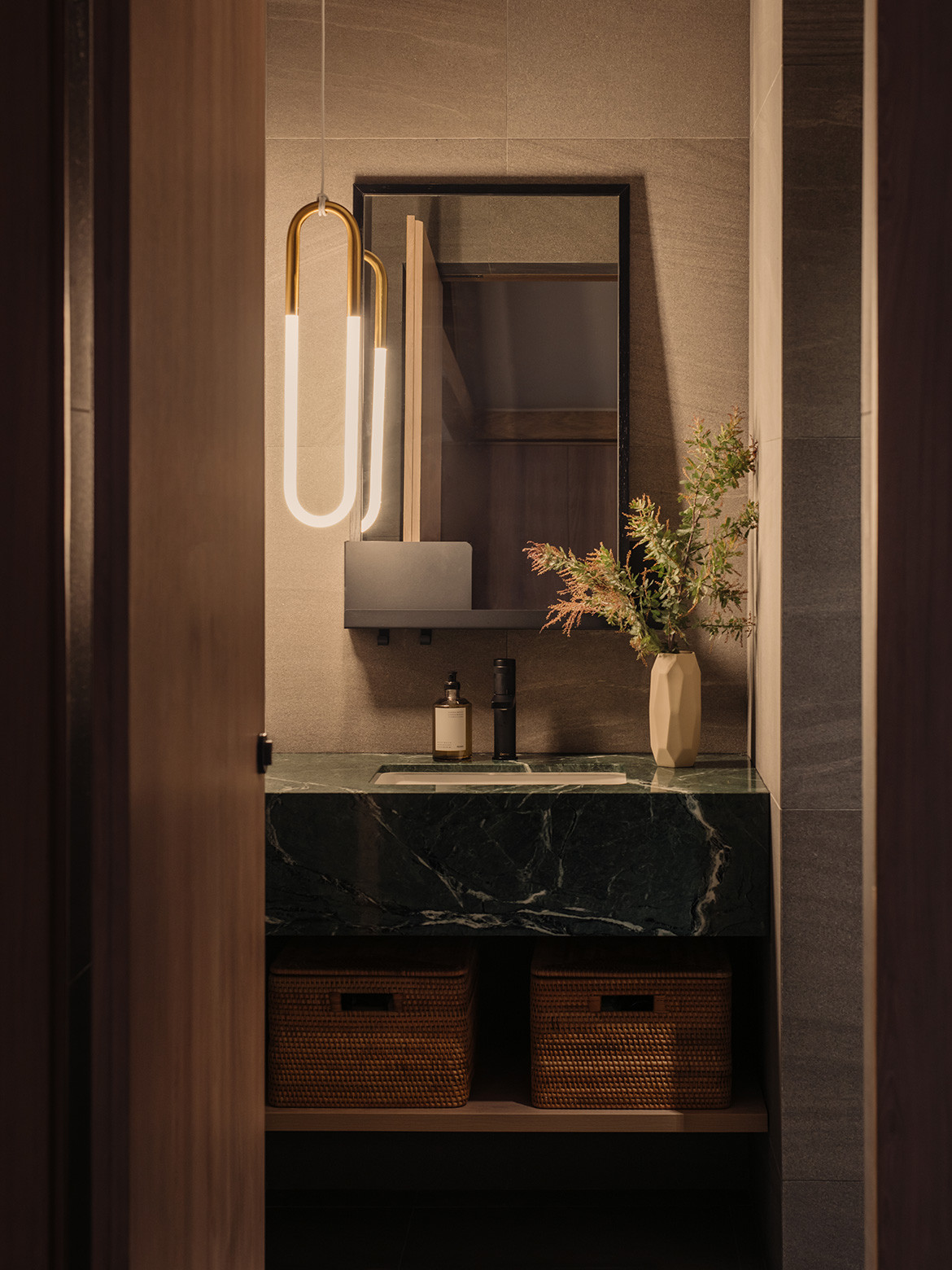
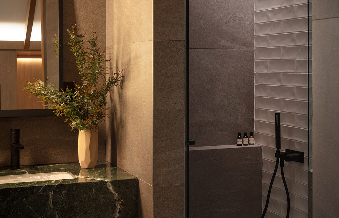
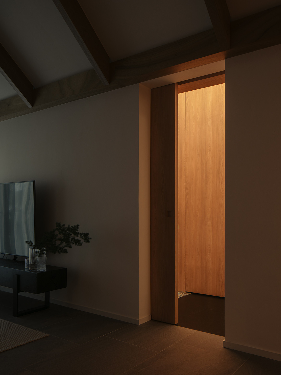
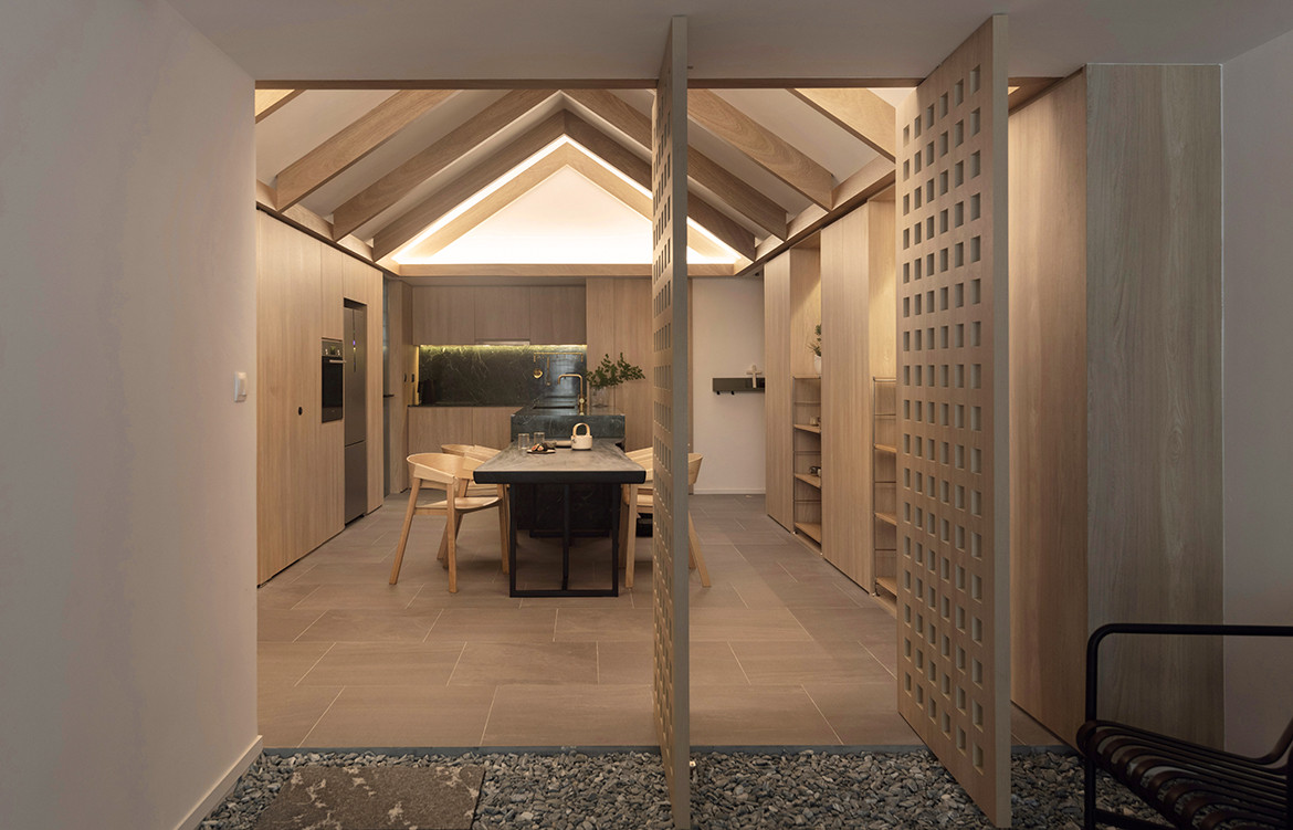
Up close and personal, the resultant residence — fondly styled The House Apartment by its designers — actually comprises three distinctive spatial thresholds, or ‘houses’, in one. The three programme-defining thresholds — one each for living; dining; and retreat — are delineated by the thoughtful placement of loose pebbles on certain floor areas. Immaculately finished in a warm yet reserved palette of natural materials, the interiors tune an elegant aesthetic with the timeless tones of Japanese and Scandinavian design.
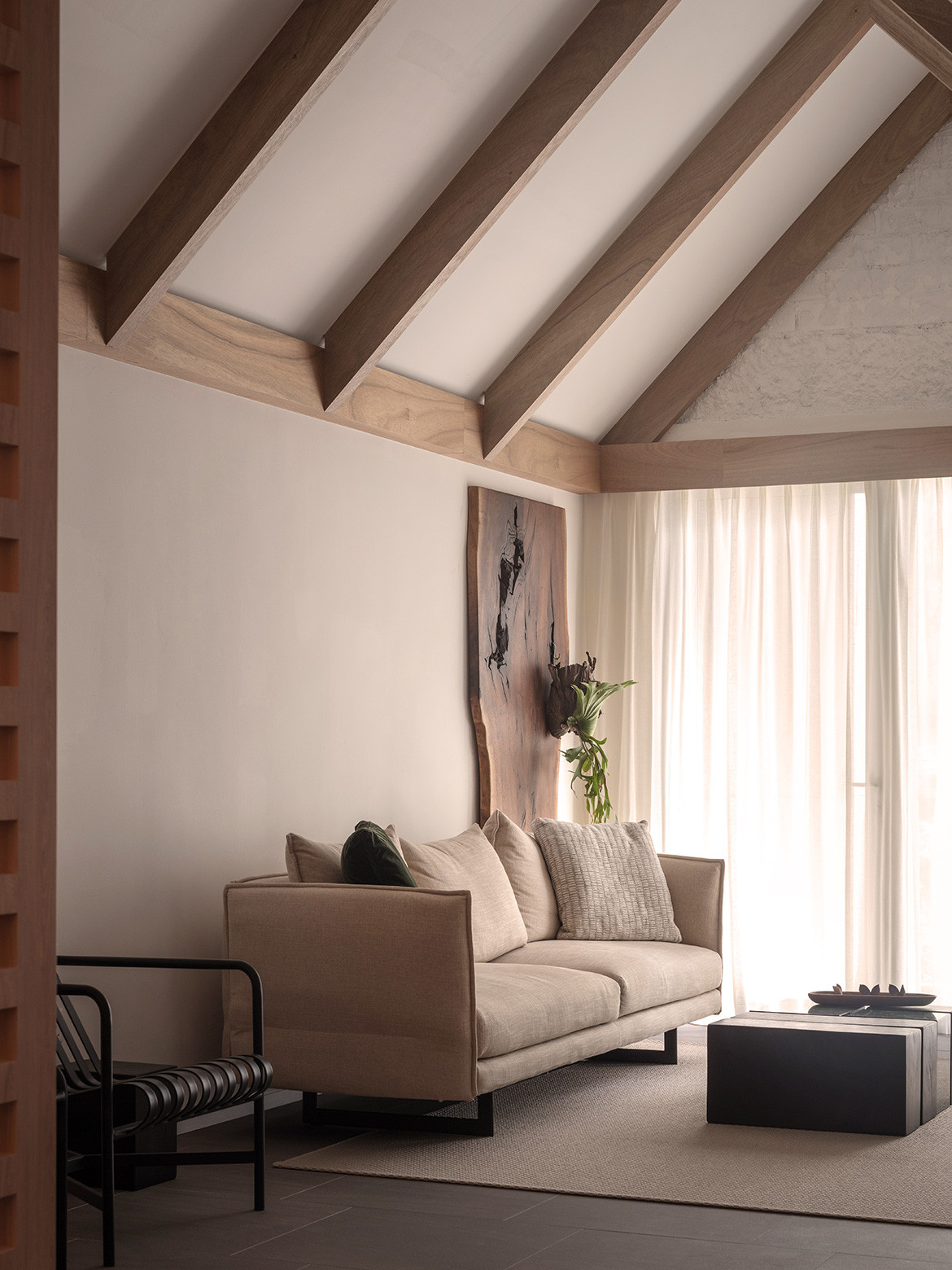
Forming an integral design feature, timber rafters have been inserted to accentuate the sloping profile of the ceiling, coming to a dramatic peak. Through this gesture, The House Apartment taps into the more rural and traditional design vernaculars of farm houses/barns, further distinguishing its posture from its original state.
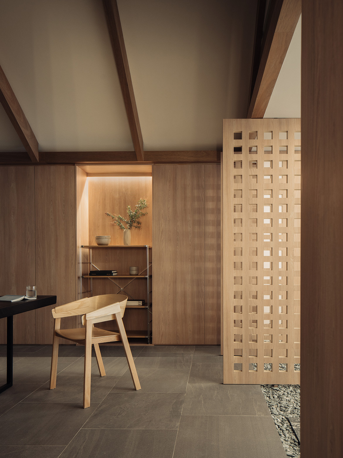
L Architects’ considered design for this grounded apartment contests common presumptions pertaining to the desirability of property in Singapore. In effect, the inflated vision of landed living Singapore is brought back down to earth and realised in a way that is decidedly more attainable and scalable.
L Architects
larchitects.com.sg
Photography by Khoo Guo Jie and Finbarr Fallon
We think you might also like this terrace house in Singapore by TE-EL
