The garage, the granny flat and the backyard shed have evolved with these often-neglected buildings being reinterpreted to provide for more flexible living needs as office, studio, teenage hideaway, guest room and tenancy.
In constrained inner-suburban sites, homeowners and architects are not only realising the potential of the diminutive building cum laneway architecture; how it can contribute to both a property and rear/second street frontage. Designed as an auxiliary to the main residence, these adaptable and multi-functional buildings are bookending backyards and creating contained outdoor spaces, while offering a more visually appealing public presence on busy streets and utilitarian laneways.
The Backyard Studio by Figureground Architecture
In North Fitzroy, Melbourne, The Backyard Studio by Figureground Architecture replaces a garden shed and provides a multipurpose space accommodating a garage, music studio, guest room/study, storage room and ensuite. “As expanding urban growth places more value on inner suburban sites, so too does our desire to realise the full potential of a block. The Backyard Studio achieves this by reframing the backyard as an active social space and essential element of the family home,” says Principal Architect Matt Rawlins. “It also encourages a model of density sensitive to evolving family structures and multigenerational living.”
The studio is designed as a “kit of parts” arranged within a compact two-storey form, and with folding doors on the garden side and roller door on the street side it allows for engagement between public and private spaces. Wrapped in white timber slats on the property side, it presents a visually appealing backdrop when viewed from the house, while having a more robust brick public presence on the rear laneway.
Photography by Derek Swalwell
Redfern Studio by McGregor Westlake Architecture
McGregor Westlake Architecture developed Redfern Studio driven by both personal and public interest, proposing an alternative model to the council for the typical laneway studio. “The laneway studio is a small project in itself, however when seen as a type, multiplied across hundreds of city lanes, it becomes a large urban project,” says Director Peter McGregor. “As the need for density and intensity of use grow, the 25-square-metre footprint is an increasingly important model for the fine-grained pedestrian city.”
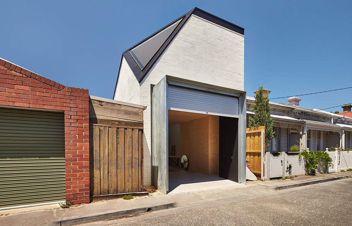
McGregor Westlake added a second storey to the existing garage located in a rear laneway in Redfern, Sydney. “The laneway studio doubles the height of existing frontages and adds another layer of use to the service lane, imbuing it with the qualities of an active, connected and urbane street,” Peter explains. The contrast and combination of the garage with mansard roof and dormers presents a robust but engaging presence, offering a private, domestic space on an otherwise public, utilitarian street.
Inside, a living/dining/kitchen area overlooks the lane and sliding timber panel doors conceal the bedroom nook and bathroom. Lined with hoop ply, the interior offers a warm and simple palette, like a refuge from the tough brick streetscape outside.
Photography by Brett Boardman
Waterloo Laneway Studio by David Mitchell Architects
Waterloo Laneway Studio comprises a garage or workspace on the ground floor with a bedroom, bathroom and kitchenette upstairs, connecting to the house via deck. David Mitchell Architects designed the building to forge a connection between the main residence and lane. David designed the form of the building to complement the fences, garages and small houses that front the rear laneway,
The selection of materials is also sympathetic to the surrounding buildings with brick, corrugated iron and steel-framed copper-clad doors that will patina with time. “The doors were designed with the intent of contributing to the laneway aesthetic and providing interest for those living in close proximity,” David explains. “If only we could replace all the roller shutters in our back lanes with solutions like this, our laneways could become so much more than the service corridors many of them currently are.”
Photography by Michael Nicholson
Little Brick Studio by MAKE Architecture
Little Brick Studio by MAKE Architecture is squeezed into a tight corner space of a property in Abbotsford, Melbourne. Designed to adapt to the family’s changing needs, Little Brick Studio has a garage on the ground level and a roof deck and studio space on the first level with the potential to be a home office, teenage retreat, guest bedroom or a tenancy to rent out.
MAKE Architecture built up instead of out, reducing the size of the existing garage to allow for more outdoor space. “We kept the footprint of the building as small as possible to ensure the impact on the house and backyard is minimal,” says Director Melissa Bright.
The corner site offered the opportunity to do a more public building that engaged with the street, and like a sculpture designed in the round, the building can be viewed from all sides. The brick is a response to the commercial buildings across the road and textured finish is inspired by the nearby factories. As the garage entrance is recessed beneath the corner, the two-storey brick volume appears to cantilever over the footpath, bookending the street, with the front door emphasising its public presence.
Photography by Peter Bennetts
The Kite by Architecture Architecture
Designed by Architecture Architecture, The Kite is an extension to a late-Victorian home in Albert Park, Melbourne, with the existing garage developed into a flexible space that engages with the backyard, residence and streetscape. The auxiliary building serves as an office and garage space, and opening up on both sides, it allows for a view from the main house, across the garden through to the laneway behind.
The house is located on an irregular battle-axe block and the addition of the open-plan kitchen, dining and living area to the main house stretches diagonally across the L-shaped junction, which inspired the triangular form. Architecture Architecture continued this concept in the studio with a triangular timber-slatted canopy and pitched roof that extends from the garden. It creates a more intimate garden space beneath it and blurs the boundary between indoors and out. The triangular forms continue on the ceiling inside, and a slice through the top corner of the structure allows for a triangular skylight to illuminate the upstairs level.
Photography by Peter Bennetts
We think you might also like Sensible Density And Small Scale Residences

