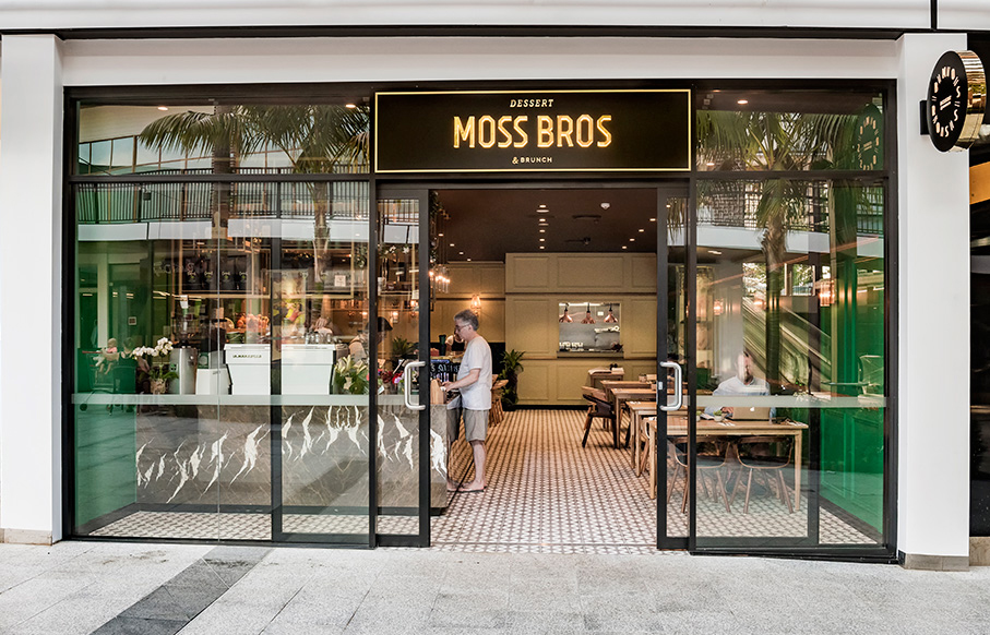
The design for Moss Bros, a charming dessert bar in Kareela, South Sydney, starts from the outside streetscape, before you have even entered the store. Walking past, the aroma of fresh coffee grounds and oozing warmth of baked goods yank at your nose, leading you through the door in to their intricately decorated cakes.
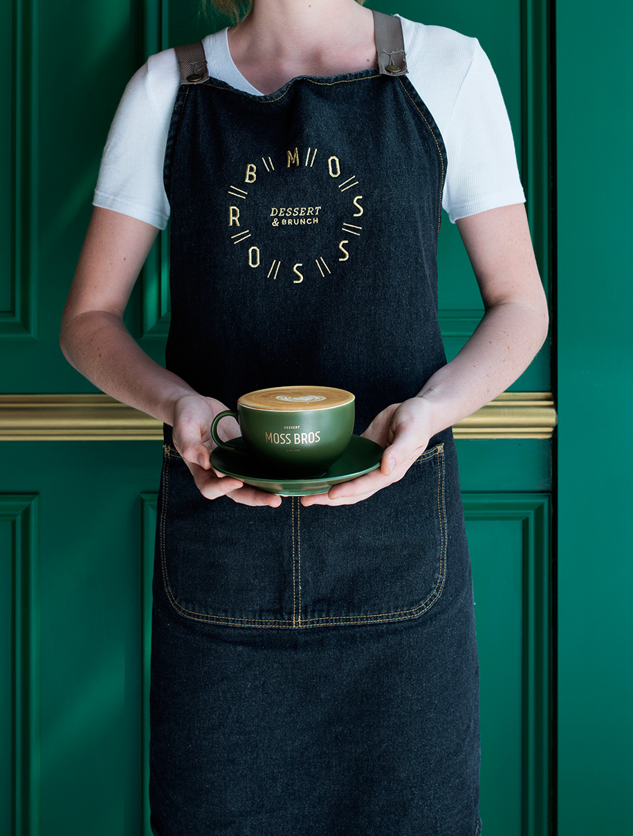
Collectiuvus, the design consultancy behind Moss Bros, takes a holistic, ground-up approach to design, incorporating interiors, graphics, multimedia and branding. Head designer Michelle Khadye, inspired by the uniquely earthy and mossy details of the cakes, was able to construct a signature brand and space that champions the creativity of its goods while delineating itself from its peers.
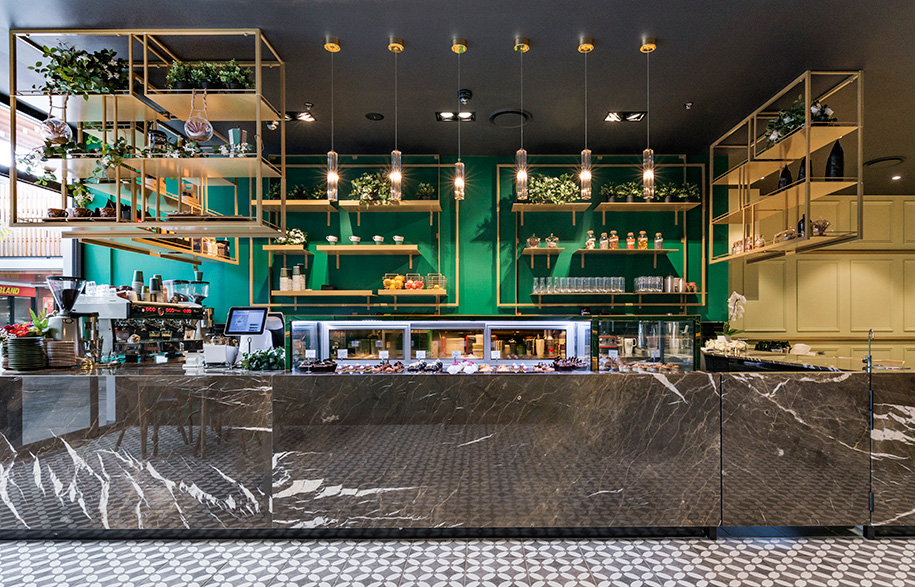
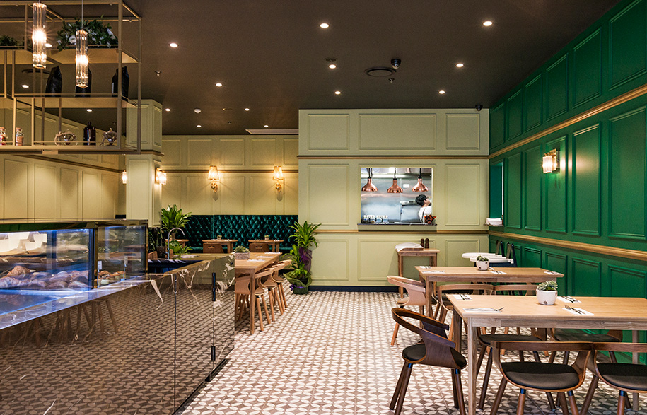
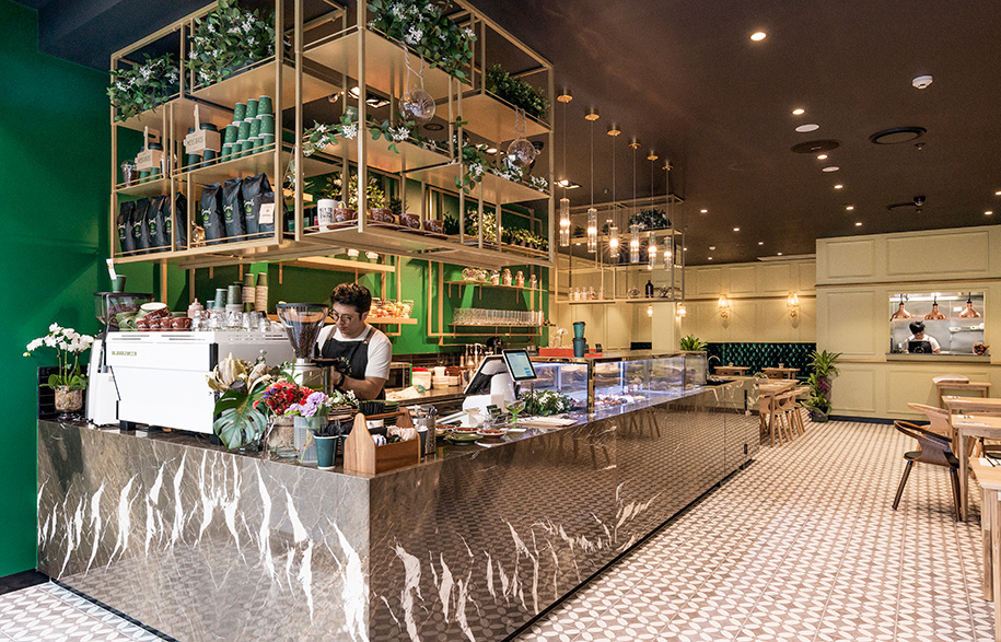
The design for Moss Bros began from an understanding of how future customers would move throughout the space; the flow from inside to outside, the desire for more open and more protective seating spaces and how to pull customers in off the street. The countertop – enchanting in its own right, decorated in gold shelving and vines – is cleverly located at the forefront of the store to exhibit the delicious offering to those waking by. Closer in, the back cut-out kitchen reveals a theatrical show as the chefs prepare the brunch menu. “It’s all about designing for the human mind,” says Michelle. “They come in, they smell the coffee so they go near the coffee, [then] they look at the desserts.”
Preluded from already strong architectural bones, the brief was to keep things clean, elegant and showcase the sweets rather than overwhelm them. “It is rare to find architecture where even when it stands alone it still looks beautiful,” says Michelle. “We didn’t want to clutter the shop front, we wanted the architecture to just speak for itself.”
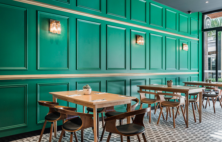
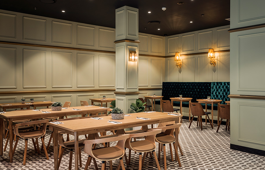
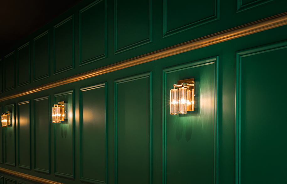
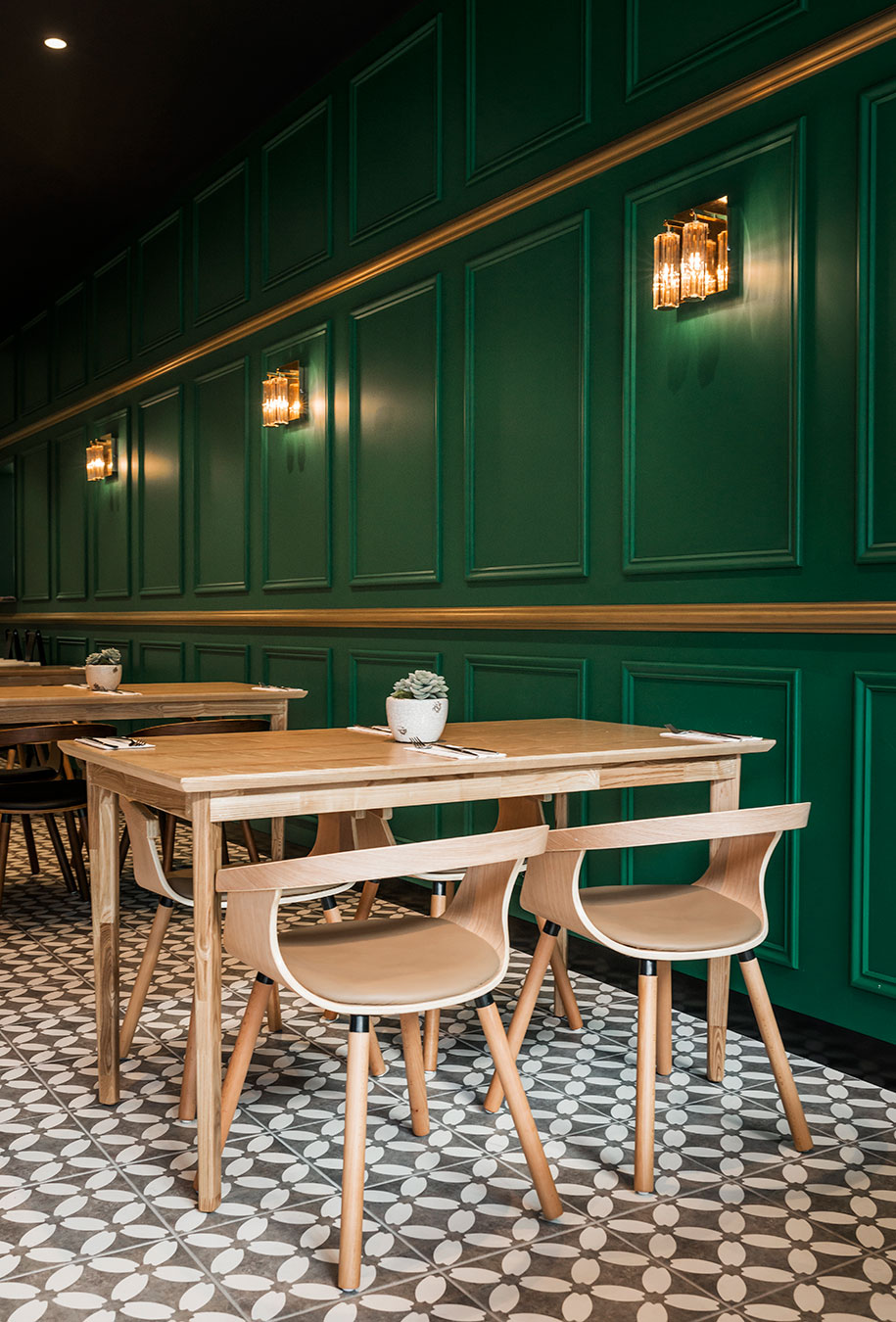
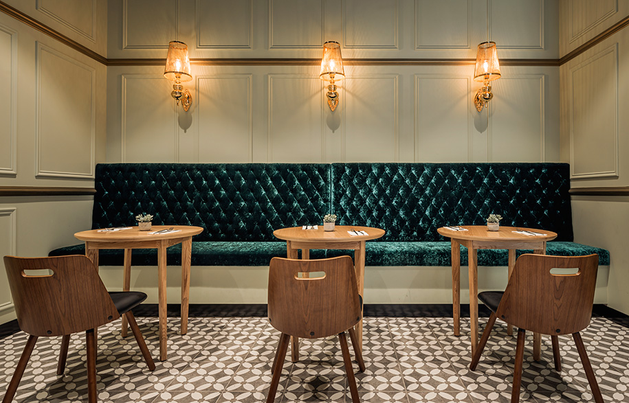
Drawing on the romance of the dessert bars synonymous with Paris and Vienna, the interior infused Europe’s old-world refinement into a clean and raw aesthetic, referencing Australia’s geography and clientele. A refreshing step away from the flamboyant colour and frills usually associated with desserts, Moss Bros soaks in a more muted palette. Rich overlaying hunter and mint greens not only create a calming environment but also visually reference the subtle wildness of the desserts.
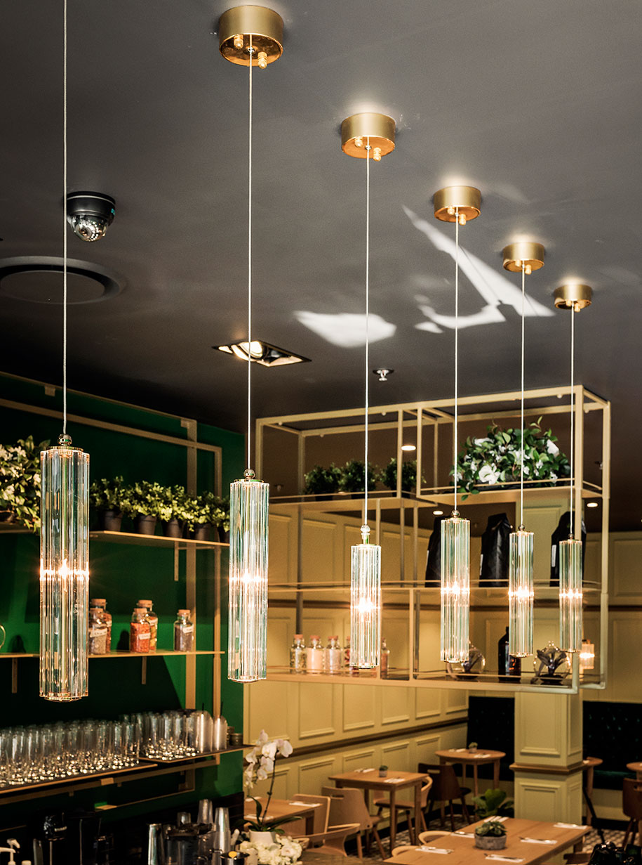
The earth-toned marble counter top visually anchors the space, adding an organic rippling detail that softens the strict lines and adds a gloss to elevate the sophistication of the space. Khadye has also considered the wide ranging needs of the customers through the mix of seating, from the banquette, high bar tables and low seating, to truly open up the space to anyone – a mother with her pram, two friends or the elderly. The warm tones introduced in the brass lighting and fixtures exude a cosy and inviting space, somewhere to escape to – a treat all in itself.
Collectivus
collectivus.com.au
