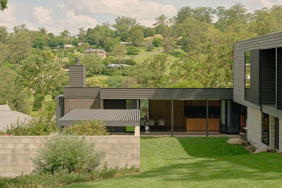
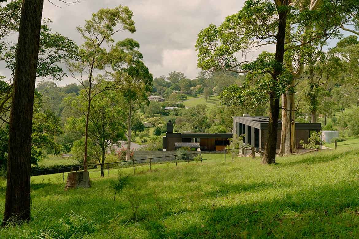
Beautifully realised as a horizontal response to the towering gum trees, Toowoomba House is very much a testament to living in good design. For Morgan Jenkins, Nielsen Jenkins’ principal, the joy of architecture lies in working through the site’s natural position and situation, which is then overlaid with the needs and requirements of the client.
In this case those of a professional couple, both doctors, who had recently returned to Toowoomba, but had been living in a small dark home. “They wanted it to be warm and protected but also connected to the outside with more generous openings and exposure to daylight,” says Jenkins, who is friends with both.
Located on the sloping rise of the escarpment overlooking Lockyer Valley, but surrounded by large houses, Nielsen Jenkins’ starting point was to locate where on the block the best view could be enjoyed. Moreover, as it was essential to screen out the surrounding houses, a line was drawn outwards to create a sightline that excluded neighbouring properties.
“That set up all the geometry: the southernmost line is the first line that you could not see any neighbours and be connected into that long view,” says Jenkins.
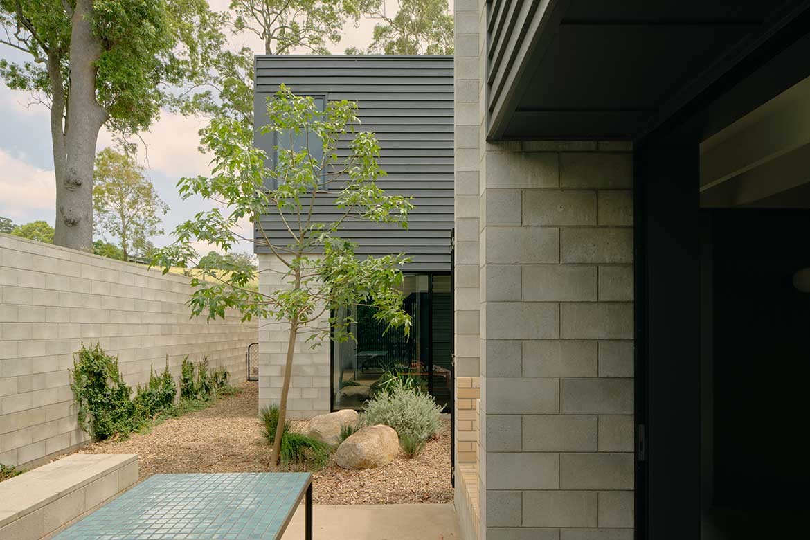
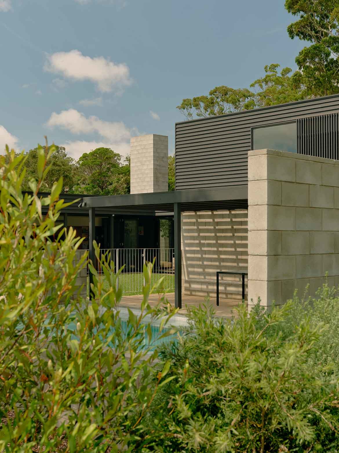
Within these geometries, the architects set a courtyard and towering blockwork chimney and fireplace at the centre as a fulcrum. “We saw the courtyard as by far the most important room of the house. And it’s an external one,” says Jenkins. From here, all the geometries radiate outwards to create a map for the home to be worked into as a stretched and rearranged set of rooms.
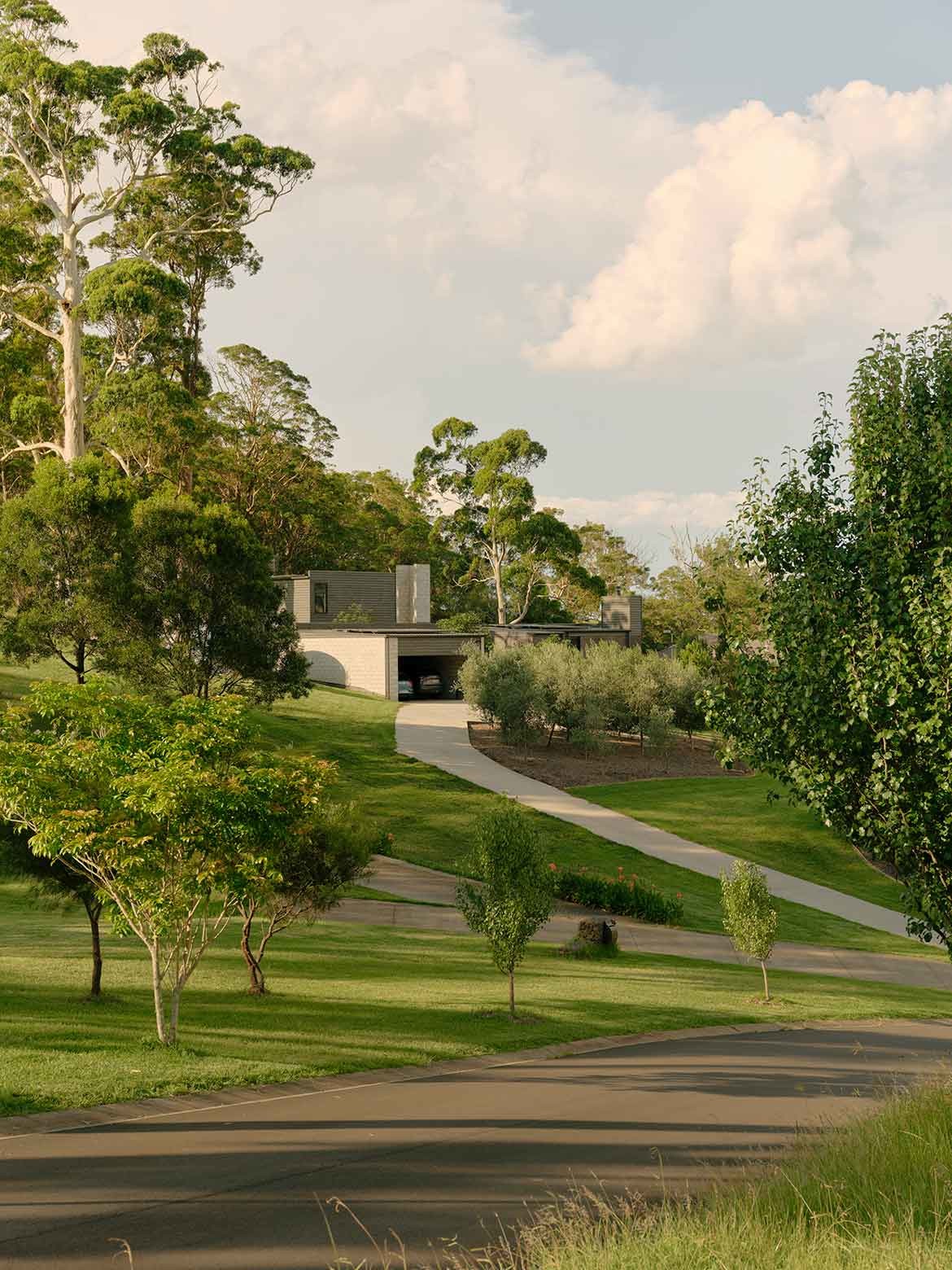
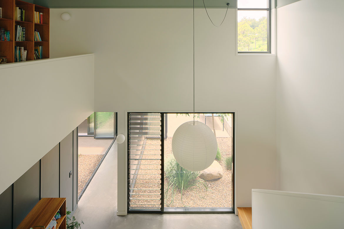
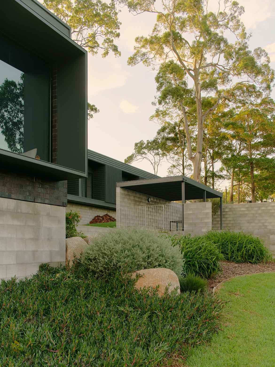
Cutting into the landscape minimally, the architecture of the home is facilitated as a series of pavilions that gently ease down the slope. “We wanted to make a building that would be quite recessive under the trees; to sit low to hug and settle into the slope,” says Lachlan Nielsen, principal at Nielsen Jenkins. Gaining both height and light through the insertion of a mezzanine, the pavilions are connected via covered walkways with walls of retractable bi-folded glazing opening to courtyards.
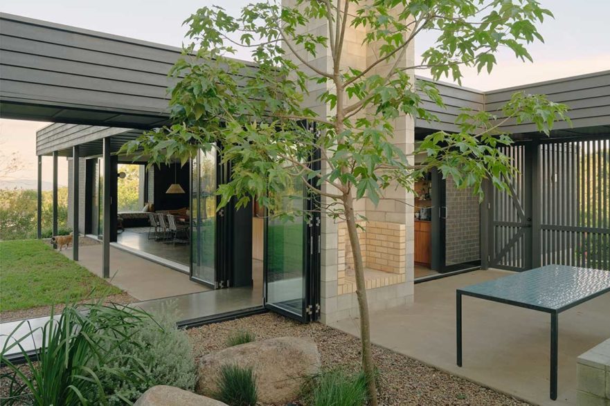
It is an exceedingly clever solution as it allows the home to be fully open for the six months of the year, when the weather is at its best. “You come in through the entry and you think you’re entering the house, but you’re actually inside the external room first, and then into the house, and when everything’s open you can sit back in that internal courtyard and see the view, see the trees,” says Nielsen.
Either carved out or boxed in to create eaves, the large, considered windows allow the home to feel like a continuation of the environment. It is, however, a highly orchestrated experience. “You feel really private and really connected to the great parts of the site, so that it’s you and these huge gum trees and vistas that are far off, as the house edits out the foreground,” says Nielsen.
The arrangement of the house creates a set of tableaux in that, when seen from outside, the full glazing allows sightlines to the interior’s views, which read as framed details. “We’re really interested in using a building to arrange or orchestrate these experiences, or moderate your experience of that particular landscape. Toowoomba House in particular is made from humble materials, but it’s set up in a way that really curates what you see – and when you see it, it really works,” says Jenkins.
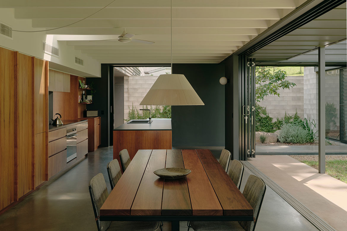
Indeed, the materials for this project, while simple, are incredibly well-considered in their arrangement, with blockwork for retaining and screening walls, while bricks are reserved for facework.
As Nielsen points out, while budget was a consideration, materiality was secondary to intent. “We would much rather spend money on the window openings than on the finishes,” says Nielsen, adding: “If you walk into one of our houses, and you notice the kitchen tap, I think we’ve done a terrible job. You should be connecting through these spaces into something that’s much more interesting, which is the landscape around it. And not just the landscape of the site: we’re trying to connect into a much bigger site, which is the site of the escarpment and valley.”
The interior’s material palette is similarly simplified with polished concrete floors at ground level and timber flooring and stair detailing for the mezzanine. Walls in white, light grey, dark grey and brick are likewise unobtrusive. The kitchen is particularly handsome with full-height cabinetry and an island all in the same timber.
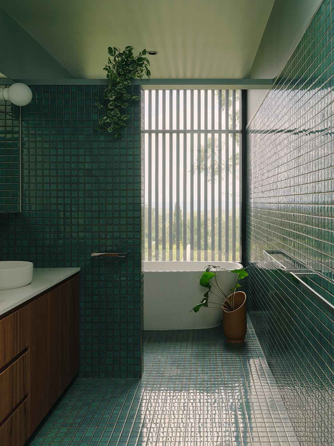
Efficiently designed to keep the footprint minimal, the calendar and magnet collection is kept to one end, but not out of sight. The bathroom of emerald green pool tiles feels like a continuation of the exterior. As Jenkins explains: “The idea was to have this really immersive feeling. So, materiality was relatively singular.”
Sustainability measures include rainwater tanks and solar, with the internal modules set up to allow for cross-ventilation and light. Materials are chosen for their low levels of maintenance, while window systems allow passive ventilation. Materials are assembled in a way that minimises painting and upkeep and will let the building gradually patina and settle into its landscape.
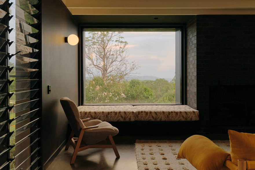
Arguably the most beautiful room in the house is an alcove with a picture window framing that perfect view.
In fact, it is almost impossible to not constantly touch back to the view, and herein lies the beauty of this architecture. It does exactly as intended, by receding to the splendour of the valley. Gone are the encroaching suburbs, gone are the sheds and in their stead, there is nothing but trees and sky. Bliss.
Project details
Architecture & interiors – Nielsen Jenkins
Photography – Tom Ross
We think you might like this story about a bespoke residence in regional Victoria.
