The architects speak of this as a renovated house. The drawings show that actually only some columns and beams have been retained, while the old floor has been taken out. So, while it is not strictly-speaking a conversion, it can reasonably be seen as one from the point of view of the clients – a young couple with a ‘simple lifestyle’ – and the designer. Umbrella House is located deep in the high density housing quarter of Ho Chi Minh City and there’s not too much of interest in close proximity, hence the architects chose to focus on the interiors.
Accordingly, every part of the site is used, but not every nook and cranny is utilised, ensuring that the small house is compact but not compressed. The construction components (walls, beams, columns, stairs and so forth) are also used as interior elements. Each of them appears in only one or two places, so it does not repeat itself while maximising its uniqueness. The whole house is a series of cleverly designed spaces and seemingly, nothing is redundant.
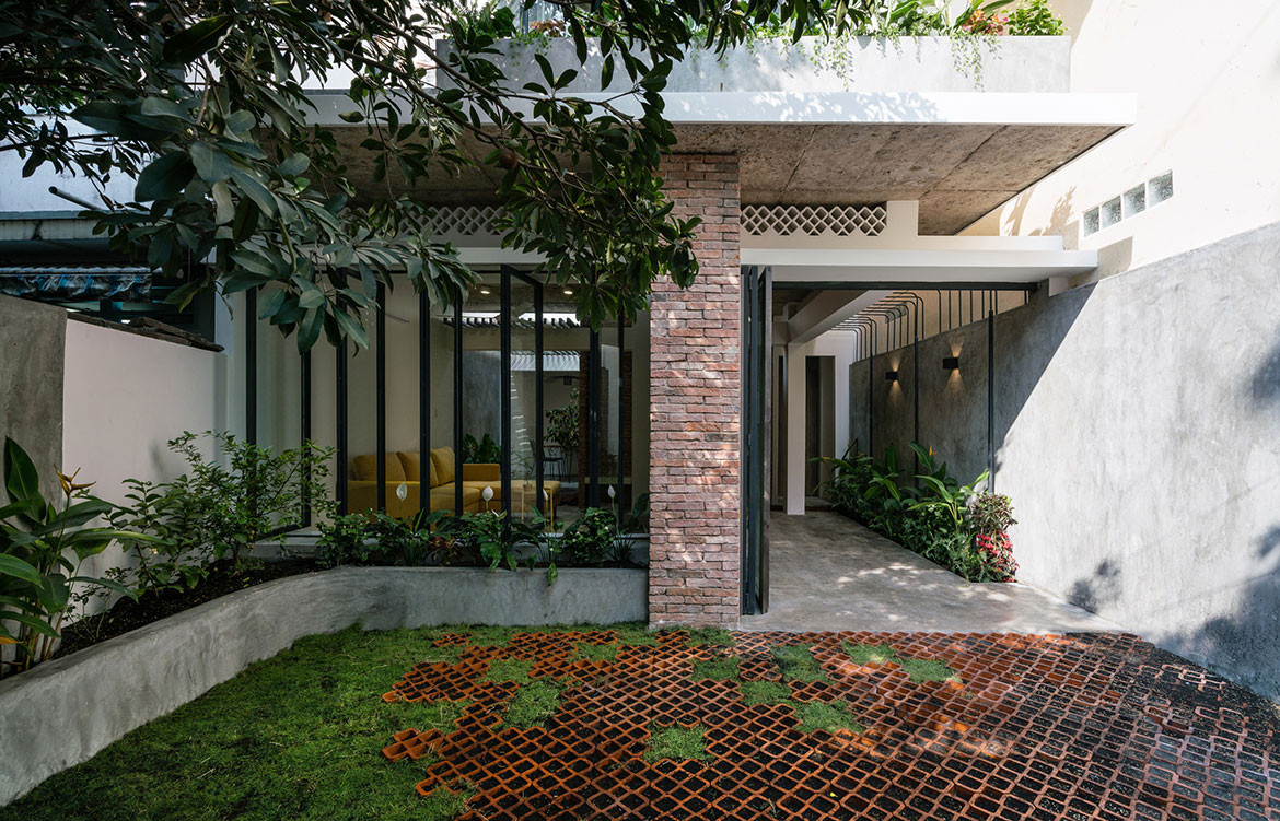
Spatial organisation becomes a game of visual juxposition in the architects’ hands. We can see their intention to make familiar elements unfamiliar in the face of common sense: the ceiling is made of glass like a curtain wall and the ground is paved with air-bricks like a screen wall. The intention is to create perceptual confusion: the old structure is finished like a new one, while the new elements are made as old (brick walls, concrete ceilings and stairs are not plastered or painted); the bedroom, which should be private and discreet, is open; the kitchen, which should be light-filled and ventilated, is shielded.
The intention is to create dramatic situations: backgrounding the sophisticated forms (of furnishings and fittings) and orienting views from spacious areas to cramped ones, creating shadows to draw attention to the light sources, and the use of white paint to emphasise the prominence of dark holes.
Glass and bricks are used – because they make sense. Not only does transparency help to expand views and draw in light, but being allowed to see something behind glass also creates the effect of photo-collage because of the reflected images. Bricks on the internal wall seem separated from each other and create the sense that this wall is broken by being ‘bent’ or overloaded by the stairs. The convex surface has a tendency to push everything away from it, but two walls bending in, in opposite directions, create a conflict and squeeze the stairs between them.
The idea of an umbrella is also part of the visual game. The architects want to create a pleasant space in the shadow of a wide roof, which is more airy and cooler than outside. Thus the columns from one side of the bedroom upstairs are removed to expand the panoramic view and let the wind blow in. The structural transition from the roof fringe to the central column (characteristic of an umbrella) is intentionally shown off through the glass ceiling above the bed. This umbrella is of the rectangular type used in coffee shops or swimming pools, hence evoking the relaxed feeling of being in a bungalow at the beach, not in a fast-paced, bustling city.
Umbrella House, with its moderated simple design, welcomes everyone to live in it, with all their belongings.

