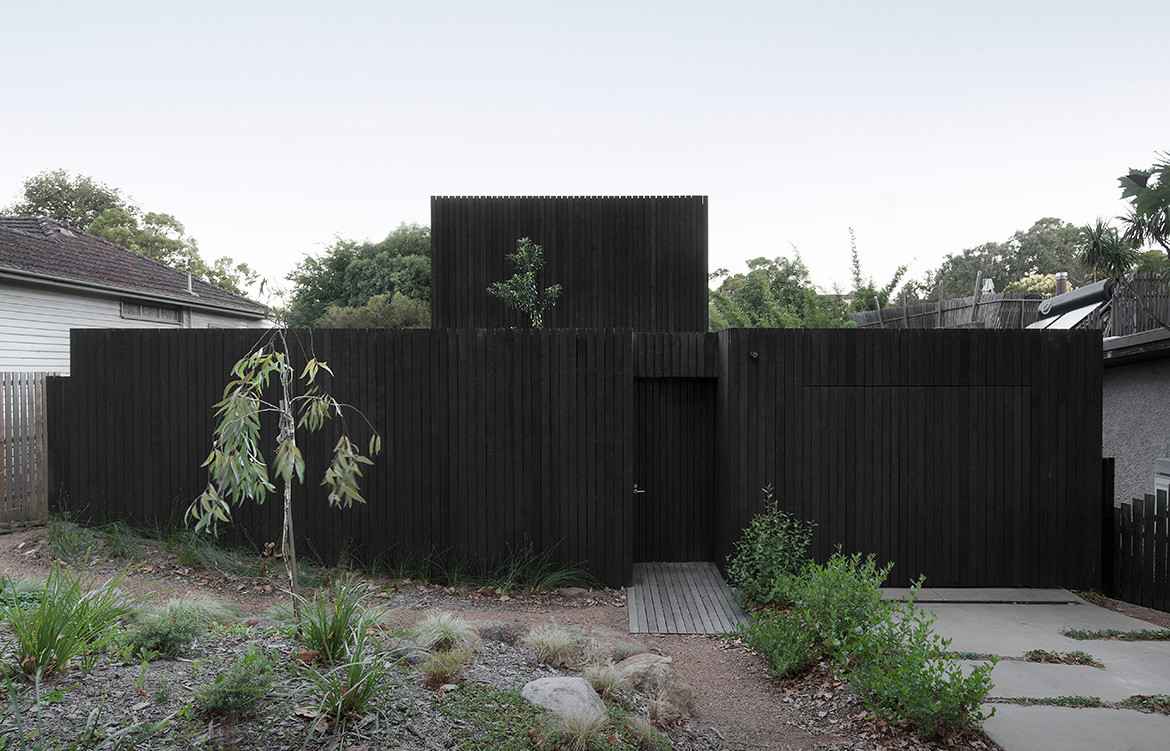
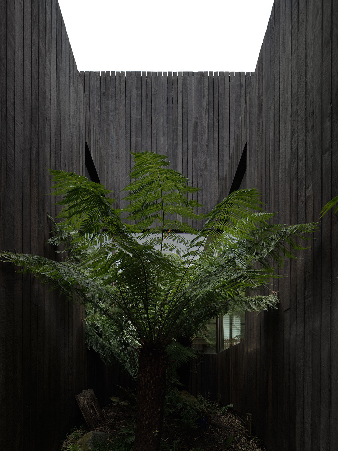
At first glance, this project presents a compelling street interface with a timber-wrapped façade. A closer look reveals a little tree popping up from the second storey. “People thought it was weeds in the gutter at first,” says architect Andrew Walter of Walter&Walter.
Rising resiliently, the little tree is gently softening what the neighbours first coined ‘the house with no windows’, adding intrigue about what lies beyond the anonymous façade of this project in Alphington, Melbourne.
This is a house that surprises on many levels. As well as its stunning location at the gateway of parks, reserves, nature trails and the Yarra River, it directly backs onto the rolling hills of Coate Park. It has been designed to open and reveal itself with a restrained simplicity that works hard behind the scenes.
Robert and Michaela bought the house in 2009, mesmerised by those rear park views. They had always wished to settle down in the inner suburbs, however with this one they had a lot of work to do: the existing 1940s double brick deceased estate was unliveable and contained nothing architecturally salvageable.
“It was on a block that sloped from front to back and side to side,” says Robert. “But then we looked back at the house from the hill, and decided it was a beautiful location for us to raise a family.”
For architect, the project offered an opportunity to explore issues that impact the environments and contexts we inhabit every day. For example, Robert and Michaela were passionate about connecting the house to the ground where possible. This led to meticulous thinking around every detail and finish to allow the landscape to feature without distraction.
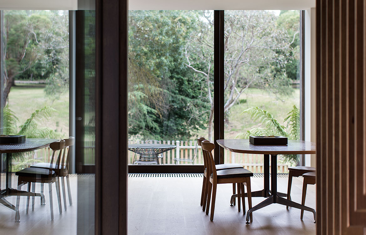
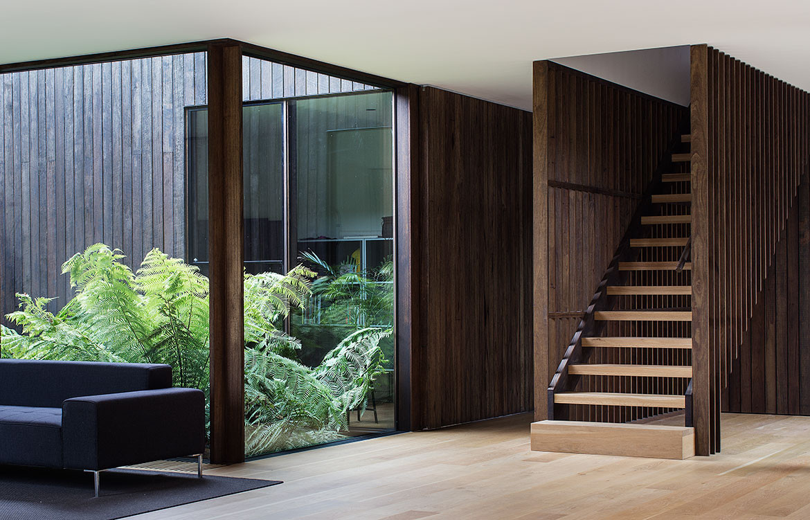
“This is when you realise that design makes all the difference; thinking something through and resolving it well,” says Robert. Although the house has quite a strong façade, it begins to unravel immediately upon entry, where the silver top ash timber façade offers light-filled glimpses into little courtyards off a central hallway.
A courtyard on the left services a guest bedroom wing and Eva’s room (their eight-year-old daughter), while a massive door the length of the hallway slides along to reveal a laundry and study at one end, and a garage at the other.
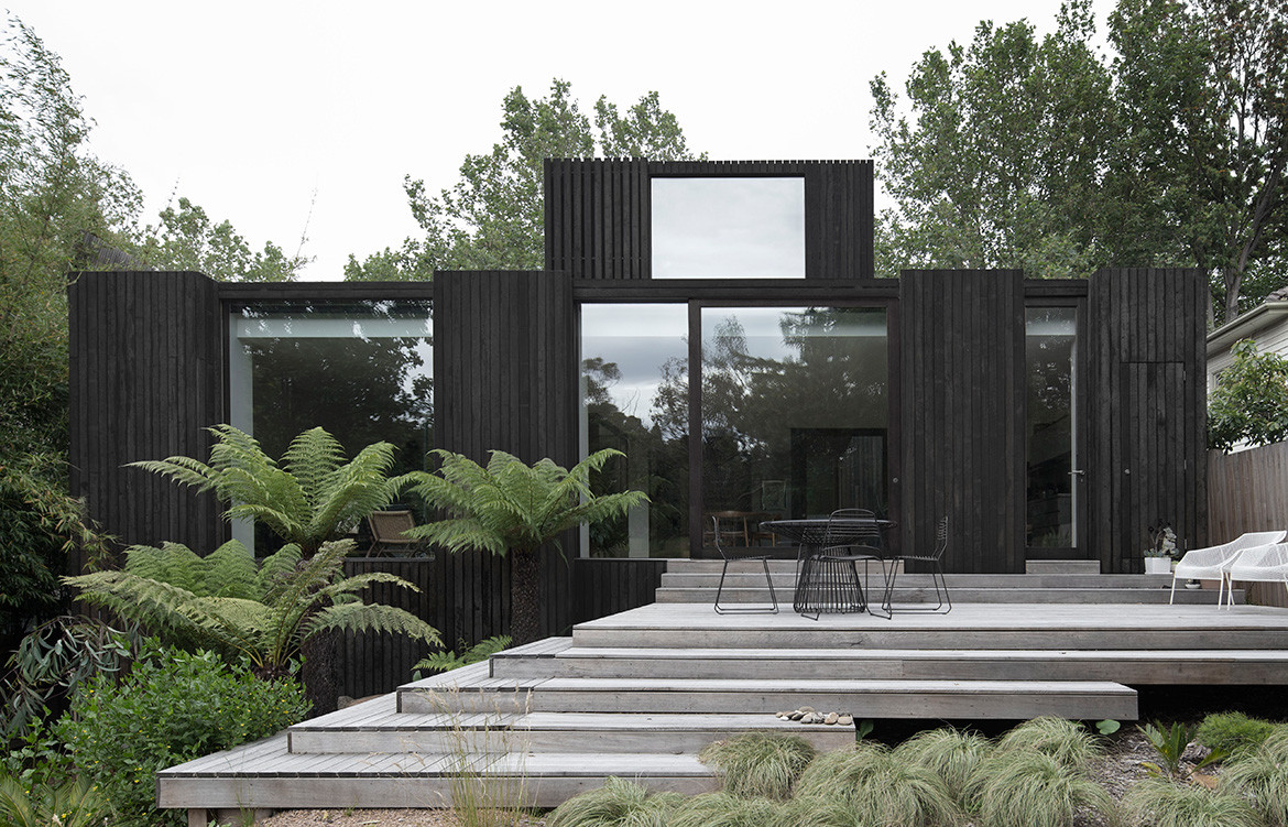
Then, the entire house spreads open seamlessly at the rear. A kitchen, dining and living room each focus on the park view through big deep windows, and there are a further two courtyards on each side of the house at various floor levels and with different landscape treatments.
“When all the doors are fully open, it really does feel like you’re outside with only a roof for shelter above, and that’s one of my favourite qualities,” Andrew says.
Outside, the sloping block and flood plain are mitigated by a seating deck and cascading steps down to a vegetable garden surrounded by native landscaping. “The steps, decks and landscaping all work together to help the house feel connected to the ground,” he continues.
There’s also a semi-permeable back fence and side fencing which neatly precludes dogs playing in the park from running into their garden, without closing off the space entirely.
“The house doesn’t turn its back on anyone or anything, which is uncommon for houses in the suburbs,” says Andrew. “There is that openness and generosity towards the neighbours.”
Resolving these spaces to expand and contract effortlessly involved a huge amount of detail.
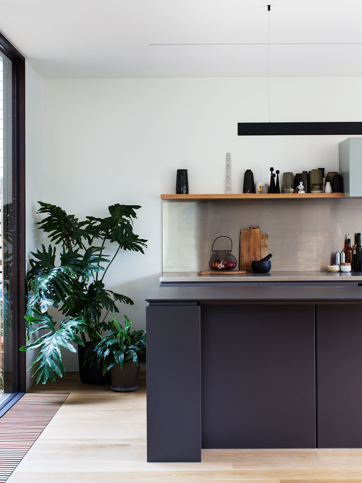
As an ex-chef, Robert influenced every area within the kitchen so that the layout would be perfected for their individualised needs and experience of the space. Walter and Michaela guided the tactile experience so the materiality was just right. Cupboards were conceived as objects and furniture, sans handles on drawers.
The minimal rear windows were also carefully considered and built by hand. The windows are separated by deep reveals which frame specific views to the parklands beyond. Cleverly, they are not just structural walls, but rather functional spaces. One becomes a space for kitchen storage and one has a pivoting door that conceals the living room entertainment system. The ceiling has the same treatment, bare and uncluttered, with minimal concealed lighting allowing for pendants to feature in the space instead.
“It was all about removing a lot of the distractions,” says Andrew. “You’re really trying to control how the landscape integrates with the inside spaces.”
But there’s playfulness too. For example, much discussion ensued about the stair remaining open or closed, and at the last minute it was left open, which revealed a nook beneath that Eva now plays in. Upstairs, the master bedroom and bathroom are designed as a parents’ retreat with heroic views over the park. Downstairs, the living area is able to be reconfigured, with various indoor plants that can move around.
“Things are allowed to evolve; openness and blurred edges allow things to move and change over the course of the years,” says Andrew.
That’s the joy of this project; it takes you on a journey. Coming in off the main road, the sense of surrounding natural beauty is ever-changing, and that flows through to every nook and niche of the house, enabling the family to live with a connection to the seasons and enhancing the way they cook, work and relax.
“That idea flowed through a lot of the architecture as well so there’s moments where you transition from work to home – from every day to your little calm retreat,” says Andrew. “You just feel like you’re going somewhere else.”
Walter&Walter
walterwalter.com.au
Photography by Benjamin Hosking
Dissection Information
Solid American Oak floors in a natural oil finish
Limestone cut to measure with Lithofin sealer from CDK Stone
Barrique bathroom tiles by Cerdomus Tile Studio
Custom timber floor grilles and custom timber windows manufactured and finished by Fido Projects
Double glazed units by Viridian Glass
Custom joinery in kitchen by Orana Designer Kitchens
Custom stainless steel benchtops
Dekton kitchen island benchtop in Sirius
Custom shelving in reclaimed Blackbutt
Sustainably sourced rough sawn Silvertop Ash decking
CH 25 Easy chair by Hans Wegner
CH30 dining chair by Hans Wegner
Charles and Ray Eames Oval dining table for Herman Miller
Vintage sofa by B&B Italia
Freestanding shelving units from USM
Outdoor furniture from Tait
FLOS Luminator floor lamp, Parentesi suspension light, and String Light in Round from Euroluce
TAL, Lumino, Xlux and Multo Luce downlights and recessed LED fittings from Light Project
Tonic wall mixer, Fantini Milano shower head, Fantini Mare basin mixer, and Matrix pan from Rogerseller
Combair SL Black Glass oven, Combi-Steam XSL Stainless Steel steam oven, warming drawer, and 5 Zone Gas Hob cooktop from V-ZUG
Concealed rangehood from Qasair
Fully intergrated G 6660 SCVi dishwasher from Miele
Double dish bowl sink by Barazza
Waste management system from Franke
