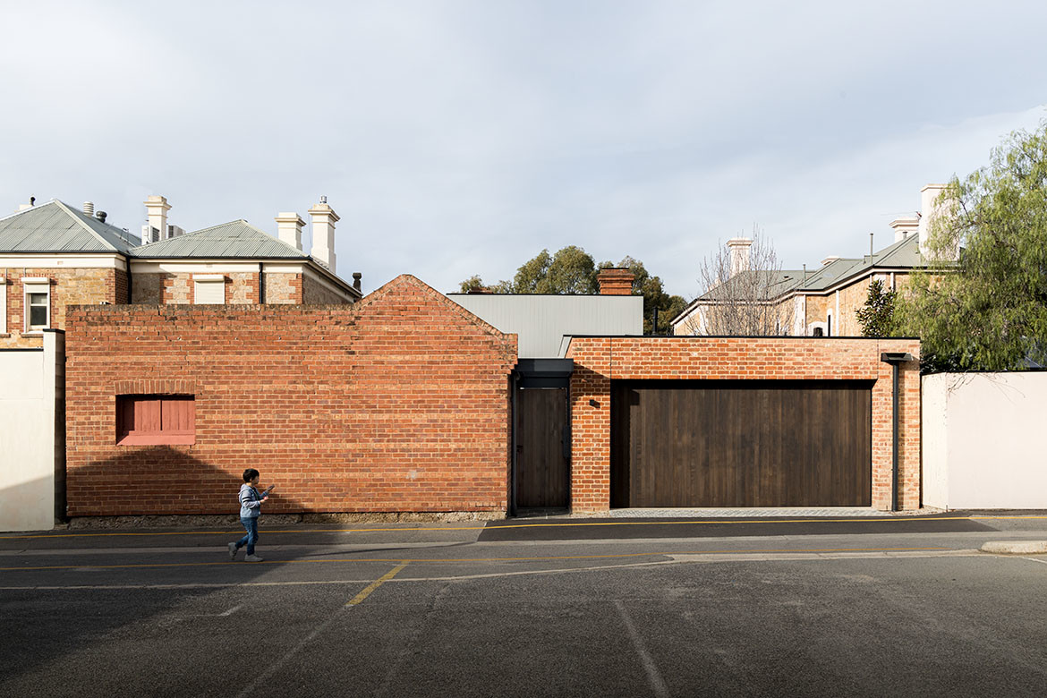
Set overlooking a loop of lush and native parklands, Adelaide Residence is a newly renovated and restored home, enriched through a considered and highly personalised approach.
Working closely and collaboratively with Williams Burton Leopardi, an entrusting client collates reminders of chapters past, in readying for his future. “I wanted to keep everything that I had previously enjoyed, and had a connection to,” he says, “and I wanted to see and be able to interact with them as I moved through the house.”
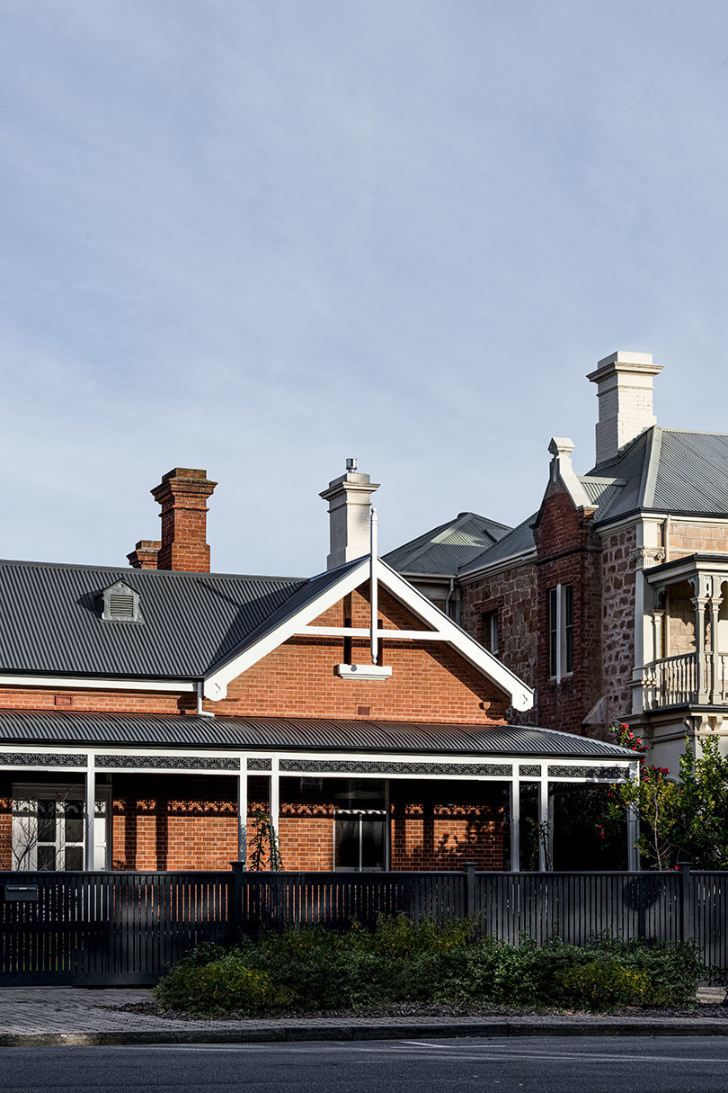
While the process saw a significant downsizing, the heritage Edwardian home was previously used as the client’s examination rooms before retirement.
Already familiar with the spaces, the owner’s relationship with the house, along with the architecture, has undergone an evolution, being transformed through light, aspect and materiality.
“It’s very much a building that is experienced from the inside out,” describes David Burton, director, Williams Burton Leopardi. “It is about trying to create this idea of framing, but retaining a sense of volume inside, capturing the essence of the existing home and its proportions and grandeur.”
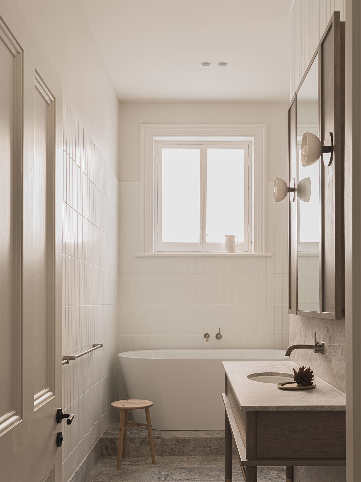
Although a generous family home, the focus was on retaining the original charm and detail while creating intimate moments to ensure an embedded warmth. The original home was restored and renovated, and an addition to the rear ensures a considered and holistic use of the site as a collective.
“Our approach focused on how the new worked with the existing,” adds Sophia Leopardi, director, Williams Burton Leopardi, “and how the interior itself frames views back to the existing build, connecting to the urban surroundings and looking through openings to the older established buildings surrounding the home.”
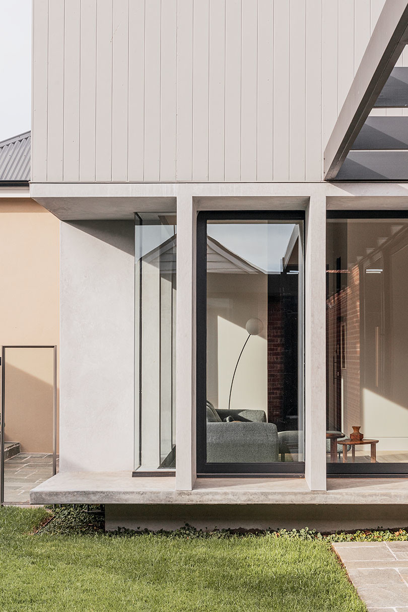
Layers of old and new elements combine to create intimate moments when journeying across the site. The addition sits in the middle, bookended by original brick stables at the rear and a heritage home at the front.
“It’s not a conventional glass box,” adds Burton, “because our deliberate continuum of scale and the idea of picking and framing views, ensures there is a depth created in the fenestration that reveals and positions a unique capture of light, while maintaining connections that reinforce a sense of solidity.”
Through a rigorous process, the architects tested whether to extend upward or outward, ultimately landing on its restrained approach. Key to the success of the home was, as the client says, “to retain the homey feel it always had”. Adelaide Residence is a unique expression of time in the way that it retains an essence of the dwelling’s past while also bringing forward elements of its owner’s own past.
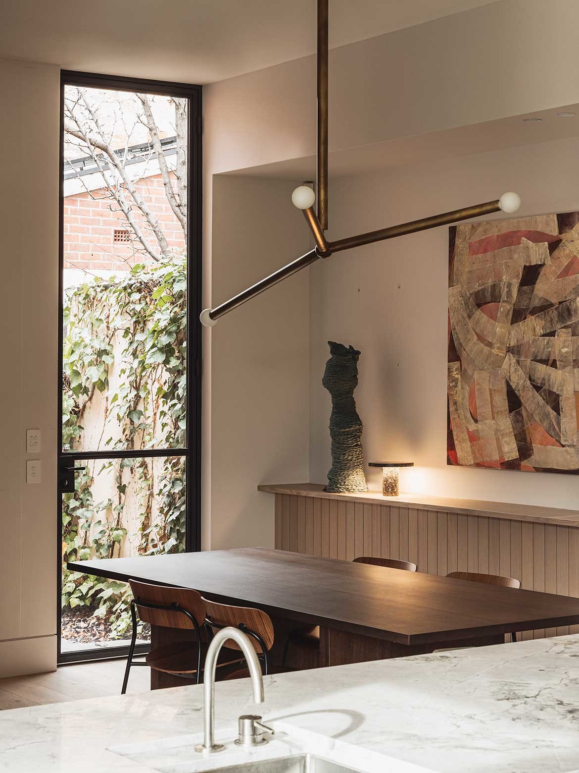
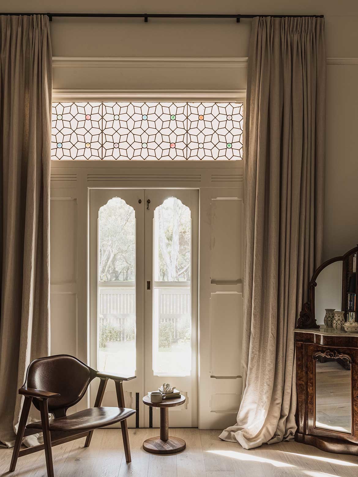
Bringing light fittings, roses, irises, furniture and artwork, so much of the owner’s previous residence is woven into the fabric of the new. “My wife and I had a big family home with our three children,” the owner notes, “and we wanted the pieces from the old villa to be kept and to curate a new collection.”
While older pieces suited the ornate detailing of the original home, there is a sense of transition that subtly changes moving toward the addition. “With the artwork, sculptures and furniture,” he adds, “we arranged more traditional pieces at the front, and more modern pieces at the back, and only purchased very few new pieces in the end.”
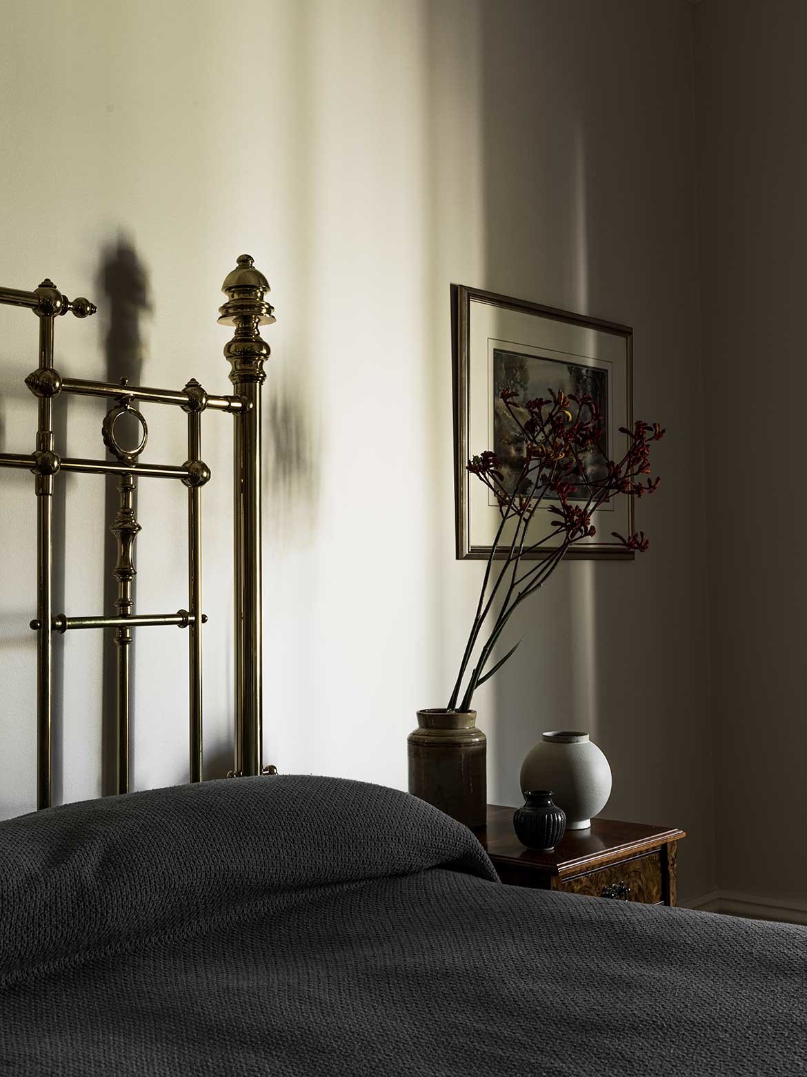
Key to the intertwining of styles was allowing for the two to coexist harmoniously with one another. “Leaving enough visual space for the elements that were being brought forward formed our approach,” Leopardi adds. “Including all of the new materials, there needed to be an element of sympathy and understanding of what was coming and express a complementary contrast as they all came together.”
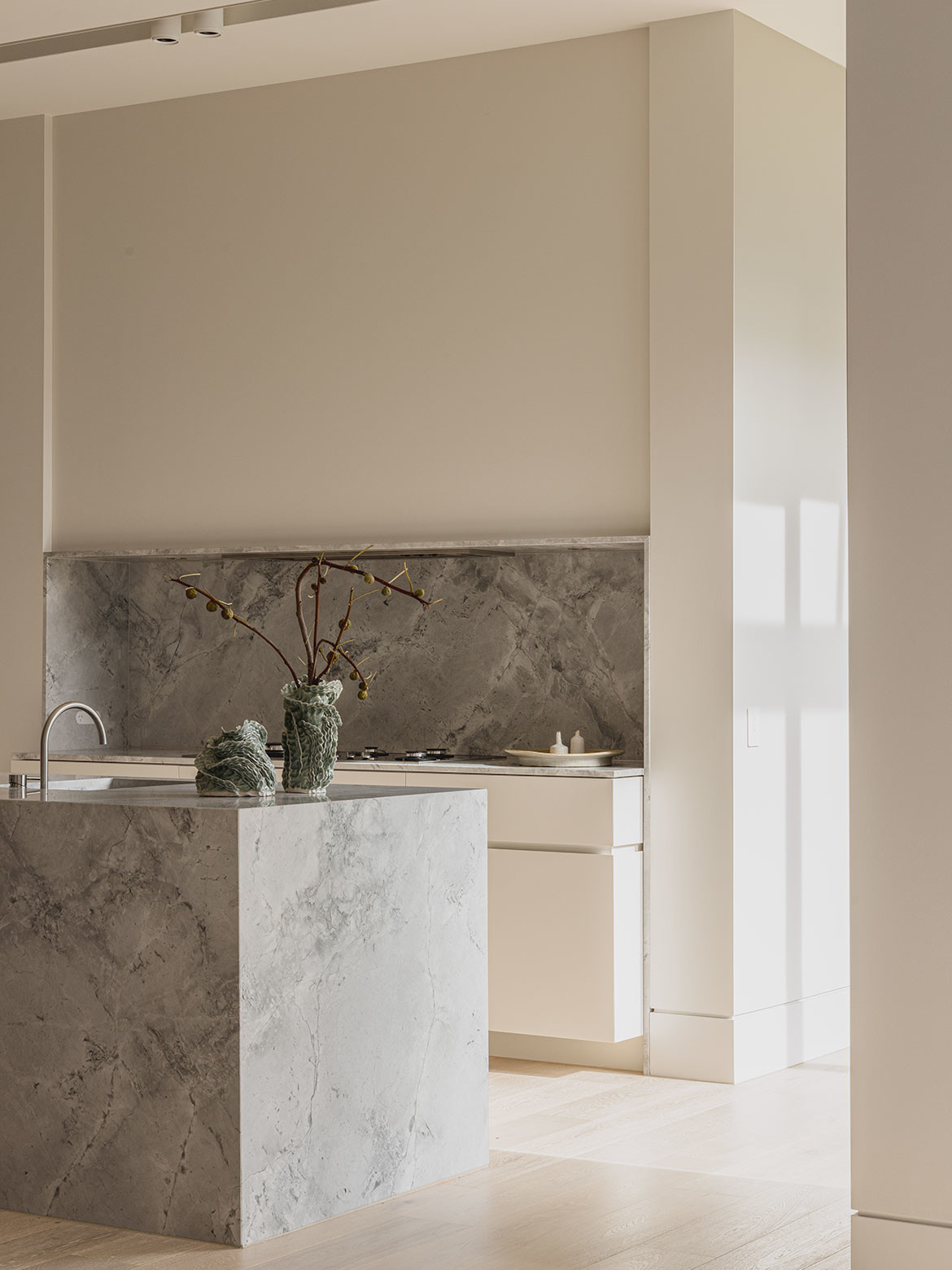
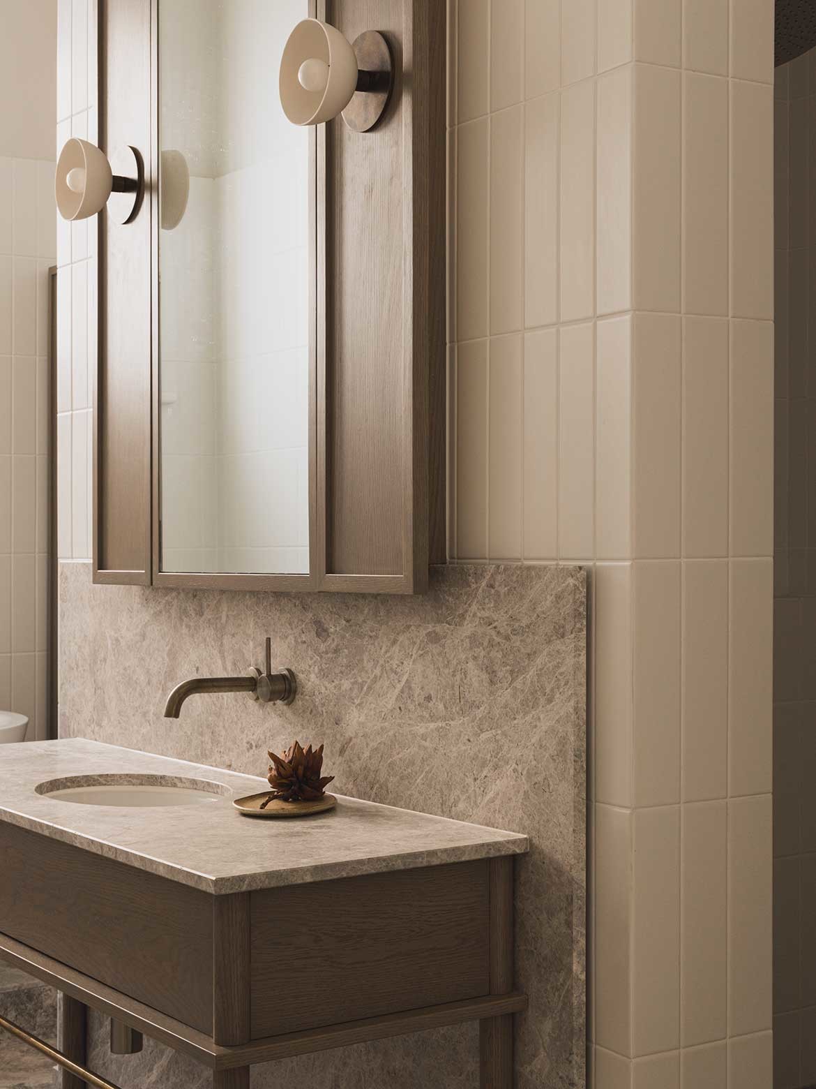
The planning and composition ensure connections both to the landscape and to the parklands, with a direct view from the kitchen and dining. “The kitchen and all of the new elements were distilled,” Leopardi adds, “to allow space for collected items and pieces of furniture to sit beautifully within the space, allowing them to just ‘be’.”
Defined by what was added and retained, Adelaide Residence is a home formed on balance and the creation of a space uniquely responding to how its owner wanted to live. “Restraint ultimately underpins what was done,” Leopardi says, “and from an emotional level, it’s about a framework to set up the next chapter that allows for the memories and stories embedded into all of the pieces being brought forward and captured in the new.”
Project details
Architecture and interiors – Williams Burton Leopardi
Photography – Caroline Cameron
Builder – Bower Construction and Design
Landscaping – Lee Gray Landscape Design
Joiner – Admor Joinery
Engineer – Meinhardt
We think you would love this heritage project, also by Williams Burton Leopardi. This article originally appeared in issue #53 of Habitus – the Art issue.
