Woollahra House is home to a couple who both have a keen interest in art and architecture. Having moved from a larger family home to an 1860s semi-attached terrace, they engaged Nobbs Radford Architects to redesign the interior and rear exterior, bringing in natural light and creating openness. “The clients wanted the sense of a ‘grand gesture’ that would lift the house beyond its functional requirements. To have spaces to nestle and read a book or sit and talk to others – all of the activities that enhance life in a house,” says Sean Radford, principal at Nobbs Radford.
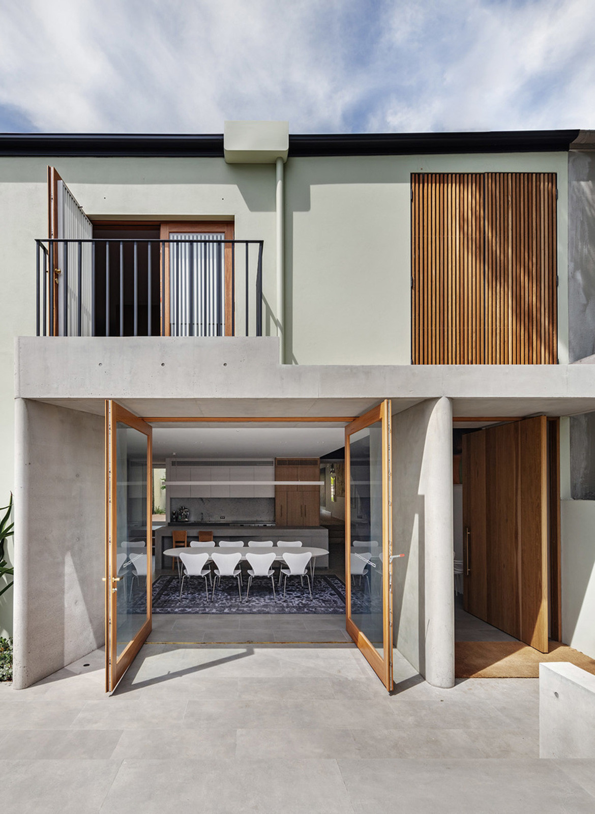
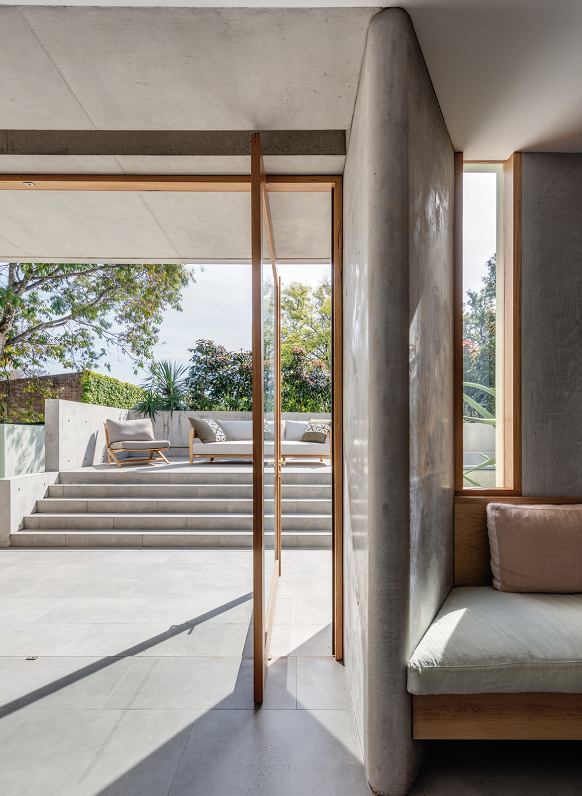
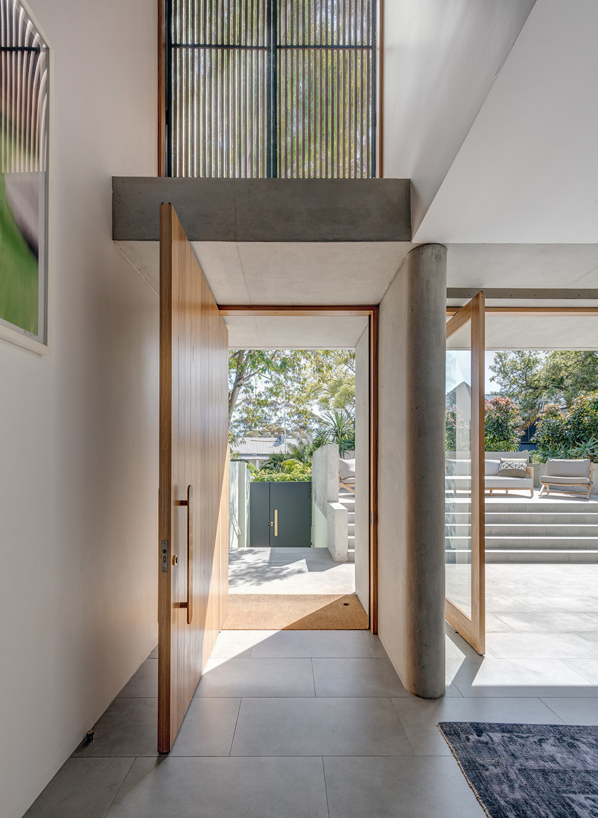
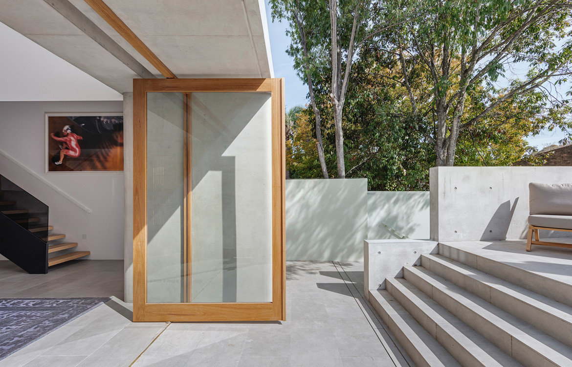
The house fronts two streets, retaining its Victorian-era façade at the formal entry. The rear of the house is now defined by an exaggerated concrete portico that provides a threshold and protective cover for arrival and accessing the terrace from the dining area. Its deep, chamfered, sculptural columns have a smooth curvilinear finish, while the roof serves as an upstairs balcony. The use of concrete is inspired by the masonry of the existing house, and the form is derived from creating a softer sense of the monumental material. “The column in classical architecture represents the body. It also relates to the body in space and how one moves through space,” says Sean. “We consider the threshold and the space ‘in-between’ as an opportunity to connect with the environment whilst maintaining a sense of enclosure, much like the traditional porch or colonnade.” Large glass and timber doors pivot beneath the portico to open the interior to the terrace, with large-format porcelain tiles continuing outside.
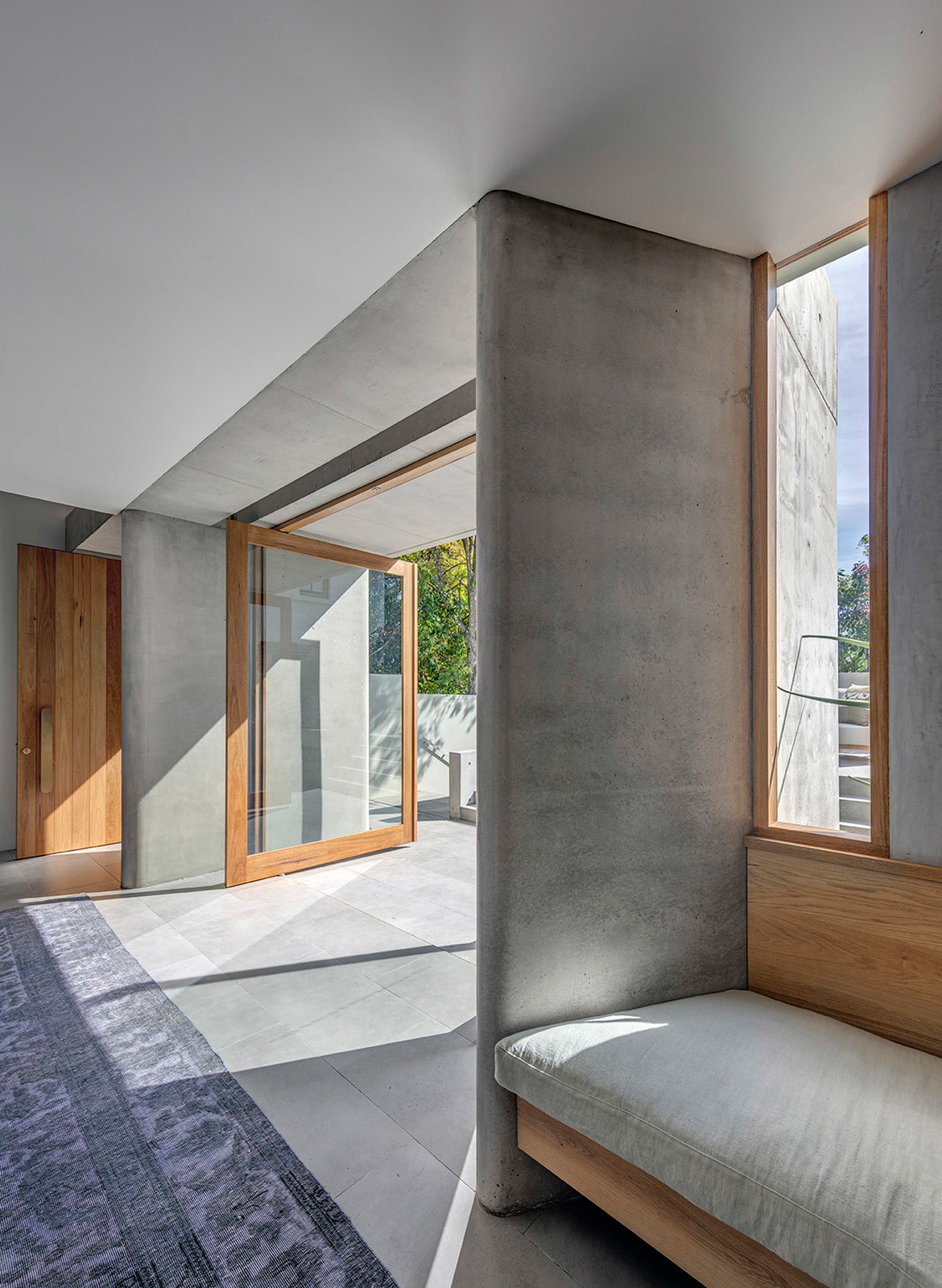
A built-in timber bench extends the length of the kitchen and dining area, from the steps at the front of the house, to wrap around the corner created by the portico column. Timber screens filter light along the bench, and it provides social and solitary places to sit. “One is drawn towards these forms and the introduction of seating specifically designed for the form creates the opportunity to dwell in this space,” says Sean. “This seemingly small inclusion has become such an important part of being in this room and how one relates to others within it.”
“The clients wanted the sense of a ‘grand gesture’ that would lift the house beyond its functional requirements.”
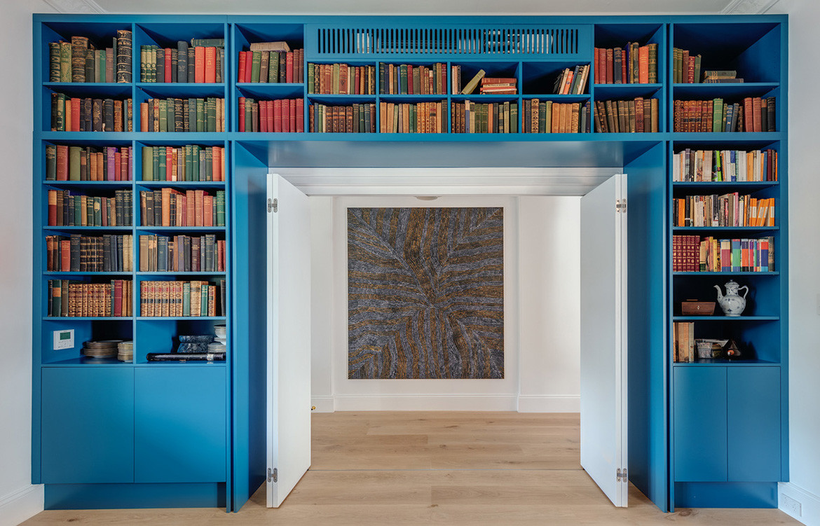
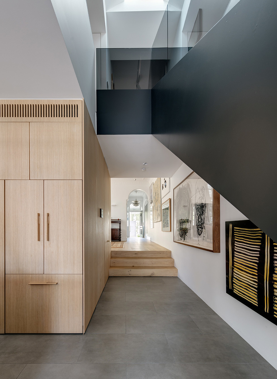
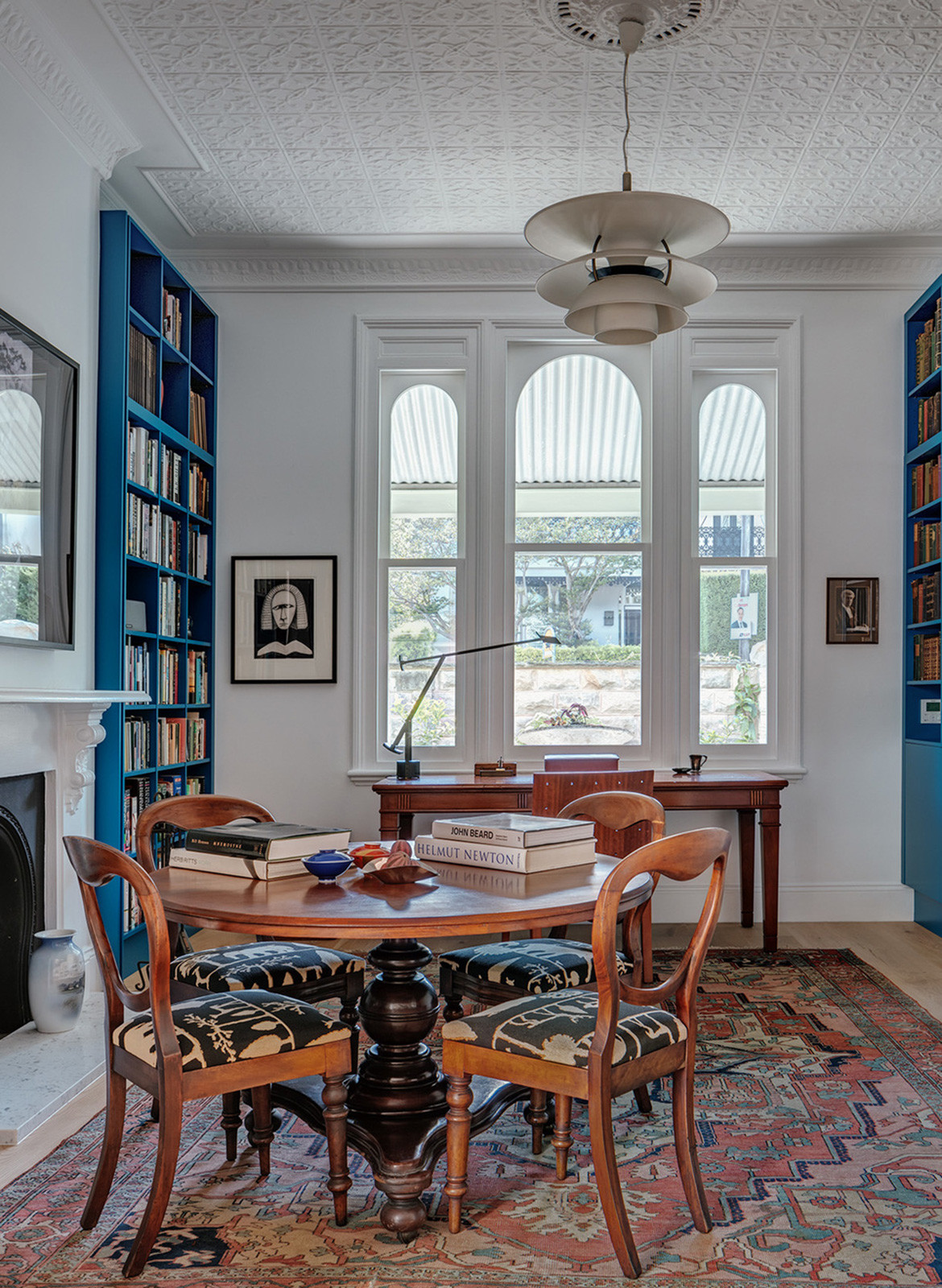
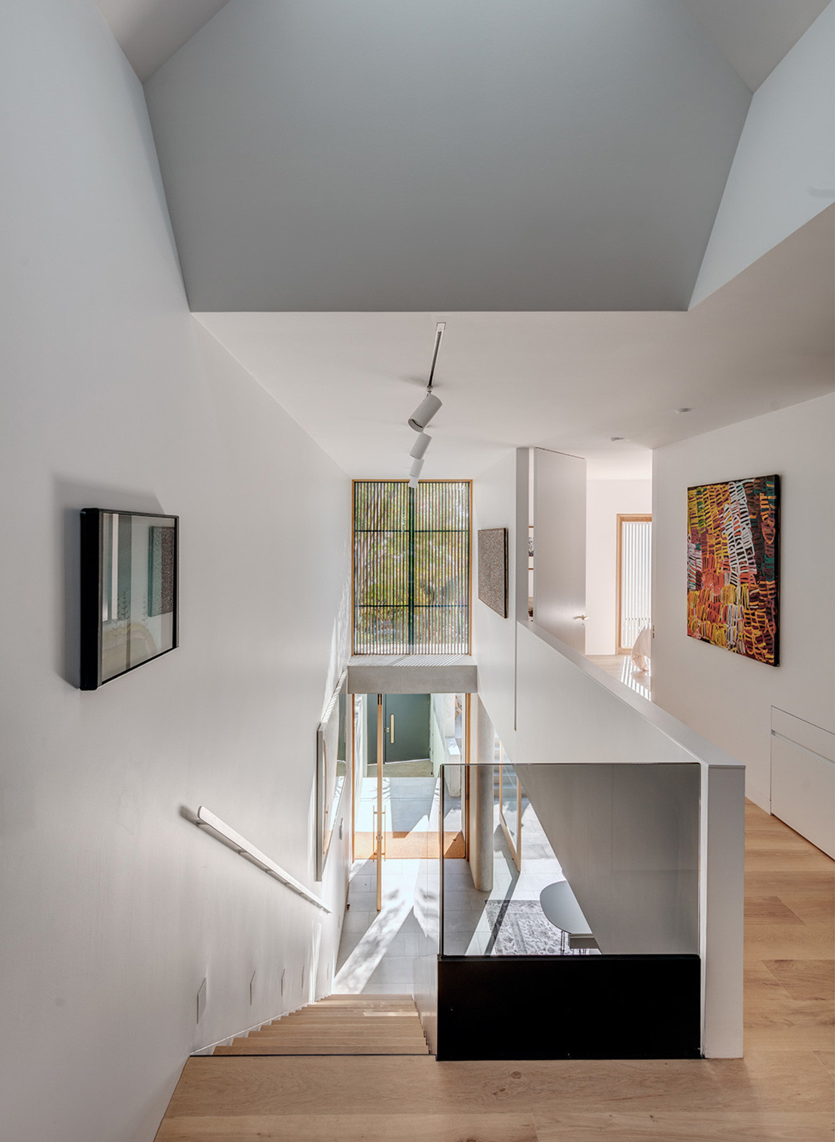
Removing the original staircase from the centre of the house has increased the area of the living room, which steps up from the kitchen and dining area. The front room of the house is now a study with integrated blue bookshelves surrounding the threshold and framing an artwork that hangs in the hallway. Artwork adorns the walls throughout the house in fact, and the void created by the new steel and timber stair functions as a gallery.
“Designing for activities in a way that is not overly prescriptive but makes the most of potential variety is an important part of work,” says Sean. Indeed, through form, materiality, light and volume, Nobbs Radford has created varied and surprising places of habitation, often focusing on the place “in-between.”
Nobbs Radford Architects
nobbsradford.com.au
Photography by Murray Fredericks
Dissection Information
300mm Oak flooring
Bespoke oversized windows with Blackbutt and painted Cedar
Aster Mercury porcelain panel from Artedomus
Carrara marble
Stainless steel
White bathroom tiles from Cementa
Grey kitchen and dining tiles from Cementa
Wall tiles from Haper Marble
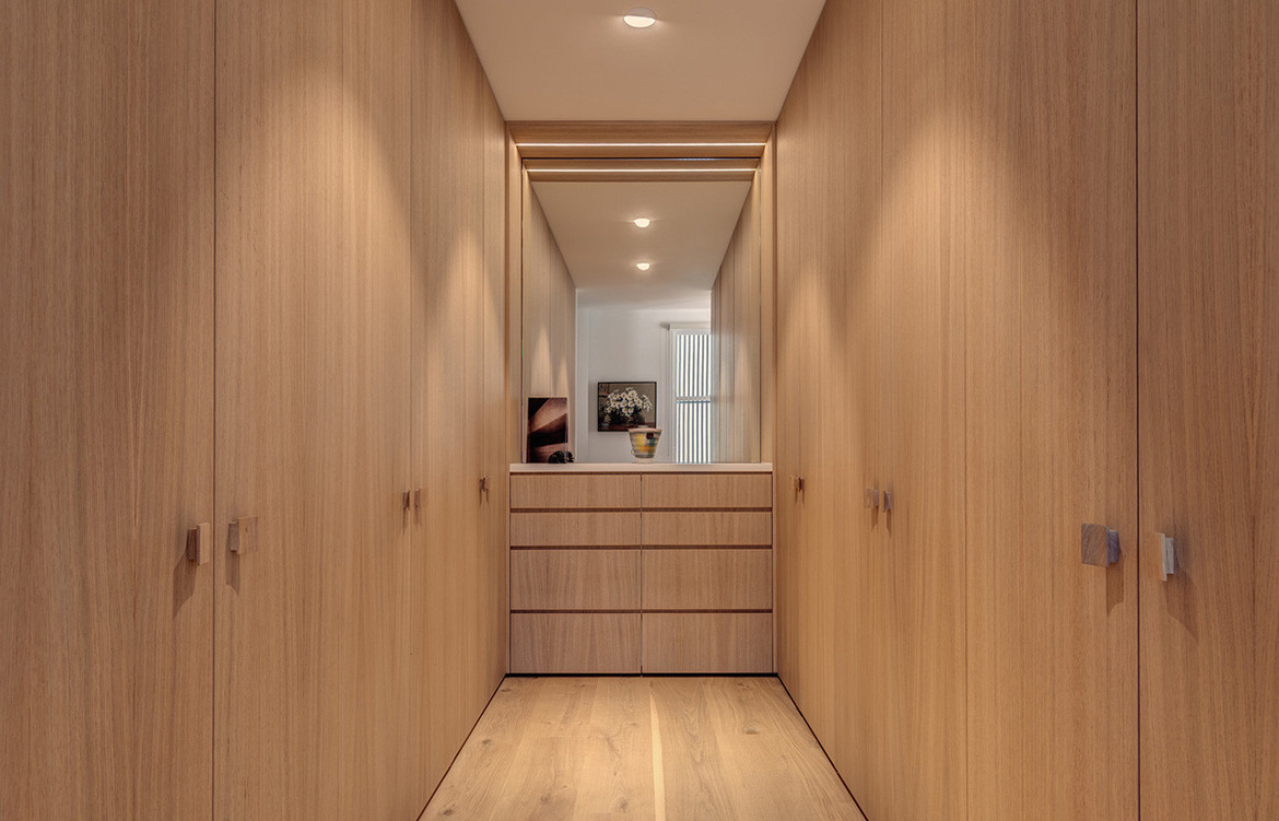
Veneer joinery in European Oak
Oven and warmer from Smeg
Dishwasher, washer and dryer by Miele
Cooktop from Siemens
Rangehood from Falmec Milano
Refrigerator from Fisher & Paykel
Basins by Omvivo Neo
Tapware by Brodware in Halo and Vola
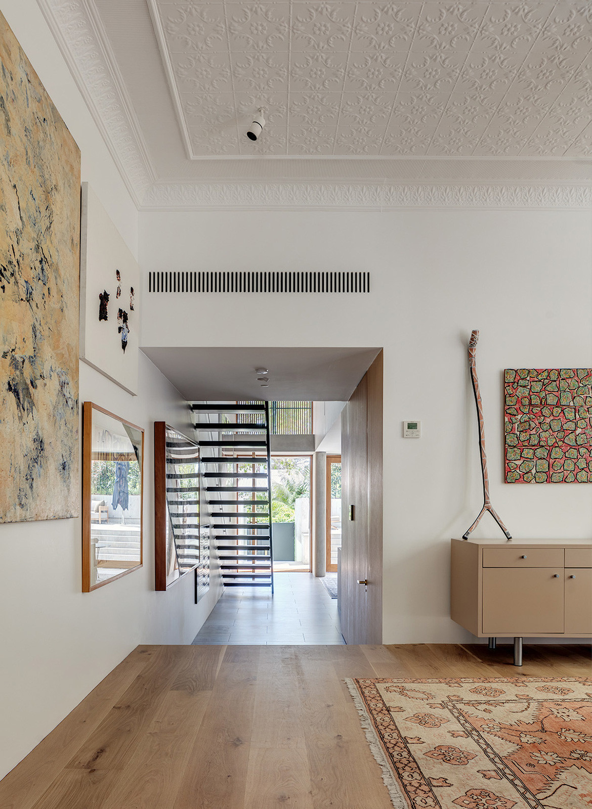
The void created by the new steel and timber stair functions as a gallery.
We think you might also like Mosman Residence by Daniel Boddam
