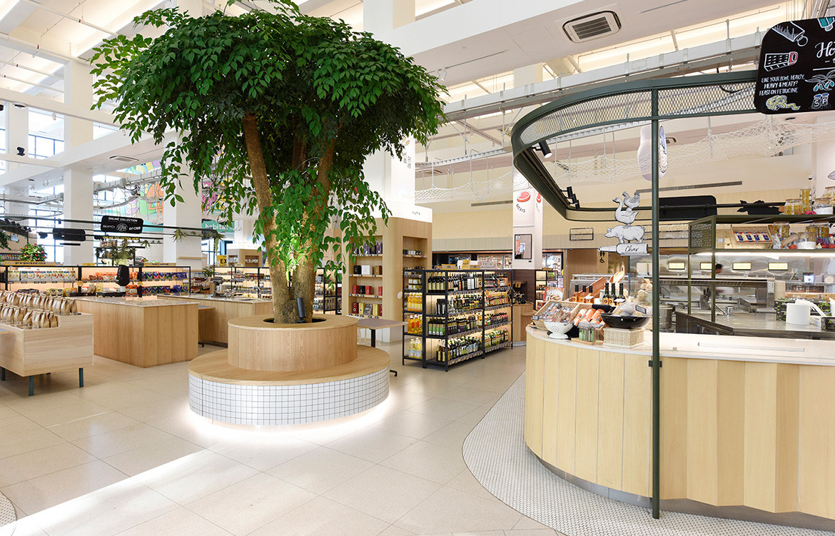
There has been a great debate on the fate of brick-and-mortar retail in our digital world. And the general consensus is that it is a half-full, half-empty glass situation. The shift toward online shopping does put a huge strain on traditional retail, but with that challenge also comes myriad of opportunities for retailers and designers to invent new spaces and new ways to engage customers. One of these new spaces is Habitat by Honestbee. Designed by Wynk Collaborative (who also designed the Honestbee office in 2016) and launched in October, Habitat by Honestbee is the physical embodiment of the app-based company’s grocery shopping service.
Grocery shopping used to be a chore. Thanks to online supermarkets, grocery shopping apps and their various free delivery promos, this chore has been made considerably easier in our digital world. “So how do you craft a new experience to attract and retain customers? That was the gist of the brief,” says Si Jian Xin, Design Partner at Wynk. “We wanted people to not just come to shop, eat and leave but also to hang out, bring friends and meet people here. We wanted this place to be more of a community space than a consumption space,” Si elaborates.
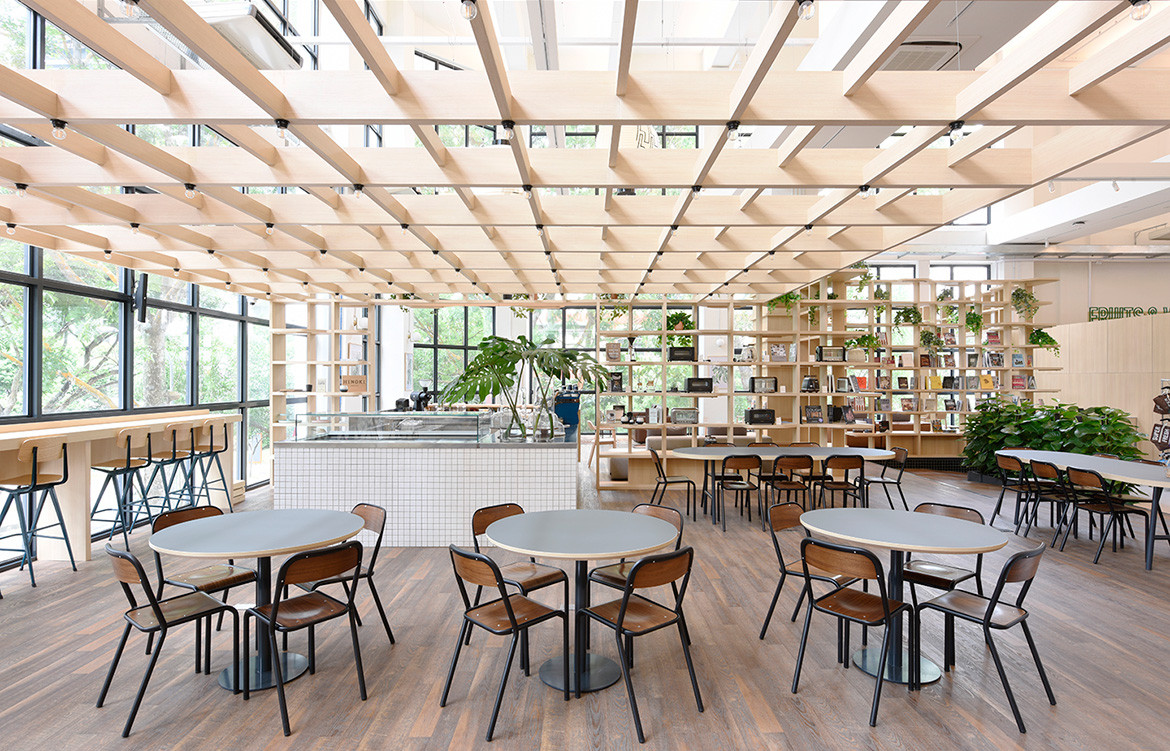
While putting retail and F&B concepts in one venue is a tried-and-tested design recipe, according to another Design Partner at Wynk Leong Hon Kit, in Honestbee’s case the brief is further layered with the need to integrate the app into the physical space. He says. “How would the app influence the space, and vice versa?” The design research involved an excursion to the markets in Paris and London, and extrapolating the experience with the consumer preference in Singapore. The concept emerged from the outing was to make the space feels like an open-air market, where one is free to meander and discover using the app as both an all-access pass and a wallet.
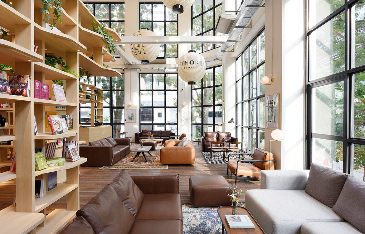
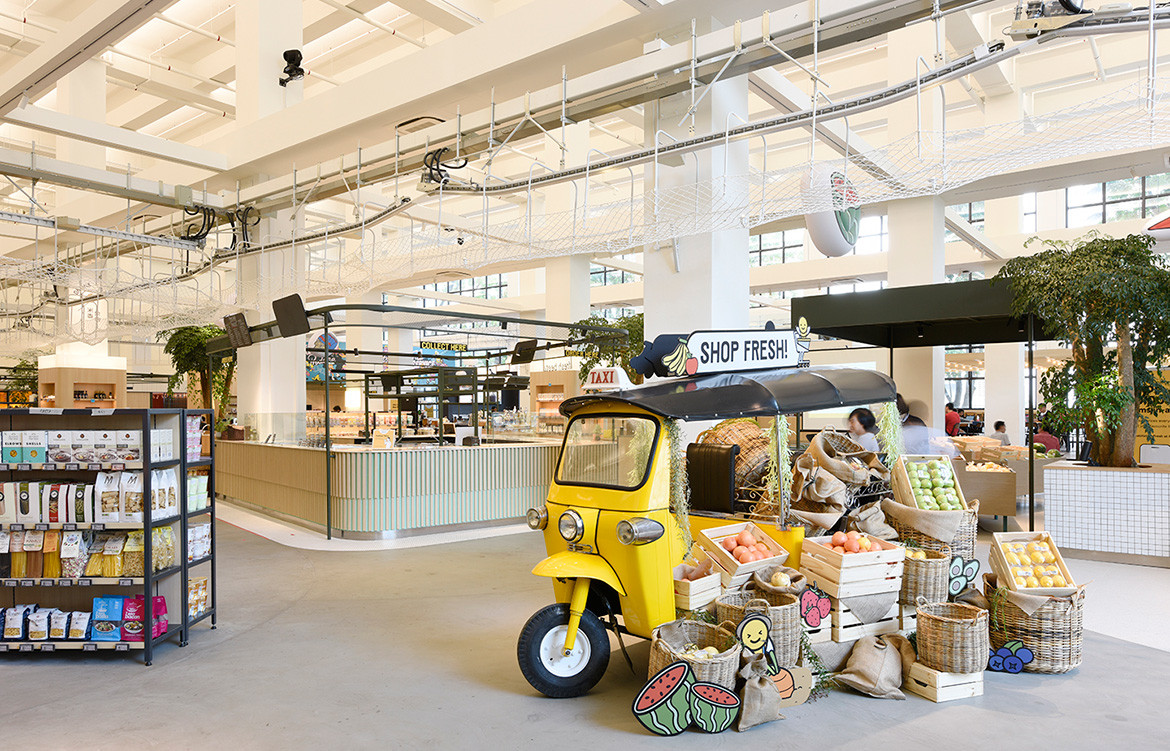
The architectural shell of Habitat by Honestbee was formerly a warehouse with ten-metre height encased in solid walls. Wynk evokes the feel of an open-air market by knocking down the solid walls and replacing them with generous glazed surfaces to bring the natural light in.
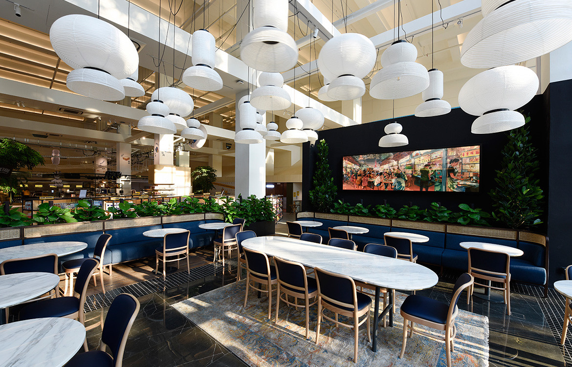
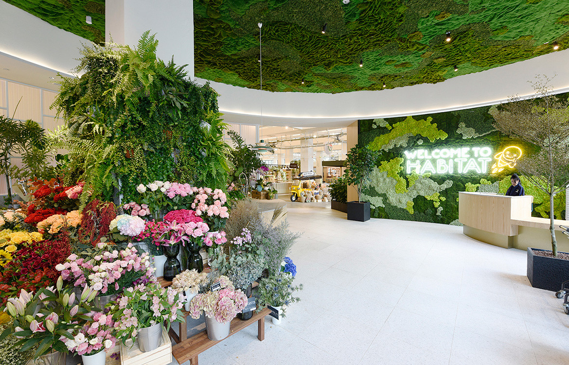
After scanning the app, shoppers enter the venue’s main space through a gallery of window displays that opens up to a bright, lofty space occupied by its florist concept Hanaya. The differences in scale and lighting between the two zones, and Hanaya’s floral décor and display, work wonderfully in tandem to set a festive welcome. The space beyond is dedicated to the fresh supermarket produce and no less than 15 F&B concepts. The loftiness of the space is retained by keeping everything – baring the café mezzanine that serves as a stage for live music – at the ground level.
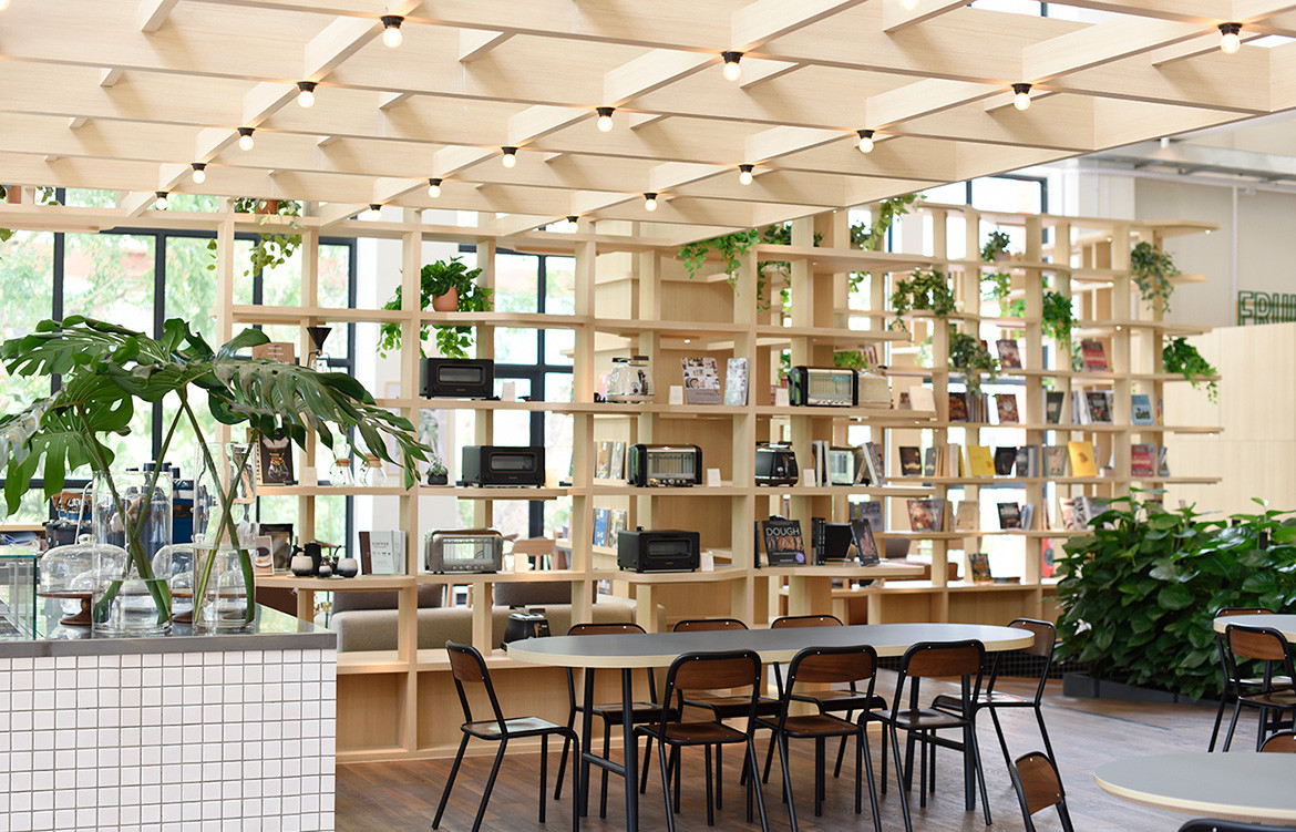
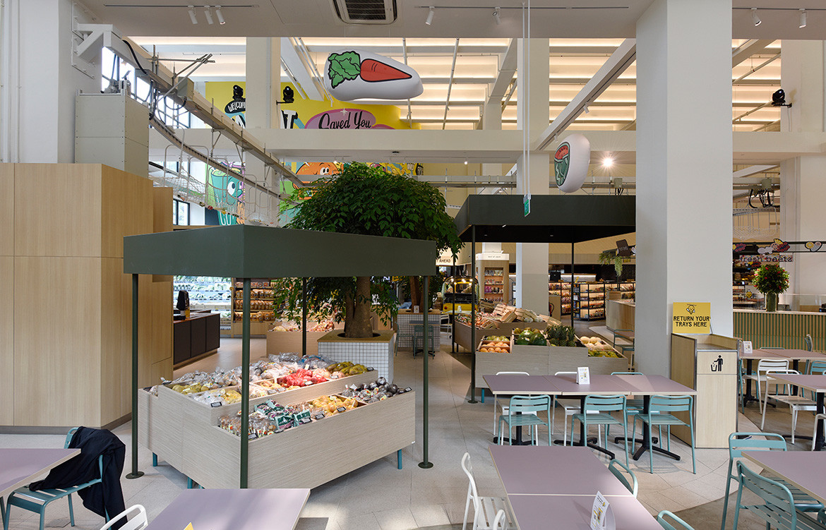
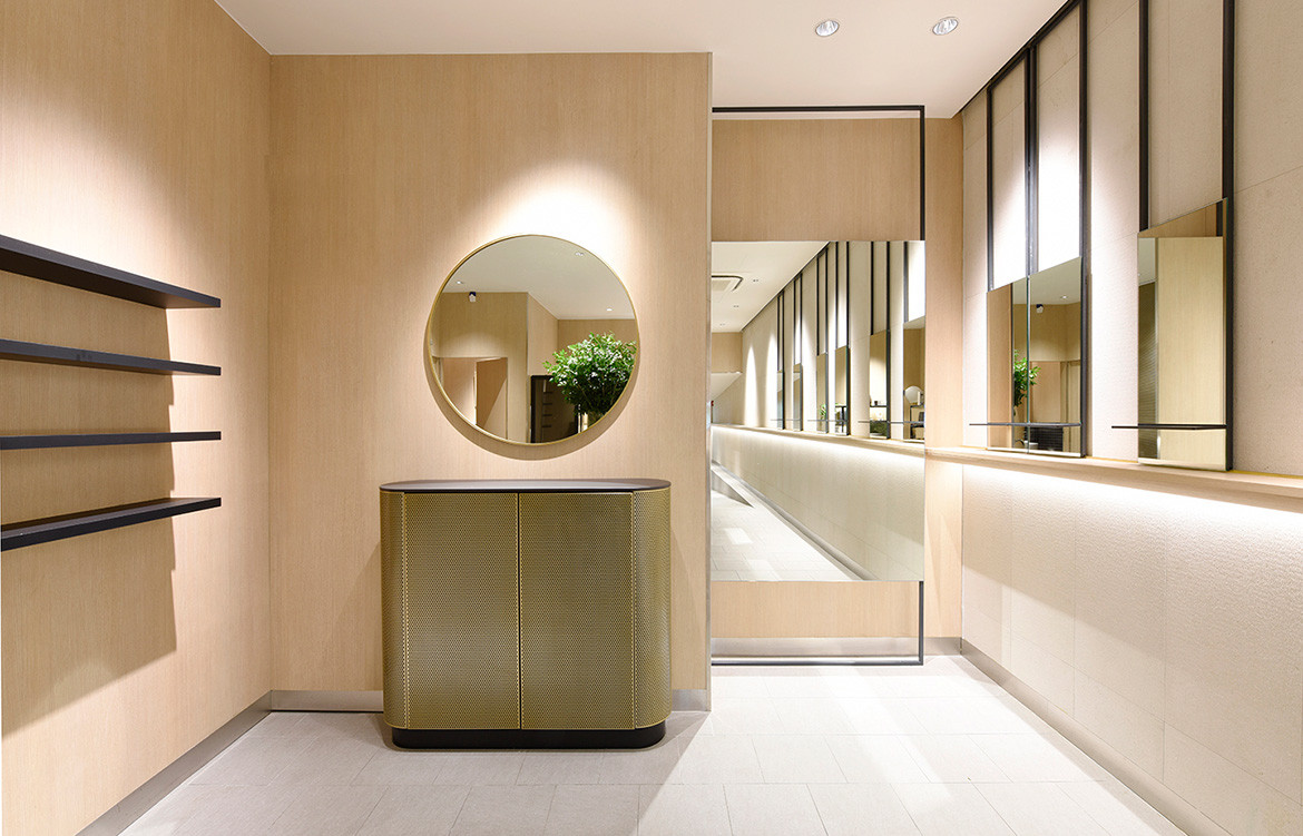
Display shelves, usually maximised to available are kept below 1.5-metre height, leaving the view unobstructed and enabling shoppers to quickly orient themselves. “The experience is very non-linear, both in the physical sense and the experiential sense,” says Leong. The F&B concepts are placed along the periphery of the interior, leaving the central part free from services. In addition to these F&B concepts, there are plenty of informal spaces that invite people to linger. You will not have a security guard shoo-ing you for sitting on a base of a bookcase at the bookstore, or on an empty nook that otherwise will be used to display products in the spirit room, like so often happens in conventional retail and supermarket environments. Even the banal act of waiting for a friend outside the toilet has been transformed into an experience with the way the space is done up like a beauty store, complete with moveable shelves displaying beauty product sold at the venue, of course.
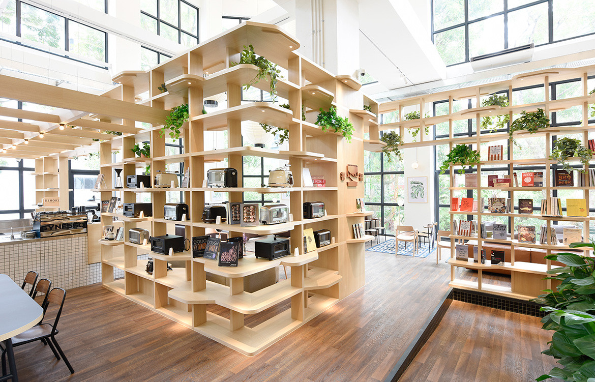
The material and colour palette is pared down to let the product shine, consisting of mostly pale wood and glazed tiles in pastel colours. “We refrained from being too specific to certain brands or identity, so the space will allow seasonal brands or display to take over or switch concepts whenever needed,” says Leong. “Like a spatial canvas for content,” adds Si. Some of the design elements created to accommodate the changing contents include the band of mesh on the upper part of the counters for signage, the curving corners of the counters that can serve as product displays, and the Bodega, a permanent pop-up space featuring perforated mesh shelves that can hosts a wide range of special exhibition and collaboration.
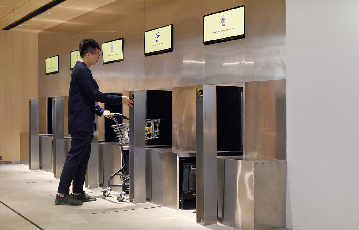
And what’s retail in the digital age without a little tech spectacle? Installed along the beam is a conveyor belt carrying shopping bags for online shoppers. The checkout experience offers two world firsts: a cashless auto checkout process where you push through your cart for packing, and a robotic collection point where you collect the shopping bags from robotic shelves. The word ‘Instagrammable’ also comes to mind. Asked if it is a requirement for retail this days, Si demurs, “It is inevitable, but ultimately people will want to take photos in a nice space. So we will always strive to create a nice space.”
Wynk Collaborative
wynkcollaborative.com
Habitat by Honestbee
habitat.honestbee.sg
Photography by Jovian Lim and courtesy of Wynk Collaborative.
We also think you might like Retreat Yoga by KCA.
