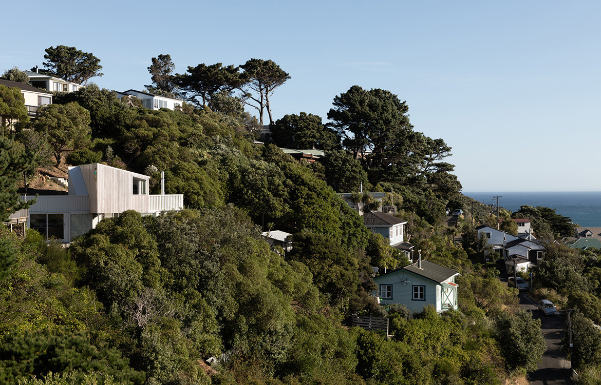
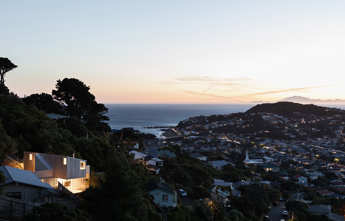
Right from the outset this project was never going to be an easy, run-of-the-mill undertaking. Located on the hills of Wellington, just up from Lyall Bay, the site was exposed, extremely steep, and accessed via a long and narrow pathway from the road, just 1-metre wide. But as ever, Spacecraft Architects were up for the challenge.
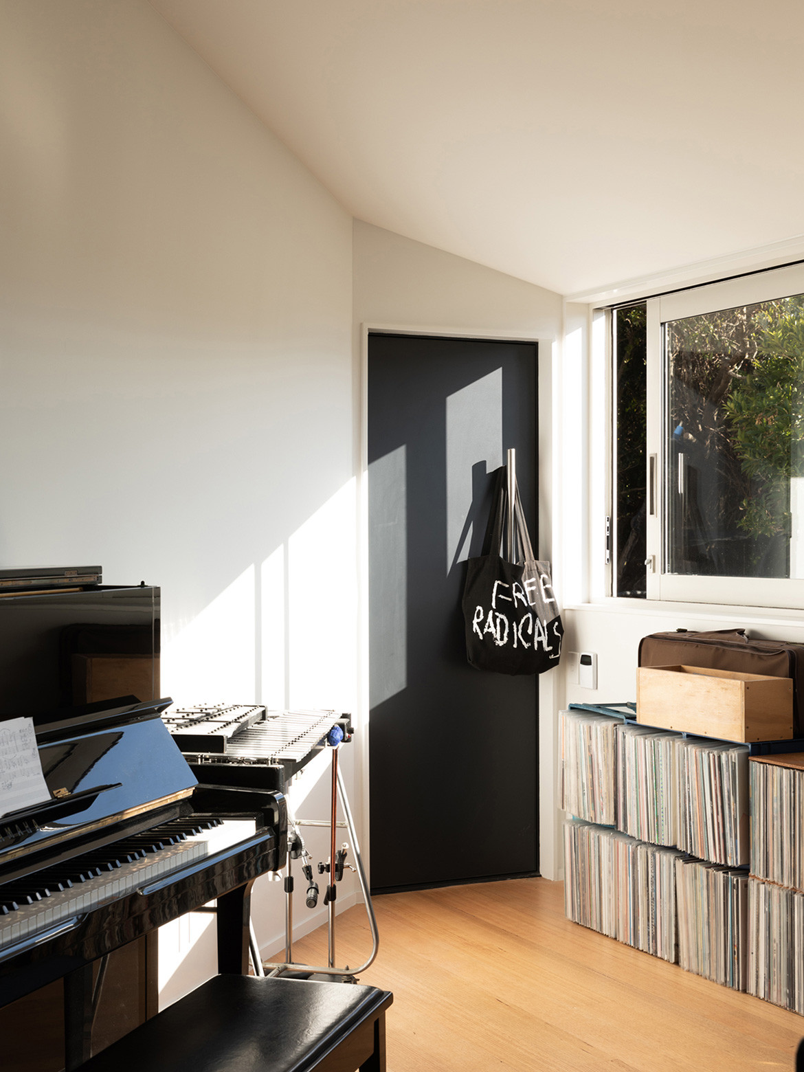
The clients and occupants, Holly Beals and Grayson Gilmour, were known to Spacecraft Architects, good friends of Tim Gittos and Caroline Robertson for a number of years. Holly originally trained as an interior designer and now works as an industrial and furniture designer. Grayson is an independent musician and film score composer. Although the four of them hadn’t professionally collaborated prior to the X-Marks House, their friendship held them in good stead. “This is the first time we have worked together, but knowing each other well meant we had a good idea of where they were coming from,” says Tim.
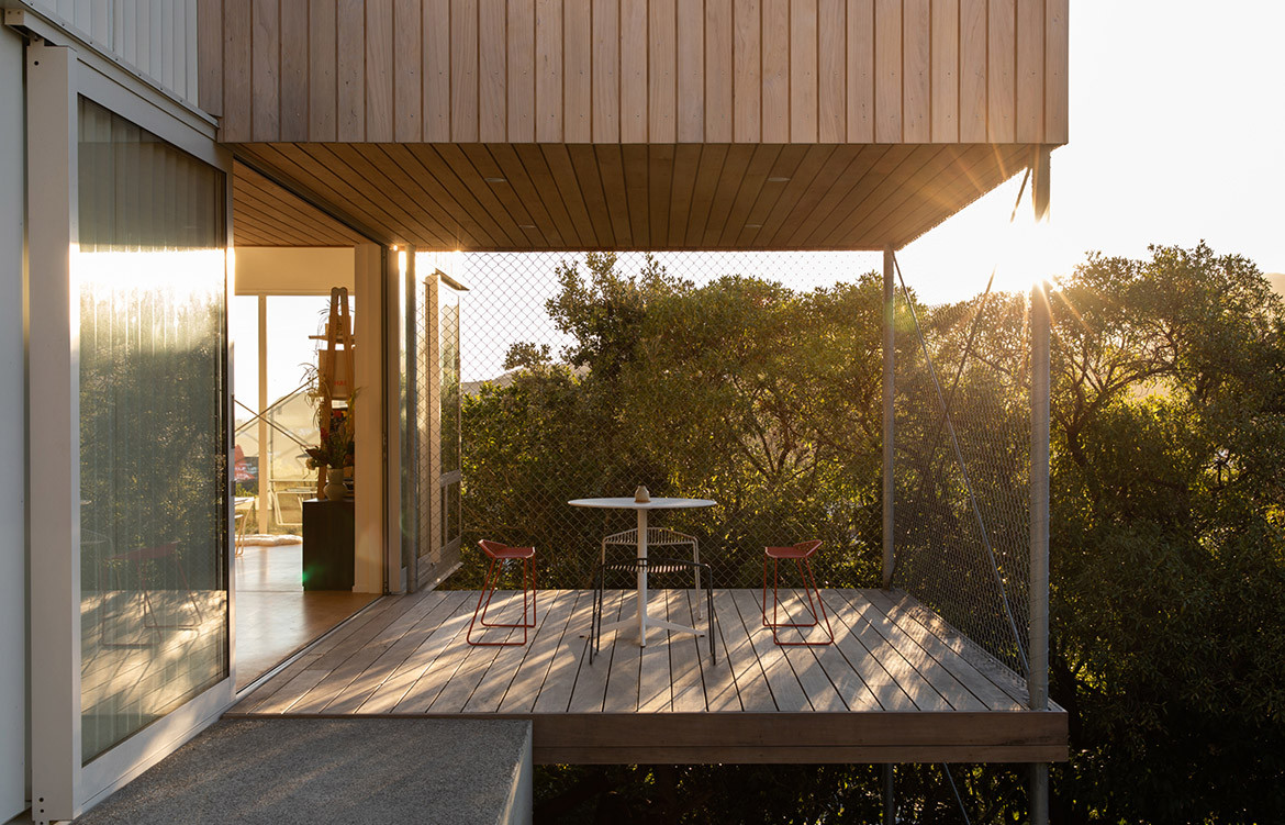
The clients wanted the building to feel perched amidst the treetops, yet anchored sturdily into the hillside.
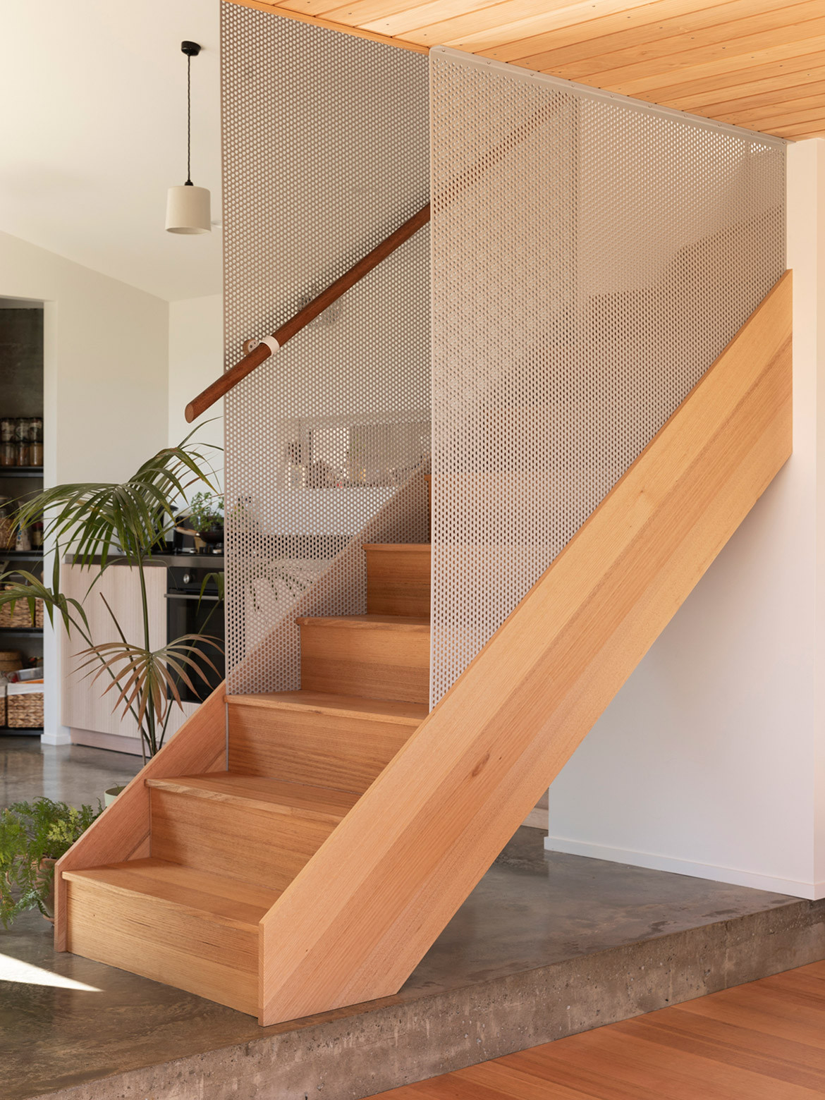
Holly and Grayson were keen to be involved in the design process – more than simply offering a brief. “Holly particularly wanted a degree of complexity to the house: surprise and intrigue,” notes Tim. This needed to be reconciled with the more practical requirements (two bedrooms and a home studio) and spatial limitations (to keep the house within 100 square metres). As it often is, the budget was also fairly tight, so Tim and Caroline were conscious of keeping the layout succinct.
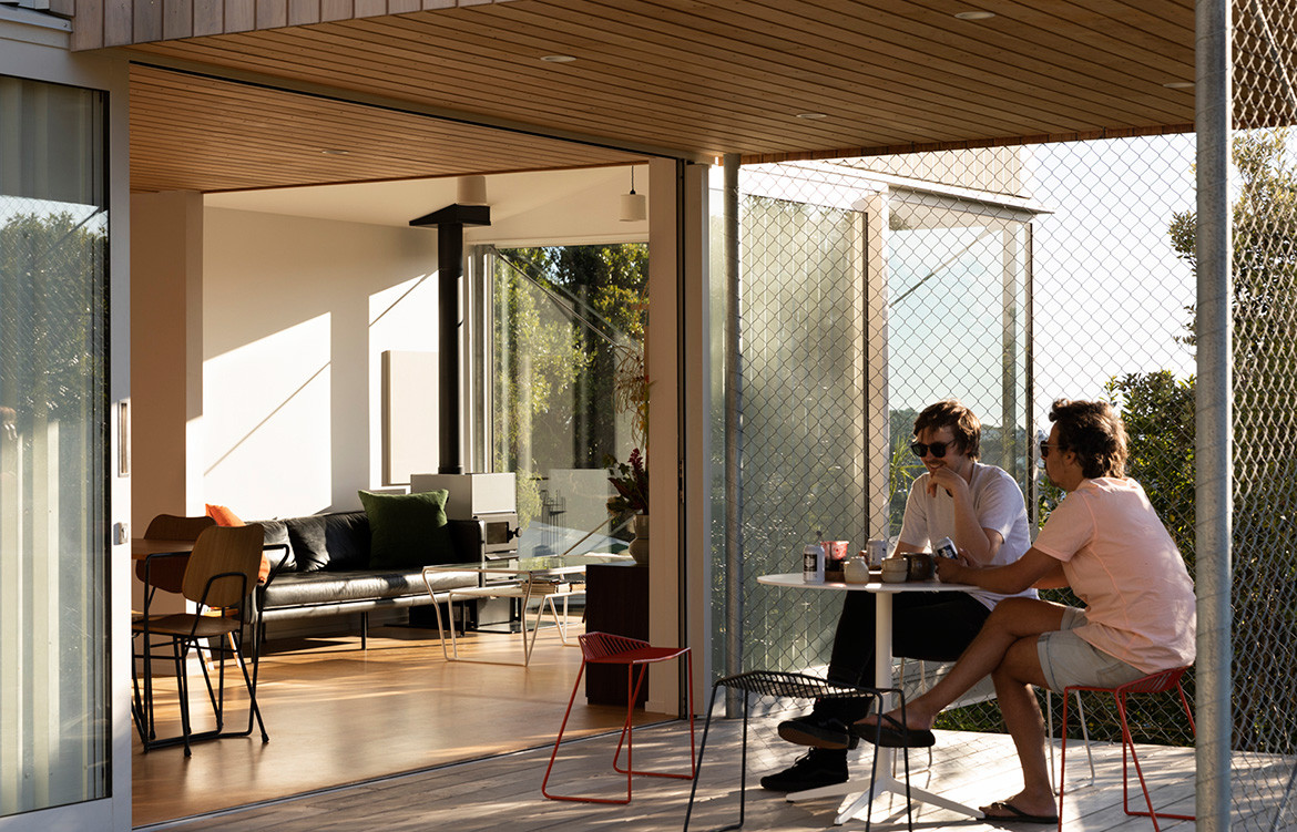
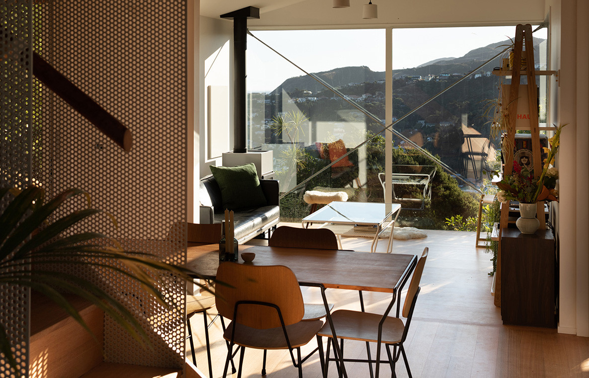
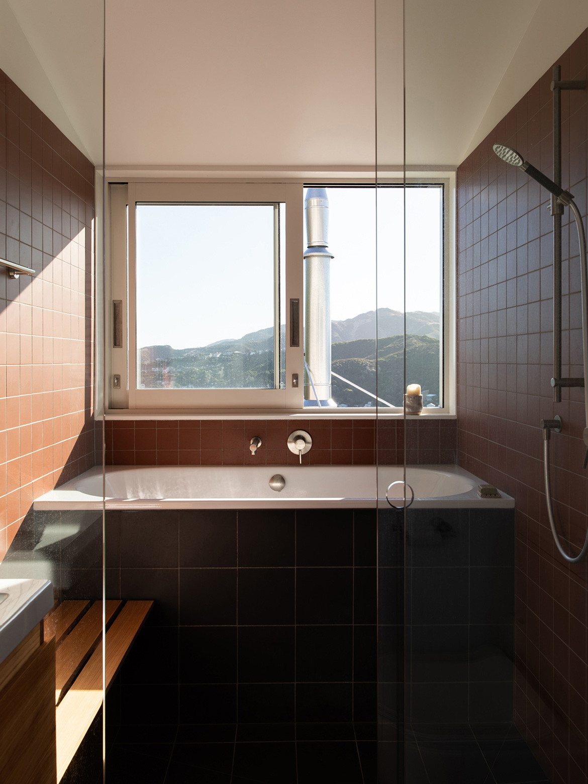
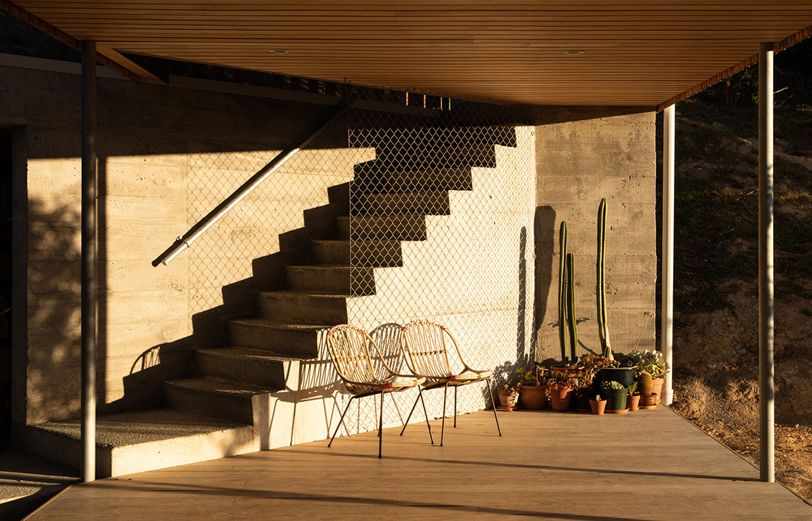
Given the enviable location – hidden from the road, in amongst the brush, and privy to long views out to the Cook Strait water body – the clients wanted the building to feel perched amidst the treetops, yet anchored sturdily into the hillside. The house is oriented to the north taking advantage of the views and sun path. Additionally, this configuration exposes the concrete floor to the sun ensuring good passive performance through winter.
The rotated upper wing, shelters the sunny terrace and living spaces below from the “brutal” north-westerly winds.
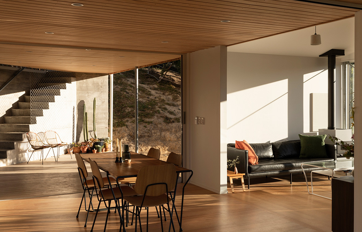
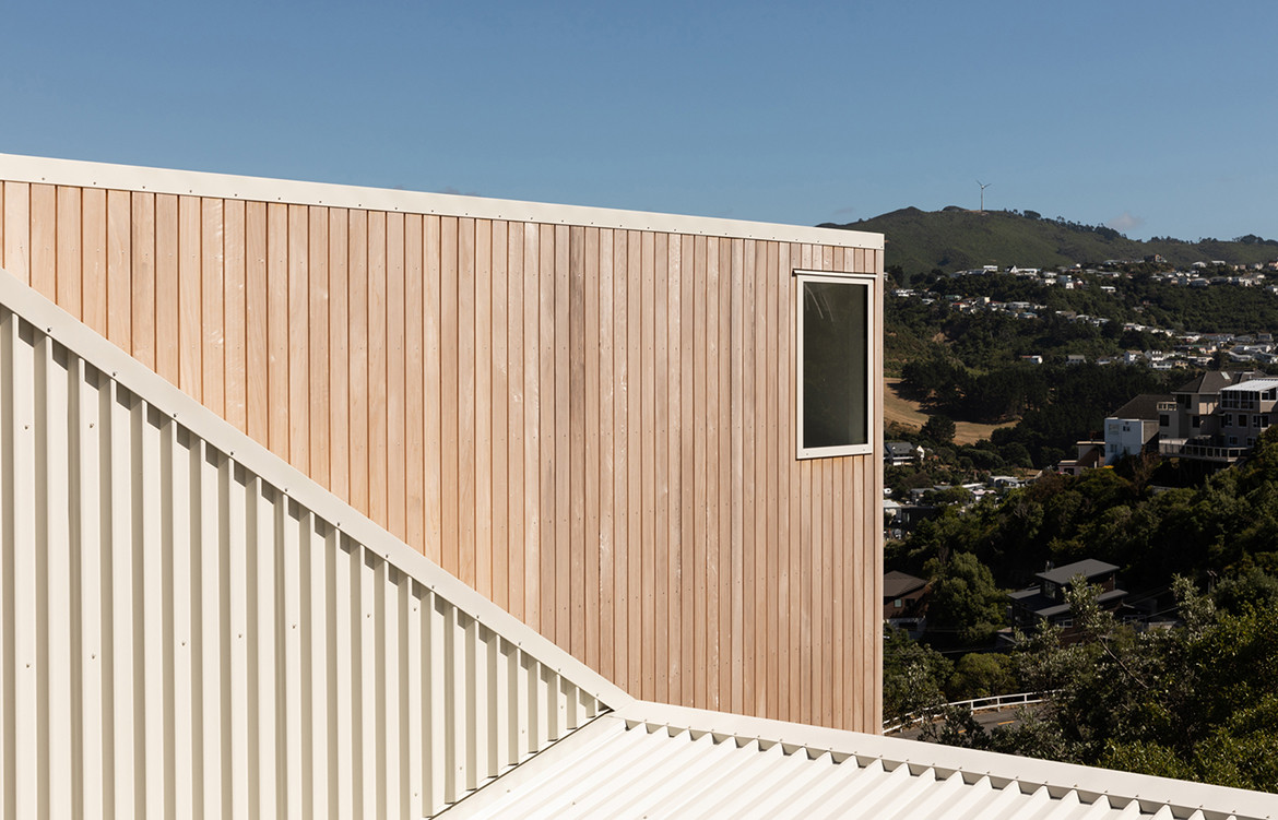
The upper wing, comprising the bedrooms and bathroom, is rotated by 90 degrees. More than creating an impressive and memorable form, this move shelters the sunny terrace and living spaces on the lower floor from the strong, and indeed at times “brutal”, north-westerly winds.
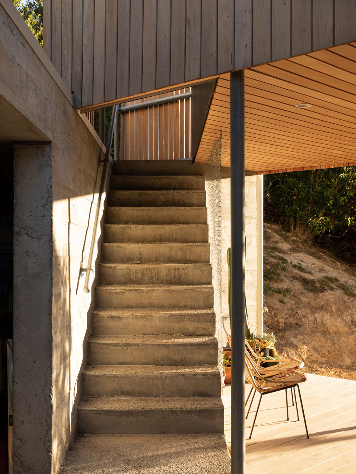
The construction of the X-Marks House was relatively slow. Given no vehicle or crane access all elements were carried to the site by hand, down the long and narrow path. This meant they needed to be light and modular, and assembled by hand. “This gave rise to the small steel components and exposed cross braces that give the house rigidity for high-winds and earthquakes,” says Tim. Holly’s furniture is dotted throughout and works well to enhance the architectural language.
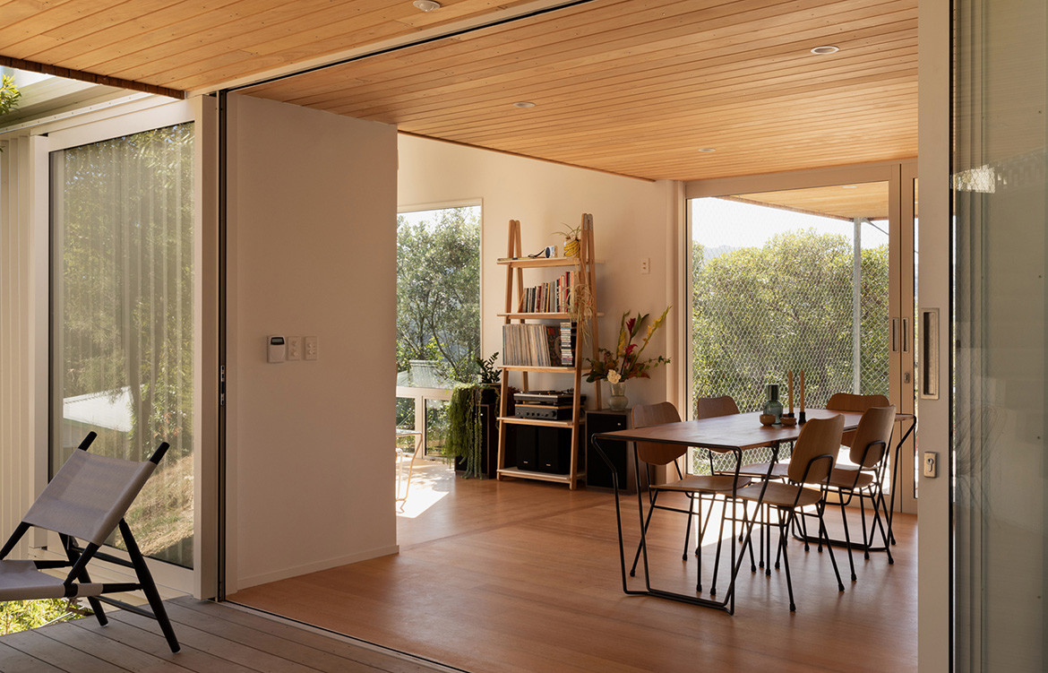
Holly, Grayson and their newborn Billie have now been living at the X-Marks House for more than a year and experienced the house through all the seasons – “which is the important test” according to Tim. He and Caroline have visited socially on more that one occasion and as architects, are just as pleased with the ends result as their clients are.
Spacecraft Architects
spacecraftarchitects.co.nz
Photography by David Straight
Dissection Information
Bucket slipcast light shades made by Spacecraft Architects
Gallons low table, Adele brass & weave-chair, and Gallons dining table by Holly Beals for Candywhistle
Pedro chairs by Craig Bond for Candywhistle
Agape Ottocento bathtub from Artedomus
We think you might also like 10×10 House by Patchwork Architecture
