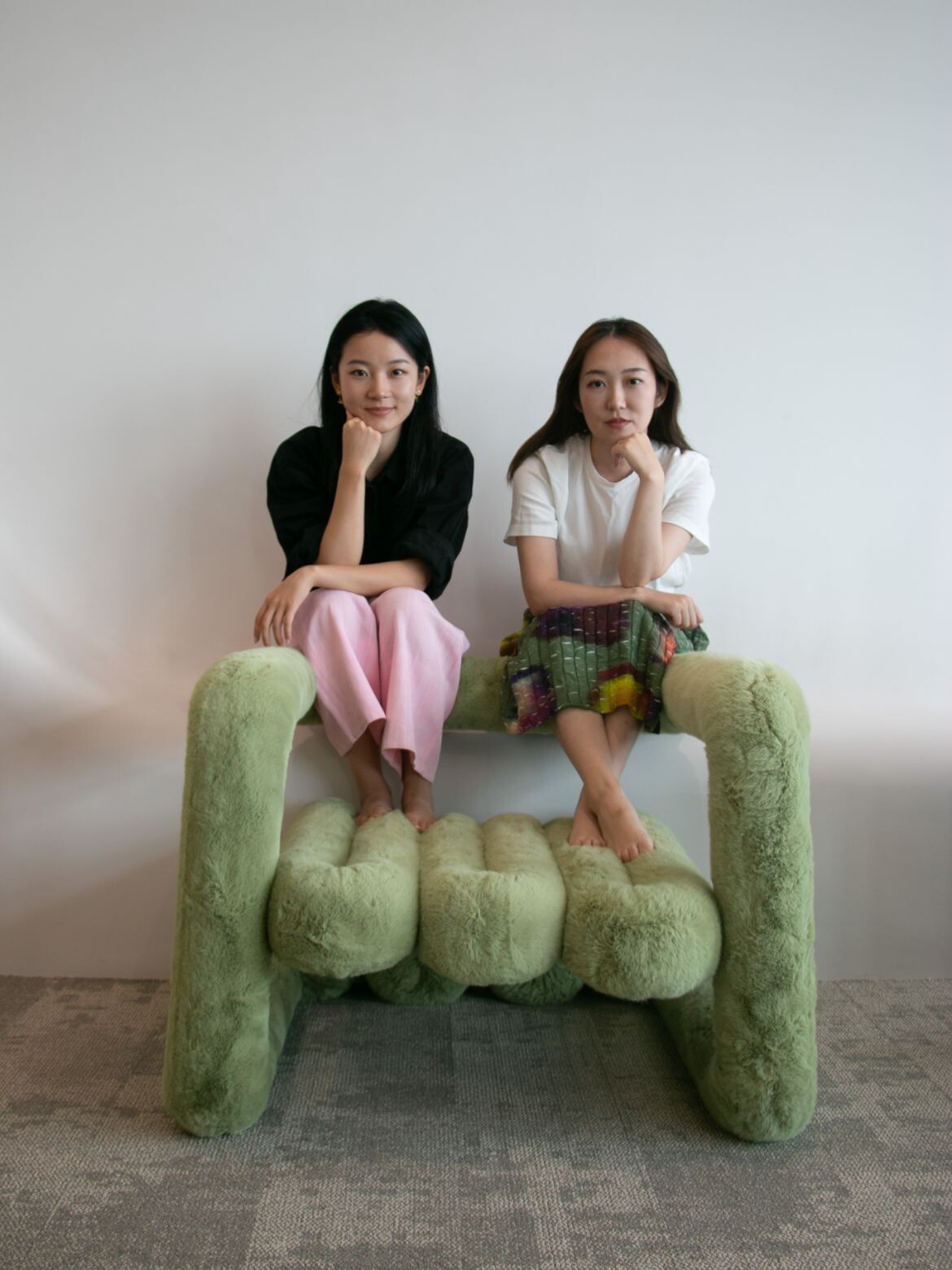
Interior designers X-Zoo have taken an interesting approach on the design of this apartment, which sees overlapping uses give way to large and open expanses. “Open space provides freedom of growth and opportunity for new possibilities. One immersed in the space should experience the freedom of living through creatively interacting with it,” say Margie Zhao and Xinru Wei, X-Zoo chief designers.
Designed as a relaxed working space to meet the dual identity of the client as an artist on one hand and a successful medical entrepreneur on the other. As such, the design has forgone fixed furnishings.
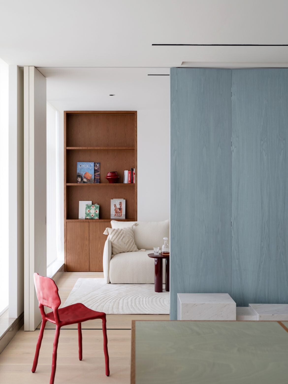
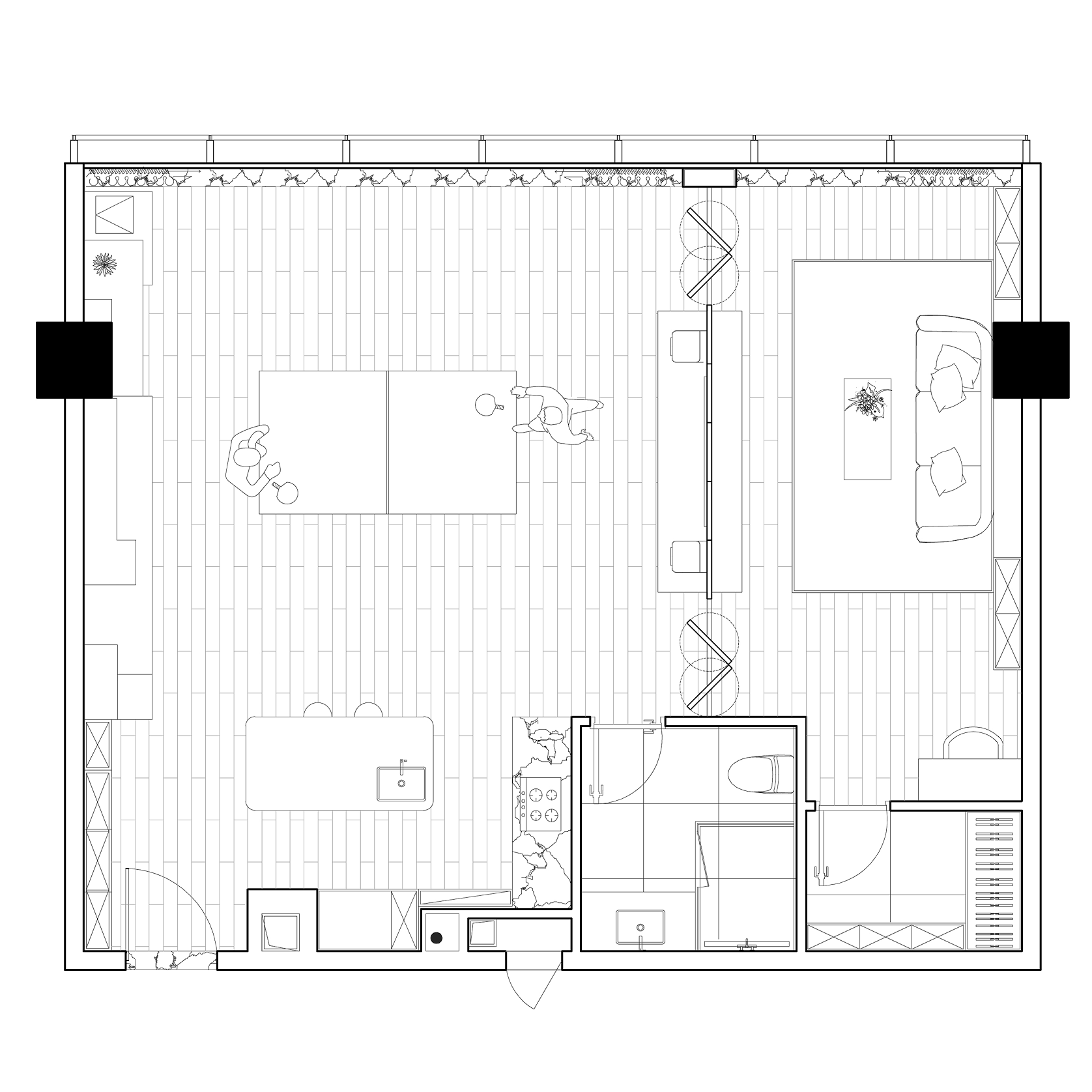
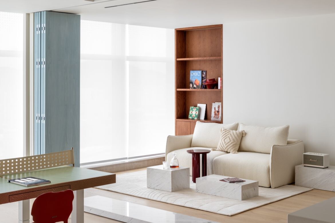
Instead, the apartment has been designed as a flexible space for team working, business meetings, entertainment, work and leisure. To this end, the design blurs the boundary between workplace and leisure with a bifold screen in a washed denim finish that allows the bedroom to be closed off completely. Conversely, the bed can revert to sofa configuration, the screen completely pushed back, and the whole room opened. It should be noted that vastly improved sofa bed technology, makes this a high-end solution and not the make-do option of the past.
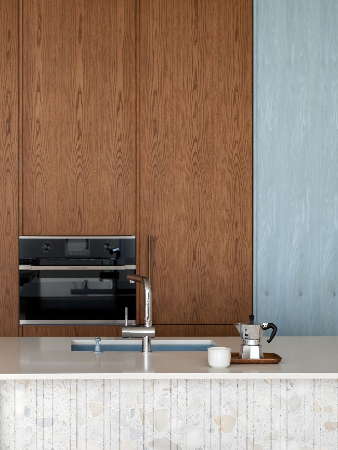
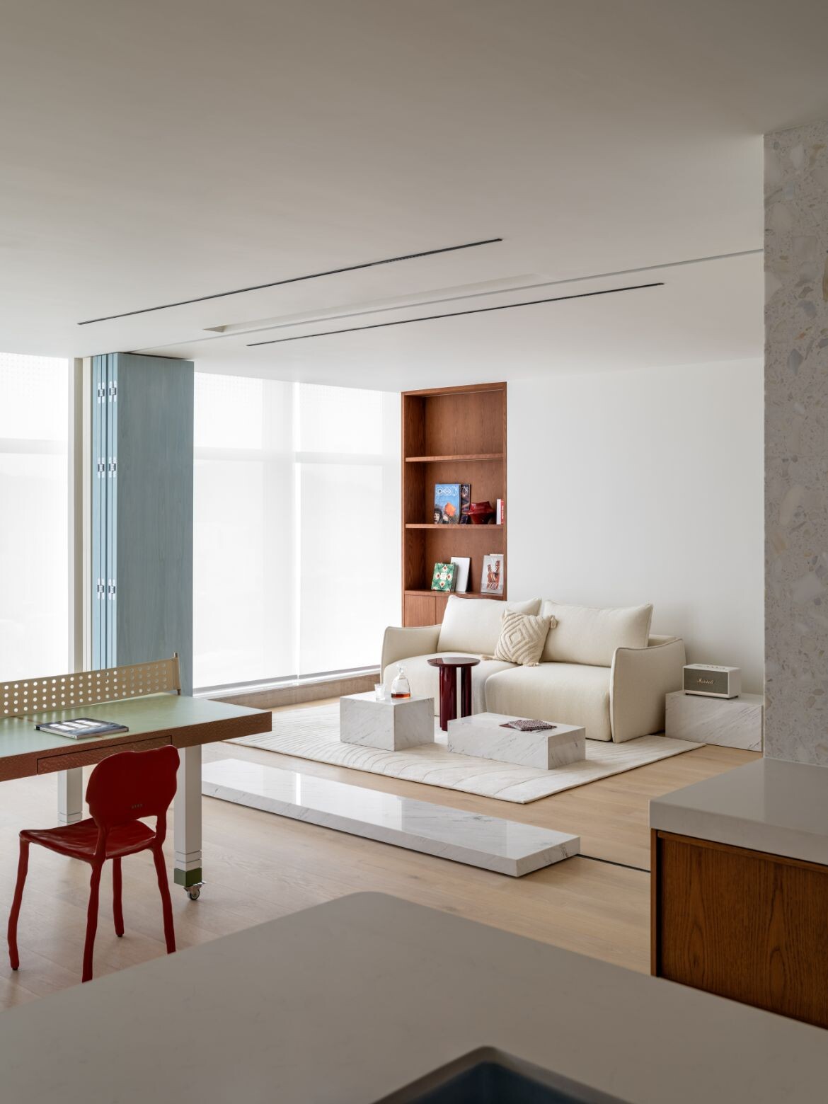
In opening the space, the full wall of windows washes the interior with light. Diffused by blinds, the space is lanternlike and gently radiant. When opened, the views of mountains panoramically invite nature into the room. Paired with this expanded light and nature is a simple colour palette of white walls and timber floors punctuated by timber cabinetry (pale ash in the public area and a deeper teak tone in the kitchen and bedroom), white on white terrazzo and blue-washed timber.
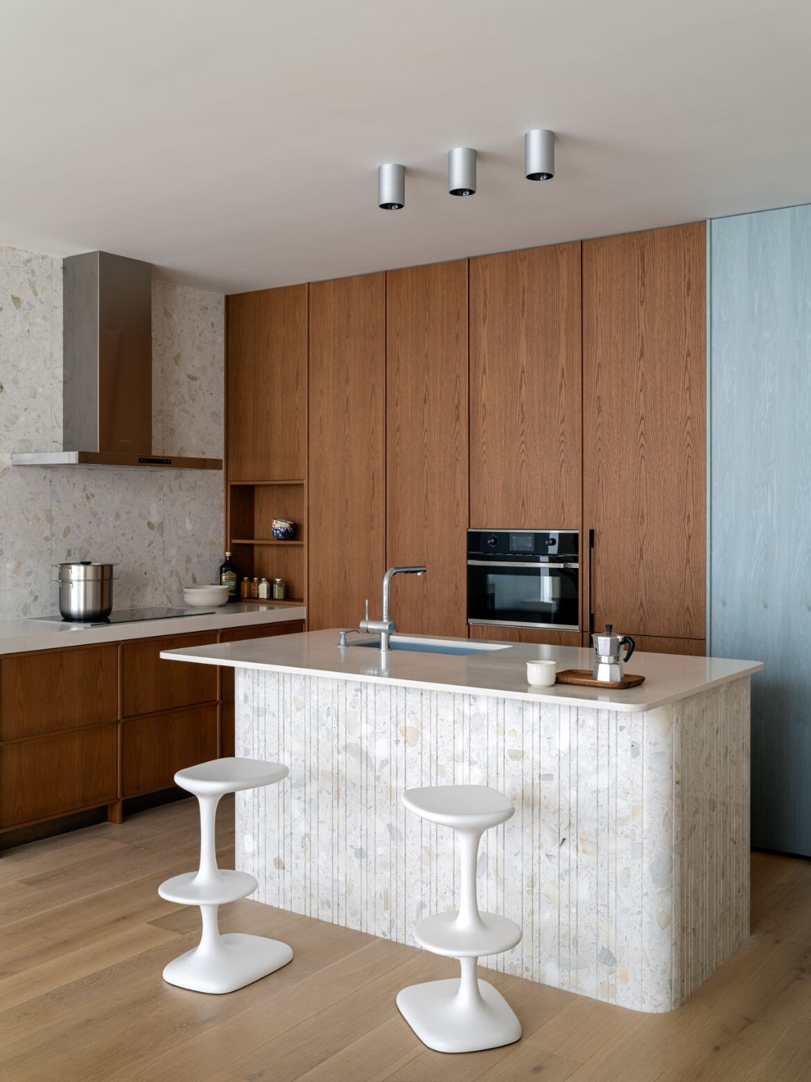
The basic square of the apartment has all utilities to the internal wall with the kitchen forming a nook within the main living area. Neatly arranged as an island for dining, minimalist induction cooking and the remainder concealed within timber cabinetry, nothing is imposing. Similarly, the bespoke white on white terrazzo forming the island and splashback, continues as a wall to completely contain the bathroom. A large inset door of the same material renders this area next to invisible and affords the room a more businesslike demeanour.
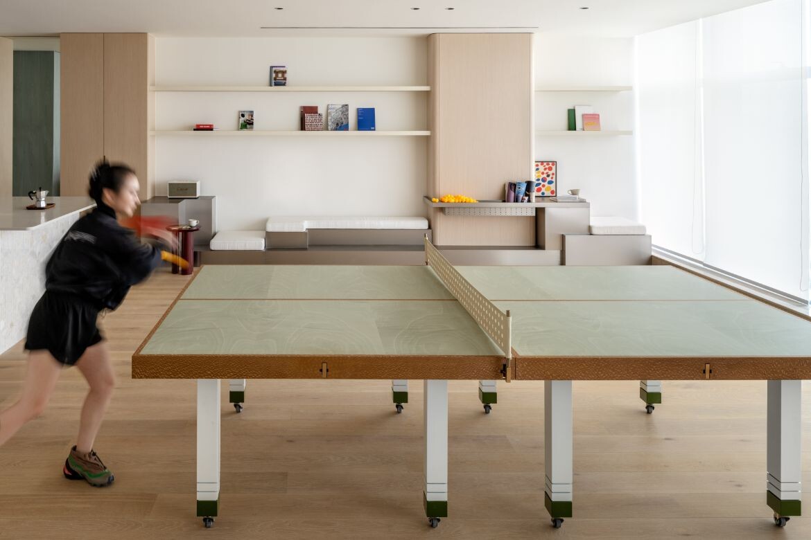
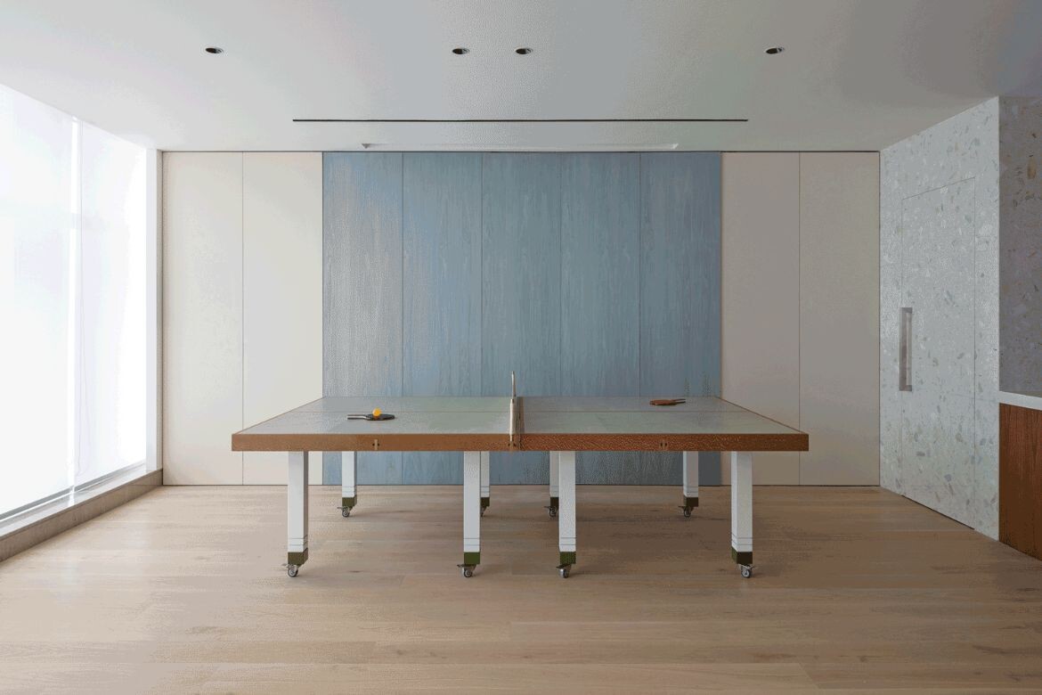
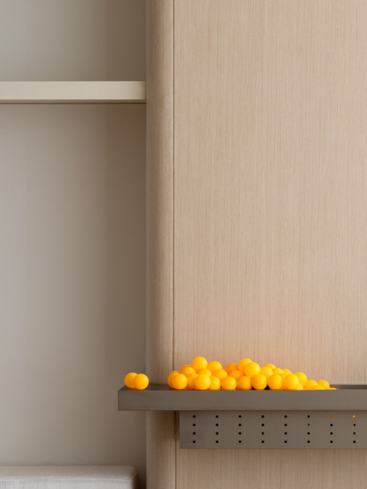
That said, the bespoke ping pong/work/boardroom tables are far from a workplace aesthetic. Emphasising the vitality of the space, the bespoke mobile furnishings adapt to suit needs from solo configurations through to large meetings, and of course ping pong (China’s national sport).
Wheels, adjustable parts, and switch springs (needed to make reconfiguration super easy), are custom-made to maximise mobility and surprises. Designed specifically for their client, the veneer and custom dyed leather net, give the table a unique personality and role as a multifunctional toy and furniture item. “Here, there is a kind of relaxation and joy, like entering a playground when you were a child. You are never tired of playing with various toys and rides,” say Zhao and Wei.
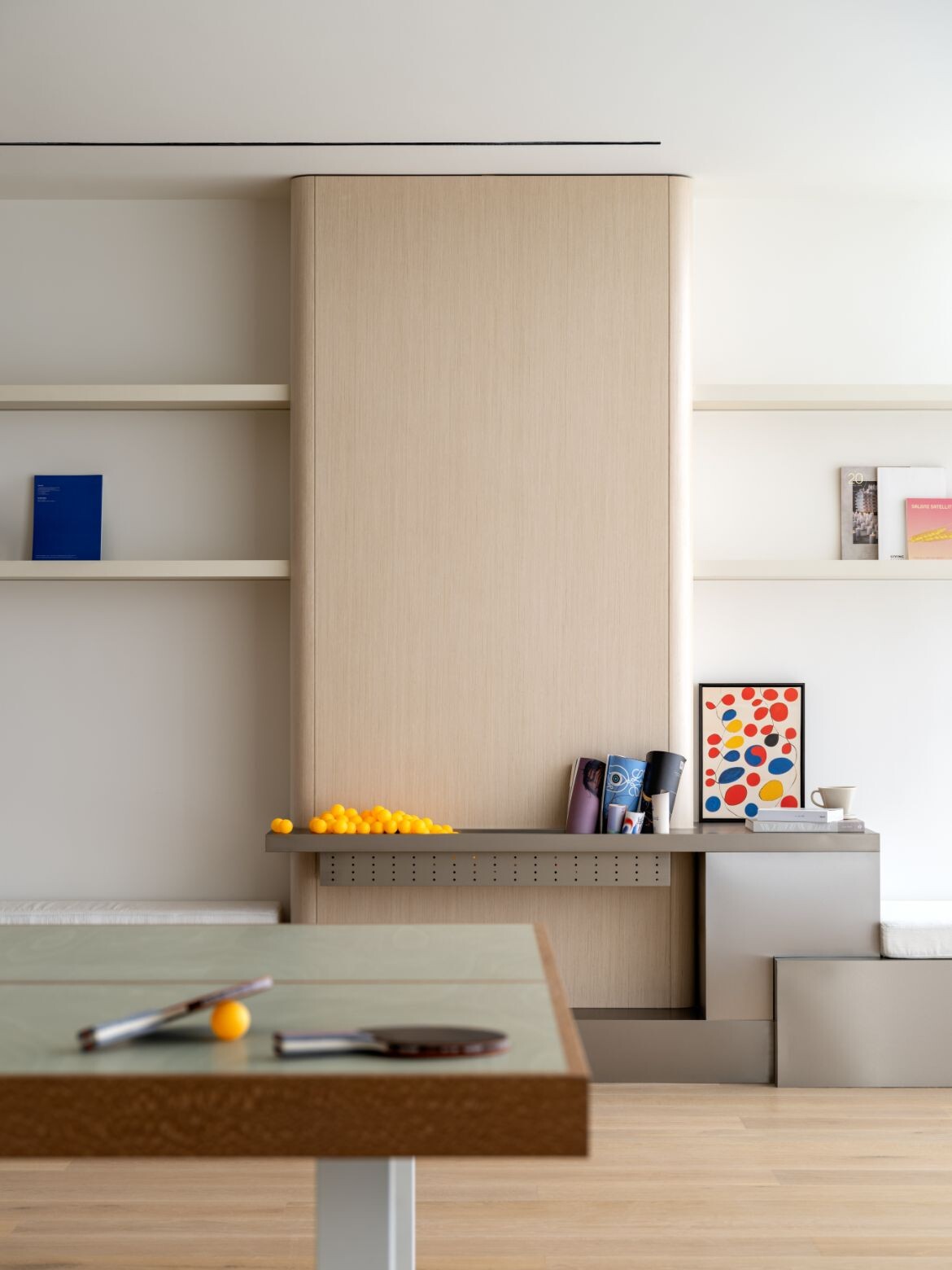
The innermost part of the apartment is designed as a comfortable living area, with storage cabinets that can be easily accessed, side tables and tea tables that can be moved arbitrarily and of course the transformable sofa bed for overnight stays.
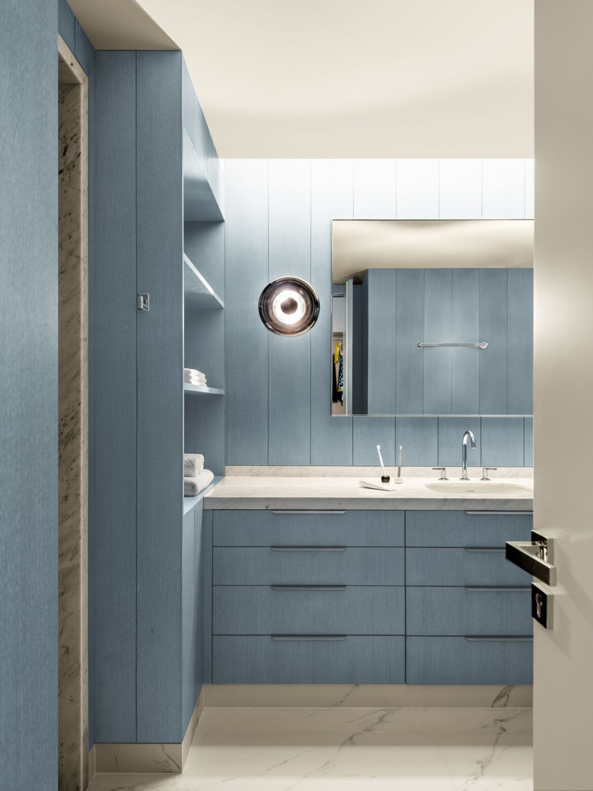
A large walk-in robe and washrooms hidden behind the wall, are surprisingly large and make a strong statement in blue. Lined with washed blue timber, with marble detailing and floor, the bathroom is spacious and bright.

There is a deceptive cleverness to this apartment beyond the clarity of open space. This is evident in small details, such as the externally accessed shoe storage, the padded bench just inside the door for guests to remove their shoes, the abundant storage spaces that are built-in but occupy the space as furniture items.
The bathroom too is filled with storage, as is the kitchen and lounge. Importantly it is transformable, with the current design bones ready for any number of living or working configurations. Moreover, as the client required and the designers intended, it is a whole lot of fun.
Project details
Interior design – xzoo_design
Photography – Sui Sicong
